
Navigation might be the most important aspect of a website. It allows users to move from page to page and to find the content we want them to see. So having a navigation that is unique and always in the same position can be a huge plus. For this article, we gathered a few examples of websites that decided to use fixed position navigation. From fixed menus to headers and side bars, you will see several inspiring examples of how to use fixed navigation.
Nizo
While every element moves, the iPhone is fixed.

Full Stop
Here the fixed element is the header.

teehan+lax
Fixed side bar.

Up on a Hill
While you scroll up and down or use the navigation menu, the ‘Up on a Hill’ is always there, at the same position.

Studio Chirpy
Another example of fixed header.

Imaginista
Here, while you browse content horizontally, header and side bar are fixed.

More than HTML5
The small header is always there, helping you to remember where you are while you browse the content.

Fat-Man Collective
Check out the content and be sure to have side bar and mascot with you all times 😉

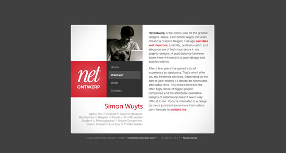
Netontwerp
Check out the content while side bar remains still.
robedwards.org
Another good example of fixed side bar.

Ryan Scherf
Nice textured fixed menu.

Loysel’s Toy
Another example of a side bar that stick around while you browse the content.

Nudge
Beautiful fixed header.

Grow Media
Here you can scroll content around while background and header bar remain still.

Bullet PR
Fixed menu!

Academy
Also a beautiful and clean fixed header/menu.

StruckAxiom
Check out the content and be sure to have side bar and mascot with you all times 😉

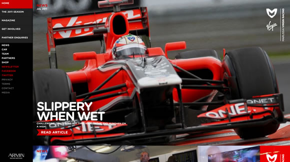
Virgin Racing
Browse beautiful huge colorful pictures while the side bar stay still to help your navigation.
DKNG
Also an example of fixed header.

Rich Brown
Here the side bar/menu are fixed.You have the right side of the page to check out content while the left side stay still.

IGN
When you start scrolling down the menu bar will move to the top and of the page and will remain there while you check everything else.


Thanks, nice examples 🙂
There are really neat examples. Some of those sites are into the best sites I’ve ever seen!
Teehan+Lax redefines a lot of standards!
I recently made a fixed nav website, maybe you’ll like it and I’d be glad to have people opinion on it: https://tecchan.loriskumo.com
🙂
Hi Kumo
Been to your site and yes you have a lovely fixed left menu.
Your home page is “Responsive” too and the fixed menu beautifully relocates itself when the browser size is reduced.
Nice showcasing both fixed menu and responsive compatibility.
I love Full Stop’s (the first one). I’m sort of a newb, so maybe this is obvious – but I’ve been through the code and I’m trying to figure out how they do their backgrounds – it’s just a background color with a repeating-image of noise laid on top of it, but I don’t see any opacity controls. Hmm.
Oh yeah, the fixed-nav is great, too.
Excellent, mine could have been in this selection 😉
https://www.michaelbernard.fr/portfolio/
Thanks !
Nice collection, my personal site also uses a fixed navigation: https://ivomynttinen.com/ 🙂
Wow. I love Nizo, thats fantastic how it all comes together as you drag the page down. Teehan + Lax is interesting too how the video plays in the background. Ryans Sherf has a lovely textured effect to it too. I really like the colours used in bullet too. Thanks for a lovely fresh collection. It’s great to see some new designs.
A good selection. This is that I search in this period! Thanks for sharing!
Loving Rob Edwards fixed sidebar/scroll page. Also appreciate the grid on Academy.
The Rich Brown website is a great fluid design and Nizo website has great transition as you scroll down the page! Fixed position is a good way of simplifying content and menu items thanks for the inspiration!
Excellent websites..Thanks!
I like the diversity of the examples! Each has it’s own personality, it is really nice to see a trend not copied blindly.
This website has a very interesting fixed menu, especially with the transparent background. https://www.thefount.com
Hi,
The Nudge and Ryan Scherf were my favourites out of the selection.
Best Regards
Andrew
Thanks for the list! 🙂 I like the IGN site.
Resoluut does a good job at this as well: https://www.resoluut.com
Can every designer thinking of using fixed position top navigation spare a thought for those of us without mice or touchscreens?
If you’re reading a webpage on a laptop with a crappy trackpad or have a disability that makes it hard for you to use a mouse, you’re probably scrolling down webpages using the keyboard. Easy and convenient.
1. Hit either Page Down or the Space Bar
2. Be taken exactly one screen down the page.
Except if the designer has implemented a fixed position topnav in the wrong way at which point it goes more like…
1. Hit either Page Down or the Space Bar
2. Be taken slightly more than one screen down the page.
3. Lose your place in the text.
4. Use the arrow keys, scroll up and down until you find the place you’d got to.
5. Read to the end of the screen and then repeat because using the keyboard to scroll in this way is automatic behaviour.
6. keep being thrown out of the text
7. Cuss out the designer.
There are ways of implementing fixed position so it doesn’t work by covering up 3-5 lines of content. Please use them. PLEASE.
Some great examples there! Nice looking websites… but as Clare said, some accessibility issues.
Echoing Clare, I hate fixed top and bottom bars because they break page up/page down functionality. And either text search down or text search up will also be broken because the highlighted text will be obscured by the bar when the page is automatically scrolled up or down to display the text. (This site itself has a fixed bottom bar that cause the same problems.)
Is there any way to tell a browser to exclude a fixed bar from height calculations (like an HTML frame) for scrolling behavior? If not, then I hope web designers can refrain adding more top and bottom bars to sites. If HTML frames are widely regarded as amateurish retro 90s design, I don’t see how using CSS for the same effect is any better. At least HTML frames don’t break page navigation.
Hi Gisele
Great collection.
Will it be possible for you to attach a simple and general tutorial along with it?
Well, great coders already knows how to do it but beginner like me need to try out the codes to learn the tricks 🙂
Thanks for sharing the collection.
Hey Gisele thanks for all of the great examples!
I am really interested in the IGN site and how they have the menu start below the header position than fix at the top when scrolling. I am going to try this on the next site I design.
A good selection. This is that I search in this period! Thanks for sharing!
good sites get an idea for my site nav bar design 🙂
You forgot twitter! The top nav is fixed
Nice post, thanks for sharing. Fixed navigation is great for mobile sites which allows users to navigate more easily.