Flat design is a concept that was pretty popular a couple years ago and it’s back with full strength this year, causing some interesting buzz around the so called “flat design” trend. Flat design is not something new, something we created now as a response to other design movements. It is a concept that was around before, and now it is appearing everywhere. Flat design is pretty straightforward. It is flat. It’s a way of designing without adding three-dimensional attributes – no shadows, no gradients, no bevels, etc. It doesn’t mean flat design has no effects at all, it just means that it doesn’t use effects to create depth and dimension. Flat design focuses a lot on color (solid colors), typography and simpler use of UI elements.
The flat design trend causes a lot of debate and certainly deserves a more in depth article, which we are working on. While we finish our research to show you a complete look at “flat design”, we want to show you some examples of websites adopting the flat concept. Let us know your feelings about them and stay tuned for the next flat design chapter.
Friends of the Web
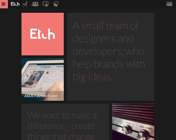
Etch
Crafting Type
vtcreative
Flaticons
Build 2012
Profound Grid
Wistia
Mark Simonson
William Leeks
The Ecology Center
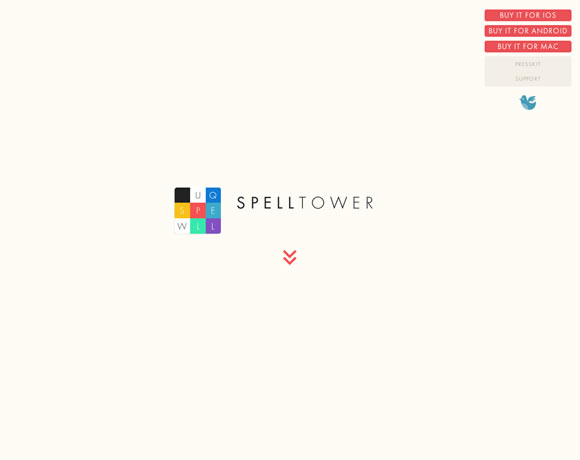
SpellTower
OnSite
LayerVault
It’s a Shape Christmas
oak.is
Werkpress
Happy Studio
Coloured Lines
Bob Galmarini
Foundation
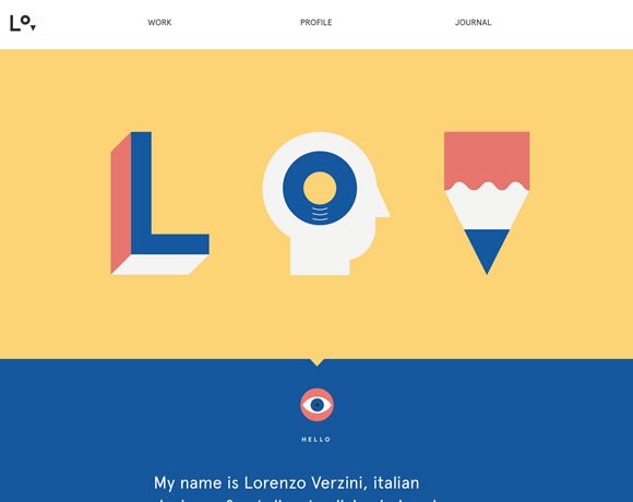
Lorenzo Verzini
Sumall
You can also find a lot of flat design inspiration on Dribbble, Pinterest and Behance.


beautiful examples , flat design is getting famous fast
I like this trend of flat design (maybe i’ve seen too much parralax scrolling since 2 years, need something else !)
And its looks very good in mobile/app
We try to do some flat design as freelancer ( https://www.les-internets.fr )
Nice collection and examples !
Check out our all-flat new project coming soon on smartphones 🙂 !
https://who-wanna.com
Keep going your great articles !
Wow!!! your website who-wanna is brilliant. Simple, yet effective.
Hello B. Berger,
I like your project.
When do you launch it ?
And are you french ? 😉
Xavier
Thanks guys!
Yes, we are french, we have planned to release the application as soon as possible, probably in a couple of weeks!
Don’t hesitate to suscribe to the newsletter or the facebook fanpage to be kept in touch!
Cheers and thanks for the support.
Love the Coloured Lines site, but then I’m a sucker for rainbows. What is the difference between flat design and simply designing a site that has no third dimension, do you think? I often try to avoid shadows and gradients, and often end up commenting to myself that everything looks a bit “flat”. But not in a good way.
Thank you for compiling and presenting these beautiful examples of flat design. Simple yet elegant!
Great article, thanks for the quote Gisele.
The flat designs are refreshing. Organizations going for what they think is sexy, 3-d, are getting sites that are very busy. The fit depends on the audience, too.
Nice collection. I can’t help to think though that theme are some Windows 8 influences @ work here.
I think the opposite view might be right. Win 8 are influenced by this trend.
Flat design, if implemented properly, looks great. Though I don’t find all the examples listed here, exciting, some of them are fantastic. Useful list in all.
I think people will get bored with flat design soon.
Nice collection, thanks. Flat is definitely the trend for 2013.
I am a web designer myself and I love it when I have to create a flat website, with out relying on that needless wizardry to create ‘depth’ and magic. You get more time to think and create new patterns and experiment with various colors. I am glad, it is back in vogue.
Also check out Kareer.me. We’ve taken the flat design approach throughout our entire product. Worth a look.
Few of them are excellent example of flat design simple but effective.
I like the Colored Lines most its full of color and freshness.
Flat and beautiful, specially colored Lines.
I really like the look of flat design. It’s simple and yet elegant. Thanks for the article!
This is great. Actually flat design is kinda answering the needs of many people in global. Not everyone all over the world have a good internet connection. So we need to create a design that use less image files. With flat design, most design elements should be able to just use the css codes, so less load times. And with condition that nowadays many people accessing websites through mobiles, so flat design makes it easier and simpler to apply the responsive web design.
So many great designs – thanks as always.
As a developer, working with a flat design would be a nice respite.
Spending so much time trying to use CSS for shadows, transparency, gradients etc. to replace images seems such a waste.
I, like most people, want to spend as little time as possible on sites because I’m just looking for specific content. Clever graphics and animations rarely, if ever, make finding content faster, or persuades me to want to visit a site more often.
Intuitive navigation and well laid out content have always been key to a great site.
Let’s get back to the minimalist 😉 approach to design!
Nice selection, i like when the flat design is combined with some “minimal / clean” effects and a bit of animation. It’s make a simple, modern, and colorful website
I tried to do this for my new website, https://www.geoffrey-menissier…. if someone have feedback 🙂