
With the ever increasing popularity and wide spread use of mobile devices like the iPhone and iPad, it’s difficult to ignore the fact that websites are being viewed across various screen sizes. And it looks like the days of designing a site for one minimum resolution are almost gone. That’s why “responsive web design” is such a hot topic lately.
If you’ve yet to incorporate this concept into your web designs and you’re looking for examples, or if your simply in search of some responsive inspiration, you’ve arrived at the right place. Here are 24 excellent example of responsive web design in action.
Reveal: A Responsive WordPress Theme


hanging up the moon


Sunday Best Designs


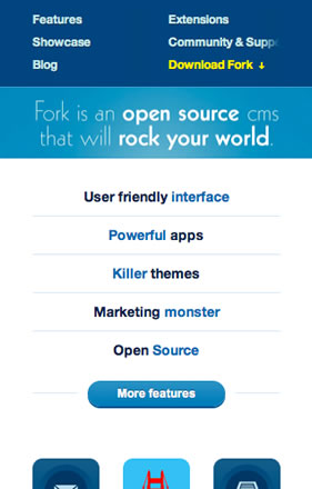
Fork

Yaron Schoen


Full Frontal


10K Apart


More Hazards More Heroes


warface


Social Marketers Summit


Atlason


White Lotus Aromatics


Cappuccino Digital


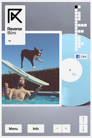
Reverse Büro

Progetty


Jet Cooper


Bloom


yoke


food sense


francesca nini


Forefathers


Stonehenge Veterinary Hospital


Patrick Grady


Frontend 2011


Source:
The Best Designs
unmatchedstyle
Awwwards
Interesting articles and tools:
Responsive Web Design Techniques, Tools and Design Strategies
Responsive Web Design
Tool: Responsive
Book: Responsive Web Design


Responsive webdesign is one of those ideas that is hyped because browser developers failed to incorporate a simple option into their product.
The biggest drawback for responsive webdesign is that it doesn’t give the user a choice of how he/she wants to view the page.
When I have seen a site on my desktop and then I want to view it on my phone later, I expect them both to be the same, or at least give me the option to view it in “regular” or “mobile” form.
Hopefully designers come to realize this and start designing separate layouts instead of responsive ones (or at least build in an option so responsive designs can be switched)
I agree with Jeff’s comment above, I’ve had the same problem with some websites where I am used to seeing the online version and know where things are placed already, when you receive a totally different layout on an iphone or ipad, it can become irritating. An option to see the original layout would be a brilliant idea and hopefully it will come with future development. On that note however Responsive web design still fascinates me and I’m enjoying all these blog posts featuring it. I love the ‘hanging up the moon’ site, although it is a little slow on loading. Full Frontal is great too but you would probably expect that from a Javascript conference website. As they are all created by intelligent and up to date designers, the designs are all pretty becautiful.
Yeah, I second to Jeff. Although, it’s really exciting to learn new thing like responsive web design, but it is still lack in some areas like what Jeff has been mentioned .
And as I’m more into eCommerce website lately, implementing responsive design is still a drawback for me to. eCommerce website is a bit complex.
However this list is very inspiring.
Yes, it is important for the user to see the desktop version and quickly recognize the site/product on a mobile device. however, not all full website looks nice on a mobile device. Therefore, colors, fonts, images and icons used in an desktop version is very important to allow that consistency which will flows in a mobile device environment.
When designing for a mobile web, designer should always understand that user behave differently on the mobile device compare to a desktop version. Not just literally ripoff from the desktop and put it in a mobile web environment. I guess that is why some responsive web works and some not.
Probably an option to toggle between view desktop version might just help some users. And I personally find it unnecessarily. If it is so much pain in the ass why dun you just view it on the desktop? If the user is not able to recognize or find a particular button on the mobile compared to the desktop, probably something is wrong with the UI or maybe its a user problem.
Most of the above responsive web design are well thought and definitely understands the behavior of user in mobile browsing environment.
I don’t agree on last posts. As a designer and developer you look for the best experience of the website on every device. The smaller the screen does not mean that you just squeeze the page in the screen and let people zoom for recognition only. No, the viewer-experience with the content is the most important key…!
Every device has it’s own view-function. Fast browsing on desktop and laptop, information and entertaining on small devices. Thats why you can change the order of the content matched to the screen. All information must be available though…!
I do miss the iPad-resolution on most designs above…!
YEs, I understand that, but it is not just about experience, but also about usability. And as a user I WANT to be able to switch between the designs you made for that site. Because when I am used to looking at a site on one device I may actually like to zoom in on another. You (the designer) should not make that choice for me.
AFAIC ‘designers’ created horribly cluttered and ‘minimum size required’ websites in the first place. Needing all that space to show off how designy they could be and loading it up with eight million images rather than using HTML.
Now it’s a “new thing” to make sites that don’t require all that heavy loading and can fit down onto smaller screens? You mean like the original tenement of not making fixed width ‘designs’ in the first place?
Designers… making things a mess for the sake of their own ego. /barf
The market asks and you provide. People browse from there mobile devices, let them experience that! Why not take advantage of the power of the iPhone to push a better experience then the one on your desktop? Stop thinking with a 1999 perspective. Just open you eyes and smell what the web is cooking!
nice examples!
I’ve been struggling to have a decent view of my own website in blackberry/iphone and other mobile devices and then I realized that I am against those who wanna browse anytime/anywhere!!! So I’ve decided to just give them a kind of “preview” of what the site may look like when your browsing it on non-telephone device.
A little stubborn, a little browser-developers-disappointed… I guess I just had enough with de cross browser fight to add another thing..
You missed out The Boston Globe.
Its probably the best example of Responsive UI live on the web as of now.
Responsive web design, as you said, has been a popular subject. And what you have here has really made my day as I am preparing a HTML5 project focused on mobile devices. Really inspiring. Thank you Gisele !
quality…
While it sounds great in theory, with the incredible resolutions now available on the iPhone and other mobile devices I usually prefer the option to view the site as it would appear on a desktop. I can understand that some may prefer a tailored option though, surely the best design solution would be to offer the choice (as others have said)?
An interesting collection of responsive websites. There seems to be mixed opinions on such sites, but there’s no getting away from the fact that it’s pretty clever stuff!
There’s some great conversation buzzing around the popular design blogs on this topic. The truth is, “responsive design” is just the buzz word as of this moment in time.
Compatibility is really what most of you are talking about. Cross compatibility from device to device. Creating a unified experience regardless of your viewing “hardware” and browsing “software”.
It’s really nothing new…
Good design is good design 🙂
Missed mine – https://www.scriptedpixels.co.uk 🙂
Hey, great collection, although I don’t agree that a lot of these are excellent examples of responsive design. Some of the mobile versions of these sites aren’t really that well thought out, in particular the Atlason and Social Marketers Summit sites.
NIce, but you missed the other side of responsive: widescreen.
My favorite responsive collection is https://mediaqueri.es/
The stonehenge design is awesome. The typography and colourschemes! Simply superb.
some interesting dialog around these examples but it seems to me there is a misunderstanding of what responsive design is. A site should be designed for mobile first and then enhanced progressively. Content is always king and nothing is sacrificed for the sake of the “mobile web” (there is only the web). This is important as designers we have to keep our target audience in mind. If you are selling a product or providing information on your site do you want the user to have to zoom to the area they are trying to read? When looking at a “mobile version” of a site I often feel like I am using a dumbed down version or something that is an afterthought. Designing for mobile first takes care of this issue.
Hey Matt! interesting view on responsive design.. i feel that you are on to something. The problem with that i believe is that almost every business has a web site now days and now need a “mobile site”. Some of those sites are good others are bad but everyone dont need a new web site to make a “mobile site”. So you have to take that in consideration tho… do no exactly where im going with this:/ Like to post tho!
Amazing examples! Today we have just finished our website as a responsive website. Here, in Spain, the concept of responsive web is growing day a day, and now you can see some websites that adapt his content to diferent devices. The reason is because now a 40% of the spanish people are using smartphones.
One thing is really calling my attention: There is hardly any example on the web with a site structure that is more than one level deep. Thank you Amit for the hint regarding the Boston Globe. That was not on my radar, living on the other side of the pond (Switzerland). Are there any more multi-level nav samples out there?
Hey guys, please take a look at this site: https://stronynasmartfony.pl/
It works very cool on tablet and smartphone. Have fun! 🙂
‘More Hazards – More Heroes’ looks amazing!