
Last week we showcased examples of color usage in web design, and this week we will keep the focus on color, but this time around we will showcase examples of dark colors usage in web design. The right amount of dark color can create an elegant and beautiful site, so check out the examples we gathered and give dark color a try on your next project.
War Child

Kyle Steed

Ryan Lottering

42Angels

La Bubbly

Abstraktion

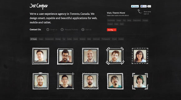
Jet Cooper
Renai

CoFinery

Full Frontal

Barcamp Omaha

Jorge Rigabert

Jux

workdiary.de

hooppps

sage

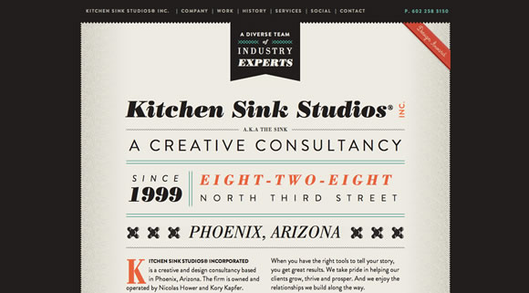
Kitchen Sink Studios
Kings of Mambo

From the Rough

Riser

Trokit

Tom, Dick & Harry

Nike SB

36Creative

Vivas


Bravo! There are so many corporate people what shy away from the darker websites – these are prime examples of how it’s done right!
In some case like “42Angels” “workdiary.de” “CoFinery” the dark site is the best solution. Nice collection and ispiration. Thanks for sharing!
I really dig the JUX website. Creative use of space. Nice and simple.
Wow! Mike Kus did awesome work on “War Child”.
Fullfrontal? It’s an epic site, lovely design, brilliant strategy, etc, but dark?
Great post. Thanks for featuring us!
I’m a freelance web developer, my site is light on dark (click my name above). I think it’s worthy for this list, is it not?
Very dramatic…only works when there’s very little copy.
Thanks for featuring hooppps… it is an honor to be up there with some of the other sites you featured!
What I really like about all these examples is that it shows you can use more than Black, White, and Gray. You can achieve contrast with other colors, and I think it is very stimulating to see a blue, red, orange, yellow etc. every once in awhile.
Wow! Those are some great looking dark sites!
Verry nice collection, I use black on my page as well, its challenging but the reward can be big.
Some very cool examples, I agree with Susan about splashes of colour really standing out when used sparingly.
i like the yellow and black one..
It very simple and nice.
A nice collection of dark websites.
I liked ‘Jet Cooper’ and ’36Creative’.
Warchild and 42 Angels. Excellent choices. Thanks.
Hey, that’s great to be listed here…thanks much. In a line-up with a bunch of talent.
Good work everyone…love to get to know the work that is coming out along side the talent on our team (that’s not me…I’m a boring business development guy).
Nice Stuff…
We like to provide our clients with one dark and one light design for their website direction (if it makes sense for their product or service). It seems like most prefer darker websites – not sure why.