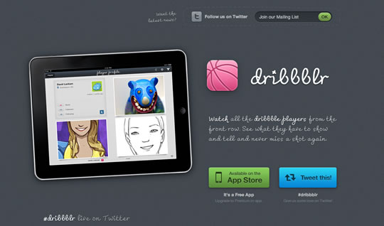
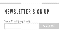
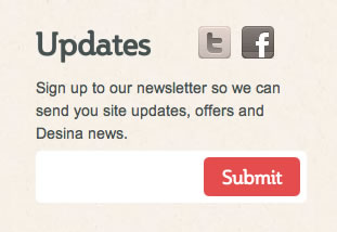
Last week we showcased a list with 25 Excellent Examples of Forms in Web Design and today I’ve decided to gather some examples of subscription forms and buttons to show you. When I was browsing around looking for form examples last week, I found some interesting examples of subscription forms and though you would also like to see them.
I’m the kind of person that tends to subscribe to something when the design is appealing and beautiful. I think it’s a good way of showing your user you care about them and even with such small details you give your best.


Thanks for the post (pun intended!) It’s making us feel inspired again….
We’ll pretty-up ours when we’re not so busy 🙂
another great example!
https://littlebigdetails.com/post/3035590179/sign-in-button-expands-and-folds-out-once
I love the irony of the ‘every pixel counts’ button being vertically mis-aligned by a pixel.
Hey thanks for featuring our site!!!
Also lots of other great examples there. Kudos.
Thanks for featuring us. Now we need to get the site and app up and running!
This is another subscription example
https://underconstructdemo.blogspot.com/
There’s some great examples of how to make something simple and a little dull, far more appealing to the visitor.
Thanks
I really like the minimalist approach to the CardFly and 300 Pixels subscription pages. Often times, landing pages or signup pages are so busy, you become distracted from the goal of the web page.
Thanks for featuring our site!!!
This is a example of creating a website with good look and feel.
I’m seriously tired of seeing these ‘inspiration’ sites spitting out this garbage. Humans..