A form can be a very important part of a website. From really simple and direct ones, to fancy, colorful and creative, there is a form style for each site. When thinking about the interface design of your site, this is certainly an element you should focus on. From Login/SignUp forms, to contact forms and other types of forms, we need to keep in mind that the point of those forms is to get the user’s attention and make them want to fill in the info. So here are some excellent examples of forms in web design.
Inspiration  Gisele MullerJanuary 24, 201114 Comments014.7k
25 Excellent Examples of Forms in Web Design
Gisele Muller
Gisele Muller loves communication, technology, web, design, movies, gastronomy and creativity. Web writer, portuguese/english translator and co founder of @refilmagem & @mentaway Twitter: @gismullr


Very nice collection!
Thanks for collect them on one place 🙂
Great list, thanks.
Forms tend to be dull dull dull, but are often a very important part of a website
It’s great to see some really interesting attempts to make them far less dull…
That Bio-Bak one was fun to play around with haha
Great Collection of forms there. I find forms are usually one of the hardest elements of a website to design – they’re just so limited!
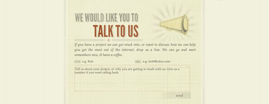
Nice collection, I love the sketched style forms… Thanks for sharing!
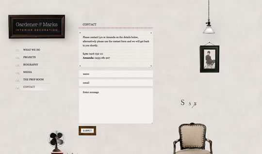
That Gardener & Marks one, whilst looking nice, is not practical. The placeholder text in the form does not disappear when the input gains focus. Some simple javascript would fix this.
Im sorry to say that most from those forms are inaccesible, and error handling in few is quite a mess. Alert for an error? Jesus, its sooo ugly. But I have to agree that some of those forms look and work quite well… but not many of these.
Nice collection.
Sorry, very childish..but the name wanken made me laugh..ha ha
I admire those simple forms with plain neat backgrounds.. another terrific list!
I loved the one from Peixoto, it’s cool to see something a little off sometimes.
Would love to see more examples of COMPLEX forms – not just contact forms
While those examples look nice, most of them were just plain horrible usability-wise. If a designer thinks s/he should sex up forms and create something unique, only pursuing egoistic and artistic ambitions, that designer should be fired instantly. Do forms like these and you’ll most likely end up losing money and/or users.
I totally agree with you. Usability is much more important than graphic presentation of the form. Personally, my user-experience went down a bit when I tried to navigate through those forms with keyboard.
Thanks for inspiration 🙂