Here on WDL, we’ve discussed how colors can be used to invoke various emotions. For example, the color red symbolizes excitement and energy, while the more tranquil color blue represents calmness and stability. Here we’ve gathered a collection of web designs that make good use of color. In these examples you’ll notice some using color to highlight and draw attention to specific elements, while others use larger amounts of color to set the over all tone of the site. Nevertheless, there’s plenty of color usage here to inspire you. Enjoy!
Inspiration  Gisele MullerSeptember 26, 201119 Comments05.5k
27 Examples of Color Usage in Web Design
Share
Gisele Muller
Gisele Muller loves communication, technology, web, design, movies, gastronomy and creativity. Web writer, portuguese/english translator and co founder of @refilmagem & @mentaway Twitter: @gismullr


I think it’s very impressive…I love Archfirm, it’s so minimalist
Awesome examples !! Thanks for sharing.
A great collection of graphic site. So nice works someone! “Grind” “de Certau & Associes” and “Hyper” are my preferite! Thanks for sharing!
Thx aledesign
Great to hear that you like our new website.
Best regards
Lars-Petter W. Kjos
creative director
Hyper
Wow great collection of sites with some really varied colour! Thanks for the share
In web designing, Colors plays an important role in highlighting the message that should be conveyed to the users. In some designs, I found too much of loud and bright colors making the main page too flashy while some other designs have a perfect balance of colors.If the colors are too intense, it will take away the attention of the user from the content value of the site.
There is no excuse for bad design on the web. Very good examples.
I really like the flow festival site. Great collection of sites, unique and inspiring.
Super exemples ! Un article à recommander!
I absolutely loved indubitablee, what a great job. WOW!!!
Some fresh stuff here. I dig it.
yeh, so many awsome website, they are all have great color. look so professional and clean. I have got some inspiration from those website. many thanks.
These are inspirational, creative and highly professional.
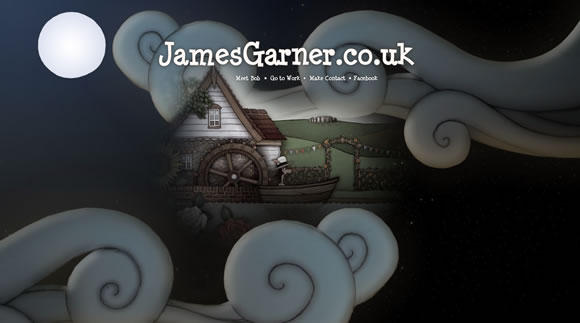
Especially James garner’s website looks absolutely stunning!
Really nice! Thanks
Love the James Garner site, but my question is whether anyone would hang around long enough to find out what it is all about.
There are some great uses of color here. Rich,, vibrant and very interesting. I will have to say I like thecombine.org, very different than the norm and great us of electronic illustration. Thanks for the inspiration!
the examples are very inspirational, thans for sharing…
Really like the Engine Creative one – octopus hatching out of an egg ftw! :o)
Thanks for sharing such an useful list.
I was unaware pf many of this sites. Now I use this to work more effectively.