Textures are being used in every sort of design. Nowadays you can see beautiful textures used in business cards, mobile apps and definitely in website designs. There are lots of high quality textures available in the market as well as free ones that can help you to achieve brilliant results. Appropriate use of texture helps to create realistic and detailed feel to a design. In this showcase you will find 30 fresh examples of textured websites featuring minimalistic, clean, subtle and grunge textures. Hope you’ll find this collection useful and inspiring.
Inspiration  Tomas LaurinaviciusJune 13, 201117 Comments05.3k
30 Brilliant Examples of Texture in Web Design
Tomas Laurinavicius
Tomas Laurinavicius is an adventurous designer and entrepreneur. Editor-in-chief at Despreneur and Product Manager at Refe. Connect with me on @tomaslau.


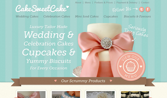
There are some lovely examples of textured web design, a few of which I have already come across such as Cultural Solutions and Cake Sweet Cake, both excellent designs. I liked the Delisham website, the colours and design suits the business. Label my Coffee is a lovely, well thought out design too.
That is a great collection, and it is such an important detail in any design project to incorporate textural elements. Even in corporate site design there is the opportunity to add small textural details to create depth and detail in a design. Thanks!
Really nice texture…
it can be usefull for me.
thanks….. 😀
Thanks for sharing this wonderful list of textures! There are so many ideas which can be derived from these designs. Bookmarked the page!
Seeing my new website listed amongst such wonderful designs is definitely priceless. These are all brilliant examples indeed! Thanks a lot 🙂
Brilliant textures. so divine, feeling so good. thanks for sharing these resources with designers
Thanks ever so much for the feature! I designed Mad About Makeup, and love using texture on web to give design some depth. It’s the future!
PS. Don’t forget to sign up to our RSS 🙂
This is so great!
Thx for adding our Website to that awesome list.
Bookmark! This is a great collection! Thanks a lot.
The slider concept on La Web Shop is just like ours – https://bright-sides.net. Our site was created at the beginning 2010.
Besides – great examples.
Cool inspiring sites again. Love the smooth texture and Zoltan’s portfolio.
Thank you for listing me. It’s an honor to be listed among such wonderful designs.
Definitely an awesome round-up of creative designs. I’m loving the Balencic site – brilliant!
Very interesting stuff here! Thanks, excelent collection
these are awesome.
Excellent collection. Thank you.
Very nice collection, simple yet beautiful designs here.
Bookmarked for future reference.