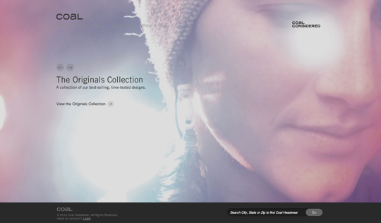
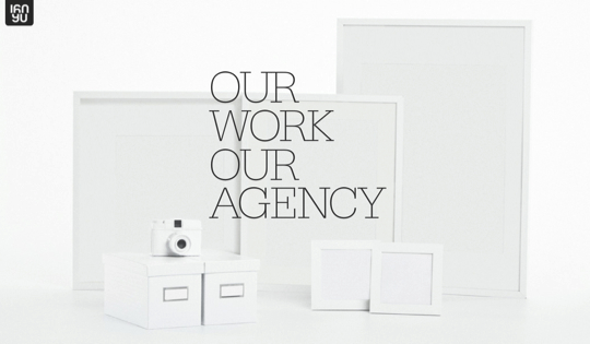
A trend in web design that has been popular for a while, and still seems to be gaining momentum, is the use of big background images. It’s an easy and effective way to add lots of interest to a design and set the overall tone with one photo or illustration. However, doing this is a bold move and you run the risk of creating a web site that has too much going on. So it’s important to find a balance between the background and other elements of the design. To give you some inspiration, here are 30 examples of web sites that use this technique effectively.
Inspiration  Gisele MullerNovember 8, 201025 Comments010.7k
30 Examples of Big Backgrounds in Web Design
Share
Gisele Muller
Gisele Muller loves communication, technology, web, design, movies, gastronomy and creativity. Web writer, portuguese/english translator and co founder of @refilmagem & @mentaway Twitter: @gismullr


Greaaat! thanks!
It’s awesome collection of backgrounds.
nice inspirational examples! using big background images in web design is one of the best way for me to come up with something unique and interesting.
There’s also https://varmlandofscandinavia.com/
The website examples are amazing. Thanks for the share. I think the biggest problem with such websites are in the SEO perspective because a lot of the examples above are flash websites that are very hard for search engines to crawl. If as a developer you are aware of this, and you manage to create a website that looks great and is search engine friendly – then you are destined for great fortunes with your project.
Perhaps you should have waited a little longer for ‘Free Agent Depot’ to be loaded when you took the screenshot… Its not really complete now. Besides that: a nice example list.
Really nice collection! Sayonara is my favorite. Thanks!
Sky walk is amazing
Cool collection! Thanks for the share.
Nice roundup. Big backgrounds really look great in web design.
Totally amazing !!!
Great article, though the free agent depot sample shot hasn’t fully loaded 😉
It’s every developers worst nightmare to come across a design that has a large background, it makes optimisation really hard work, but the examples you have posted seem to cope really well and they work really well.
Awesome 🙂
Mavic and Because Studio both look really striking. Fave has to be the first one, just for using the tight rope in the mountains picture. Great collection.
Mmmmmm … I like big backgrounds … 😉
Some of these backgrounds look amazing, my favourites are Sayonara and The Squad.
I think it can be tricky to get backgrounds to look right. But these examples are amazing. An inspiring collection.
Terry
Love the first one with the guy on the tightrope between the mountains. Awesome!
Wow! I find these pages breath-taking. Been wanting to try making these kinds of interfaces but couldn’t find the right background.
awesome collection of backgrounds
Great selection. I’ve been wanting to design a template or two – this is just the inspiration I needed.
nice collection – cheers heaps for putting together and sharing
For sure there are hundreds of designs out there with huge background, but thanks for sharing this collection. I’ve seen one from carsonified before but I can’t remember the link. It was really an awesome design and it should have been one of the sites mentioned above. Thumbs up for Studio Tilt!
Love these large background sites. WordPress is making it pretty easy to customize the dashboard to make large background sites easy on the client.
Nice list! This Coal Headwear is beautiful! Nice colors, nice atmosphere!
Super Awesome! Thank you for the post! Great settings for the user experience.