
Choosing the right color scheme for a web design is extremely important. It will set the mood of your design probably more so than any other component. Sometimes it’s appropriate to go big with an assortment of bold colors, while other times it’s better to play it safe with a minimal color palette. For today’s inspiration, we’ve gathered 30 web designs that make excellent use of color. Enjoy!
Netlife Research

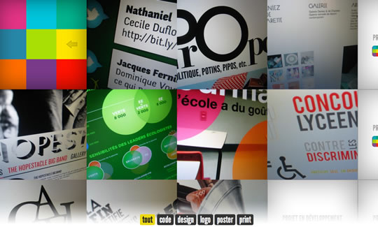
Collision

Instagallery

FIFe

The Material Group

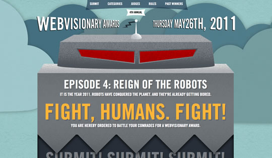
WVA 2011
Orange Sprocket

Co Exhibitions

Spoon

Gerren Lamson

Yuna

rec beat

Assistly

Love of my Life

Aiala Garcia

Elliot Lepers
Polyester

The Daily App

Keenan Wells

thoughtboxes

girlondon

Fhoke

AWP Express

Marie Catrib’s

3 Sided Cube

Jeremy Church

Sparkbox

moovents

Biola Undergrad

best app ideas


Its really nice to see some examples of colour used in web design. Simplicity is good, but adding a splash of colour can really pull a website off the page. I love the Girl London Website. Its really clean and playful.
I think the Biola Undergrad site is my fave on the web right now. Love it!
Another fantastic and inspirational post – every time I see screenshot of moovents I have to go and look at there site – love the way the header moves with HTML5.
Love this post! I had seen the collision site on a CSS gallery somewhere and used a few elements as inspiration on my own site.
Keep posts like this coming, WDL
I love the colour in your examples, but would like to see what you select for sites that are very content heavy. I find most news and information or large online store fronts tend to be very bland and lack in flavorful colour.
The writer of this post does not seem to know the difference between using lot’s of color and excellent use of color. The examples here DO NOT use color well.
Love the WVA 2011 website!
Love it!
Thank you for the examples. I strugle with color on my web designs and ended up with just sticking to a gray scale color pallet. You have deffenantly given me something to think about as I work to redesign my site in a more attractive way
I love the design of “Love of my Life”. Brilliant usage of colors and love their typography.
Awesome post. i can’t decide on a favorite!
such perfection is difficult ot find nowadays on the web :/
Thanks to great weblogs like these we can still cheer in this virtual world 😀
I like most of the examples used in the article but would have especially liked to have read more about the ethos as to why you chose these particular sites. Fed my eyes with some nice colour though, so not complaining to loudly. Thanks!
// alex
My personal preference with colorful sites lies more towards the use of contrast. Keep the majority of the site toned down and then splash color where you want to draw attention.
Wonderful examples, I’ll be revisiting this array frequently for inspiration.
many of these designs were very cluttered. Ie: biola, Simplicity is key.K.I.S.S. Keep it simple stupid. many of the contrasting colours are hard and cold: sketchbook. The most inviting was AWP. Exhibitions, change that dead green.
Great examples, but agree with zenelements, would love to see some analysis.
Making a site look pretty is one thing but actually doing ux testing is another. These examples are great but some don’t think about the user. UCD (user centered design) is my thing!