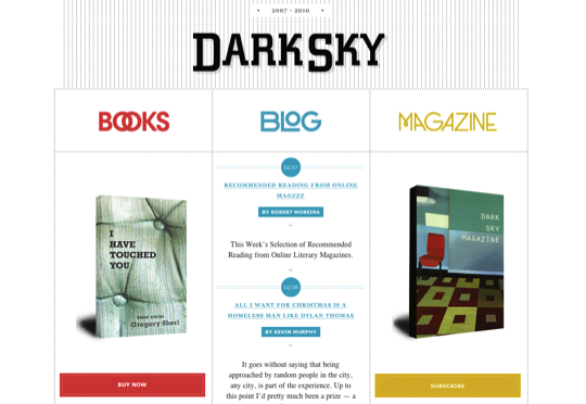
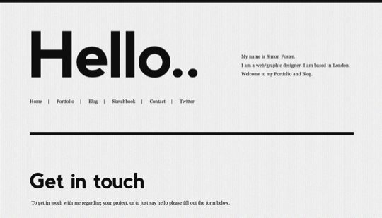
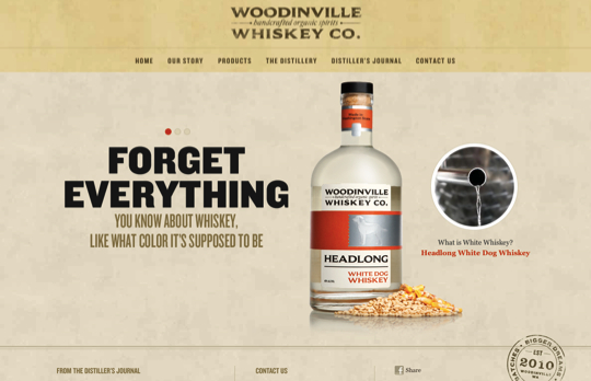
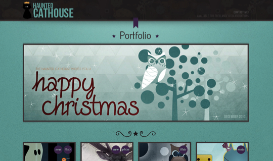
Typography is certainly a very important aspect of web design. So choosing the proper typography for your site is for sure a huge step of the design process. You can have a simple and delicate typo, a huge and strong one, you can also go colorful and crazy or light and smooth. From simple headers to whole ‘typed’ layouts, we have selected some good examples of typography to show here. So enjoy the selection and remember to take good care of the typography in your next project.
Inspiration  Gisele MullerDecember 20, 201014 Comments08.5k
40 Examples of Beautiful Typography in Web Design
Share
Gisele Muller
Gisele Muller loves communication, technology, web, design, movies, gastronomy and creativity. Web writer, portuguese/english translator and co founder of @refilmagem & @mentaway Twitter: @gismullr


Incredible designs. Thanks for taking the time to collate them.
Nice collection! Especially love how Amazee Labs uses different fonts on the same page to make a statement.
Hi Gisele, another article filled with inspiration! the two sites in this list I really love are InfinVision and MumMade. The choice of fonts these websites have used seem to be perfect for the look and feel of their website. Great collection. Thanks for sharing.
Great stuff. I think that ones choice in font either makes or breaks a site. Although, it may seem that simple, it is one of the decisions that need to be made early in the design process.
Awesome collection! Thanks for sharing! I really love typography, they are really good to use for designing.
well done
Nice job for putting this together, some of these look beautiful, some good and some pretty average but that’s all about opinions when it comes to typography.
Congratulations on a great effort, merry xmas from London
phil jones
Jealous and inspired by all of these examples! Thank you. It’s weird tho’ – I feel like I’m seeing Bradbury Thompsen-esque printwork on the web as I scroll through these. It’s nice to see the design sensibilities of print finally playing nice with the digital page.
Comment is spot-on
another great list
There are some very nice examples of design and layout here, but I think the majority of them are actually poor web design because of the way they were implemented. Most are using only background images so the usability is non-existent if the images aren’t loading or are disabled.
Amazing! This is the first page I saw this morning, and it’s gotten me inspired!
Great list!
very inspiring… thats just helped me with a project i am stuck on.
Great Post but have you ever thoughrt that the best way to do it to get and expert in the field