
There is nothing more inspiring than a clean and minimal website. A design with few elements representing something. The saying “less is more”, even though somewhat cliche, couldn’t be more true. We already published here a A Showcase of Clean White Web Designs and a list with 60 Minimal and Super Clean Web Designs to Inspire You. Since minimal sites are always around and they are actually pretty trendy right now, we decided to gather a new list. Enjoy.
Works of WeLoveNoise

Isotope 221

Stuart Hobday

hauser lacour

Hinterland Studio

byLouise

Artypapers

New Simplicity

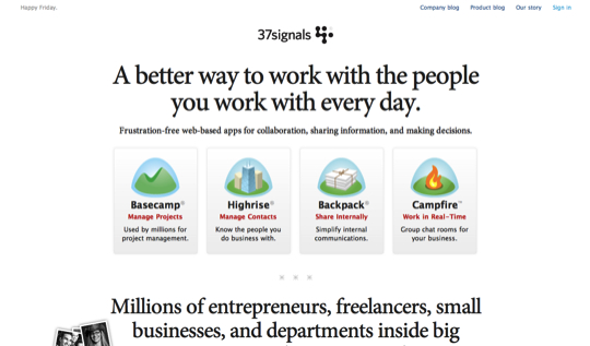
37signals
BX22

here design

Alexander Munk

Omnia

Our Beautiful Game

Julia Schaefers

propeople

Design Woop

The Art of Metropia

Lonely Tweet

Indie Labs

CouchCreative

Vitor Lourenço

The NewMode

eCoverSuiteElite

tictoc

Wearable Print

Grow Interactive

Rodrigo Corral

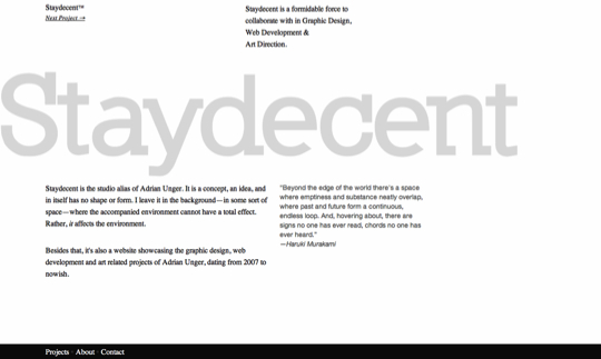
Staydecent
VonChurch

Carsten Prenger

Rhythm

Rob Treutel

The Divisions

Design Influence

thinkmore

Royale

David Gill

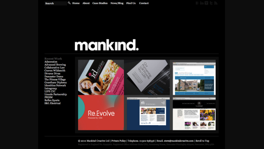
Mankind Creative
Mainstudio


I think the criteria for minimalist was a bit loose on a few of them, but great list as always. I like to call my blog https://ndrw.me minimalist as well though it’s not quite as refreshing as most of the designs here.
Always love looking at examples of minimalist designs. I think I like the Lonely Tweet site the best for some reason.
Great collection! Thank you!
Can’t get enough of minimalism!
Thanks!
Hi Gisele,
Thanks for a sweet collection of fresh minimal websites, .. just loved it.
Sunday, a week ago, I published my minimal portfolio, https://www.gonzographic.com. Very fresh indeed ;-P
If you’ve liked my portfolio, please vote for me on webfontawards.com
Thanks for sharing, cheers & ciao ..
I too have put out a minimalist site as my companies site. I have always liked minimalist design, and I love to see what people do with the whitespace in their designs.
You can check out my minimalist site at https://www.JonGambleLLC.com. Tell me what you think!
Gisele, I LOVE Lonely Tweet. Yah. That’s the one.
Thanks for sharing this collection of websites.
I really really need to update my theme, which has been around since before WP was launched! 🙂
Cheers,
Mitch
Excellent collection! Thanks for sharing.
Really love minimal web design. Very simple yet looks so good. Thanks for the share! Gret collection.
Very good designs, Design must have the capability to attract the visitors and compile the industry and theme of the topic..
Great Designs! You have such wonderful collection!
never seen such a breathtaking collection..thanks a ton
Using large chunky text always has a good effect in these kind of websites. I really like “Grow Interactive” and think “Hauser Lacour” is very clever for using a diagonal line as it does. Great collection and thanks for sharing.
Nice collection, I too love when a site uses minimal graphics and content and still rocks. Good to see so many examples that pull it off.
For me the best of the list are:
1. Omnia project – incredible
2. Vitor Lourenço site 🙂 nice nice nice
3. thnwmd.com – nicely done but i thought it’s going to be based on just that left navi element.
4. And the fourth place goes to carsten prenger – for me the font is a little bit off.
As for the rest. Well it’s hard to say that website based only on slideshow gallery is an minimalistic site and that’s mostly the case in this list.
Cheers.
Excellent collection! Loving them!
Great list! It is good to see fresh examples. My favs are the “We love Noise” and the “here design” sites.
Thanks for collating these. I like to think that minimalism is more than as aesthetic genre – it’s also simple and ‘practical’; this collection illustrates that idea very well.
I’ve just rebooted my own site, https://www.simpledesign.com.au, and the ideas here were a great source of inspiration.
Cheers!
That’s what I call some fresh content 🙂 Good work on searching for new stuff!
I like the concept of hauser lacour. It is something different.
Thanks!
Great examples of minimalist work. Its funny how how simple an clean design often takes the longest!
We just launched our site as well, http://www.woodscreative.ca and after seeing this would like to go back and strip it down some more.
Thanks for the post!
Nice work putting these together! As they say ‘less is more’ but it’s always a lot more difficult to come up with a very simple and useful design then a cluttered one.
Minimalistic design rock! Simple = Good!
Nice collection list … please considering take a look at my site as well. THe link is on my name. Not in my comment.
Hi guys
If you are going to write about minimalistic portfolios again, I would like to suggest my new portfolio http://www.martin-fabricius.dk
Please, have a look 🙂