
Beautiful graphics and colors are great and play a big part in web design, but most would agree that the backbone of a solid user experience is the layout. After all, what good is all of the eye candy if one can not easily read and digest the content. There is nothing better than opening a perfectly organized and readable website – a page where the layout invites you to browse the site’s content. There are several ways to organize and put together a nice layout for your website, and here we’ll show some examples of sites that use grids, columns and blocks to showcase their content.
Superawesome

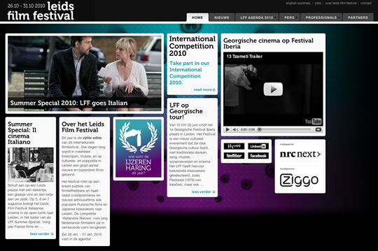
leids film festival
Kokoro & Moi

UX Magazine

TRUF

The Bygone Bureau

Live Now

OURHYPE

Minimalist Design Magazine

Computerlove

Simon Collison

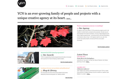
YCN
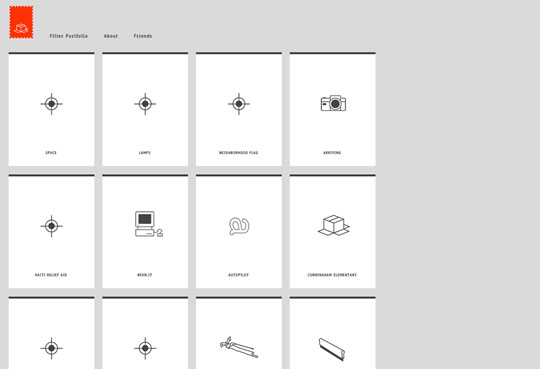
Arnaud Beelen

BB – Bisgrafic Blog

Derek Mack

Magnum Photos

The Canary Collective

Zachary Pulman

de51gn

The Grid System

iniva

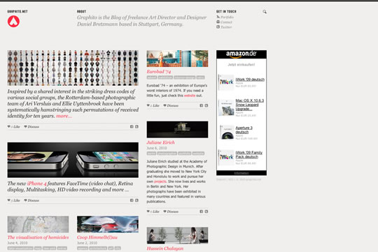
graphito.net
TBWA – London

method.com

Theme

Jan Sochor

FYNN

AiGA NY

Draft

skyskraper

cheetos

Haik Avanian
Morphix

nocturn

Zaum & Brown

SF 70folk

Cool And The Guide

T Magazine

next room

Indextwo

The Feast

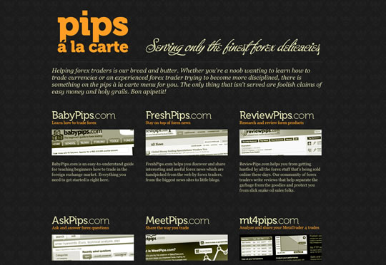
pips a la carte
Dojo Design Studio

Frieze

The Morning News

Rainfall Daffinson

Mark Boulton Design

design B studios


It’s an impressively long list of websites but I’d be interested to know what the thinking behind why some of these are because apart from a few, there are some pretty average designs and layouts listed here.
J.
this is nice collection, but a lot of using sama template.
What’s the point?
The point is to show nice ways to organize content in web design! And also the idea is to reinforce that a good layout is very important and that you need to show your content in a way that gets the audience attention.
I have to agree with Paul on this one. 48 links to sites is far less useful than 10 links to sites with differing, but well crafted, layouts and an analysis of each. Most of these sites have the same type of layout, and you could easily argue that some are not easy to read. And to throw out a bunch of links with no explanation as too why they were chosen, or what makes them good isn’t really beneficial.
@ paul, you knew what the post was about from the heading and nobody forced you to read it…why complain?
seems like @ paul was making an observation. I tend to agree. These are great layouts and great ways to organize and present content, and I love the grid as much as the next guy, but I would love to see some that aren’t based purely based on, or so obviously based on the grid. Great collection- (thanks Gisele Muller) and great aesthetic, but a lot of similarity.
I agree, not very interesting here. In fact this look like a ploy to get picked up by search engines on a story that uses a list. Something very popular these days is to provide a list of something and number it. People love numbers. By the way, not one of these sites truly sells a product. It would be nice to see some “nice design” put towards function in selling something.
I like it, very helpful.
Greetings from Germany
A lot of those are very nice sites, but by selecting only grid based sites you inadvertently demonstrate how cluttered and homogeneous the format can sometimes be when used to the exclusion of all others.
It would be interesting to see the comparison of CSS frameworks implemented, and other different comparative metrics.
Eh, these lists are all the same. Plus, many of the sites included aren’t laid out well in my opinion. There are a few nice ones, don’t get me wrong though.
These layouts were pretty mediocre at best and I agree, most come from the same design, faintly colored transparent boxes in horizontal grid.
A for effort though
boxy boxy boxy…so boring
The grid is so delicious!!!
@mike,
Paul didn’t complain – he asked a question.
However, Jesse, Jordan (and I) agree with the implied constructive criticism and those two offered excellent suggestions.
@mike – if Gisele is going to post stuff publicly on a site with COMMENTS enabled, then by-gawd we’ve all been around the net long enough to know that’s an invitation for comments – good & bad.
What’s most ironic is that this post (and this site) is about good web design, but this site is poorly laid out. I’ve got about an inch or two of horizontal scrolling I have to do to read the width of the page and the layered ad at the bottom “create stunning flash sites” cuts off just to the right of the ‘G'(on yellow bkgrnd) whether I scroll or not – so I have no idea what word the ‘G’ begins.
And the (too) colorful & disparate boxed ads on the right compete visually with the navigation, article headers, and screencaps on the left.
Good god what screen resolution are you using?
That was about to be my question as well… As a developer and designer, you normally have a large screen with a high screen resolution and being that you’re on this site… I’m guessing you’re either a designer, developer, or you want to be.
That being said, this site is set to a width of 1100px which is larger than the typical person’s screen on the internet.
Although I may not think ALL the sites listed are examples of good layout, and even though the layouts repeat themselves on different sites listed, that doesn’t mean this is a bad list.
Not everyone has the same taste in design. And the fact that the layouts repeat means that type of design really does work.
Now it’s up to us as designers to take the knowledge, be it good or bad, and go create good design.
The same resolution that the iPad uses… and most netbooks.
Any designer that doesn’t design for 1024 wide is more interesting than design guitar solos than serving users.
(note: I’m writing this on my netbook).
Its a fantastic collection! im agree with @Jordan_Walker, i love the grids used on those sites.
The grid of “T Magazine” is awesome!
Maybe they look nice, I for me, it’s pretty hard to read some of them
Thankx for featuring my site!
Best regards,
Daniel
I like some of these examples!
great list, thanks
excellent post i really like it i need that one really thanks
I like “Minimalist Design Magazine” . Is very clean and well created on the framework.
Thanks for sharing them!
I’m glad you like it 🙂
Such a very nice work it is useful for many users so great Thanks for sharing with us….
I agree that this post is seriously lacking in information. Most of the examples are redundant and any nuances would be missed without explanation.
One might argue that this is for inspirational purposes, not educational, however the lack of variety leaves much to be desired.
Nice layouts. Thanks for the ideas. Layout designs are very crucial to the website’s personality. These sites look fresh and innovative.
I find these difficult to read not to mention that most of them have serious usability issues. I don’t think posting 48 links to be an insightful article without any explanation as to why they are “Excellent Examples”. Most of these are “layout diarrhea”.
For the most part I have to disagree. So many grid-style layouts that don’t help direct the eye anywhere, and just lead to information overload. Grids everywhere!
That uxmag.com site actually made me laugh out loud. The layout is plain, copy-heavy and borderline unreadable.
The icing on the cake though is its ‘common sense’ headline. Cramming copy in endless boxes is not common sense. Colour and whitespace is common sense.
Aah, I was very excited to see this linked to from WedDesignerDepot, but it wasn’t exactly what I was expecting!
A lot of the sites featured there are variants on the same boxed-out layouts, I was expecting truly innovative layouts fitting to the websites purpose – the kind you don’t see everywhere on the web!
My hatred for boxes aside, there’s certainly some nice sites in the collection above (The T Magazine stood out the most for me) so thank you very much for that!
Despite all the negative comments above i must say that it’s a nice selection and i must thank you for including nocturn.ro, our website, in it.
nice collections.. but lot of designs are same…
Great post,
Although the title should read:
48 Examples of Excellent Block Based Layout’s
Yeah, I agreed. The title is kinda miss leading, I expected the post to have different variety of layouts.
paul: Inspiration!?
Some nice sites here, some of which I haven’t seen before. They all use and adhere to strict grid strictures (apart from perhaps design b’s) making them all look quite similar and boxy. Not that there’s anything wrong with this style, but maybe the title of this article was named incorrectly. The design remind me of a lot of the sites seen on https://siteinspire.net
Short summaries of why each design had been chosen would be good.
T Magazine is freaking awesome 🙂
Thanks for the post, gisele!
What good DESIGN makes is usability and look. At least one half of these examples is missing readability (usability). Title pass by the content. It should be: “48 looks good layouts”. Anyway good reason to debate about.
Hi from Brazil .. nice list thanks 🙂
I like it, they are all the same (with the grid/block thing going on) but some are really neat! I think it was a great idea to start with to display only “block” layouts, I know all the others, I don’t mind seeing some magazine kind of design once in a while, it’s refreshing! Good job!
Fantastic post! The best part about these is that they are able to show a lot of content without the mess of over design.
Thanks Gisele!
Brilliant collection! some amazing work here.
Thanks for sharing
Awesome collections but some are just same..
Thanks for sharing!
Laim….nothing but grid newspaper looking designs.(other than a few)
Too many boxes. Not enough actual layout design. Think outside the CSS box people!
Kudos to you for scouring the net in search of designs that I certainly hadn’t seen until now. I did get some pretty good ideas.
I really like Simon Collison’s work, clean crisp and modern – awesome site, thanks for these!
What about usability?
I don’t think visitors will find this kind of layouts easy to use
Aswome Collection, like the TRUF-Design
I always appreciate these lists, here and on other sites, as a quick way to get exposed to different designs. Thanks for that. I agree with many of the comments in that I find a majority of these sites quite unreadable, and suffering from trying to fit everything on the home page. I prefer a design that suggests what content lays inside the site, and leads us into categories of interest.
Disclosure: I’m a programmer.
Many of these designs are horribly busy. They are not inviting. Even the Minimalist looks, well, decidedly NOT minimalist.
Remember, this is a programmer saying this. We are the font of all busy UIs. Since there’s no commentary from the author, I’d like to give my, admittedly, non-designer, programmer, __end-user__ views on as many as I can fit time for.
Superawesome: Looks like a dev made it and a designer came in after and centered it and put images atop each block.
Leids: Someone *really* likes the idea of newspaper clippings pinned to the wall. Beyond busy and bordering on gaudy. Newspaper clippings. On a wall.
Kokoro: Where the heck am I supposed to focus? Is there any thought to eye flow? I can’t find it. The combination of the pink triangles and the moire pattern at bottom right make my eyes vibrate. Unpleasant.
UX: Again, a dev made a basic calendar-style grid and a designer came back through and tried to break it up with multi-block-sized chunks, but it’s still a bunch of blocks stacked atop each other. At least there’s eye flow – top left(red) to top right to mid-mid-right(smoker) to mid-right(long column) to bottom-left(wide block). At no point does any of it make me want to go there.
TRUF: Well, it’s got more pictures, but it’s still a dime-a-dozen big-focus-block-at-top and many-smaller-blocks-below that is ubiquitous on the web these days. I’m seeing a trend here. Dev made a grid, designer modified it. The ***layout*** is boring. The images are mildly interesting, particularly in juxtaposition.
Bygone: If you changed the palette to grayscale, it’s the Wall Street Journal. No, not the site, the actual, physical paper. From the extremely broken up article teasers all over the front page to the “navigation” on the right. I like the muted font-color choices, but that’s not layout. And look at all that wasted space up top. (I remind you, I am a programmer. That’s wasted space. 😉 ) This layout may be the most “interesting” so far. Still, I wouldn’t call it excellent layout. It’s a grid. Devs do this every day and designers complain about how boxy and busy our UIs are. Maybe UI design has gone the Volvo way.
Our Hype: I’ll skip the colors this time. It’s about layout, right? Because those ARE hideous. They scream 1995. I wouldn’t be surprised to see a blink or a marquee, to be honest. To the Layout! How is the “excellent layout”? The articles are arranged in 5 thin columns. At least they’re not all the same height. How excellent is your design when that’s an actual complement?
I’m out of time for now. I may do more later, but so far, I’m seeing a lot of programmer UIs that a designer has glossed over with a little color and font, with the occasional “make this block 2×1 and this one over here 1×2 and – stay with me – let’s make this one 4×2! Crazy!”
I’m not saying designers are awful or little better than programmers, but these particular UIs, if they are the epitome of excellence in layout, give the suits more and more ammo when they say “we don’t really need an artist, do we?”
What happened to innovation and uniqueness and eye flow? Why is it that the “best” design to my non-designer eyes – as far as I got in my commentary – looks identical to a 128-year-old print periodical whose graphic design has not materially changed since the 1940s? (see paragraph 4 of Beginnings at https://en.wikipedia.org/wiki/The_Wall_Street_Journal)
Here’s a serious question: Is this the best that web designers, graphic designers, and artists have to offer in the way of ***layout***? Pretend all those pages are in black and white with no images. Blocks. Just black or white. Ok, I’ll give you gray, also.
In fact, I’d love to see someone take each screenshot and simply photoshop over each block with a shade of gray that most matches the value of the image/text therein.
THEN let’s see how excellent the layouts are. I personally thing they are busy and uninteresting or overstimulating(which has the same effect).
That link should not have a closing parenthesis. https://en.wikipedia.org/wiki/The_Wall_Street_Journal
Great Designs! Great Inspiration!
Thanks for the great resource!!
Inspiring! TRUF site is awesome
Some great examples, but they are all very similar. As a few people noted, fewer examples, but good examples of varying layouts would be more helpful.
Lame, nice for a mobile page but useless on the big screen.
very nice and very useful article thank you