Several months ago we showcased a list of 50 Inspiring Dark Web Designs to show that how dark colors are a really good option when comes to web design. The list was so inspiring and commented on that we decided to do a new one with another 50 inspiring dark web designs. So here they are, 50 new examples of how some sites are using dark colors as main elements of their design. Enjoy.
No More Dedicated
chilli
Digital Labs
Tobias Baeck
Opacity Design Group
Awesome
Visual Notion
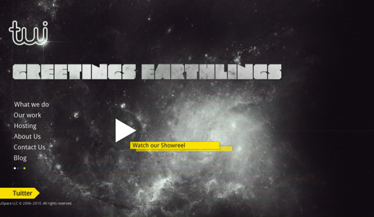
tuispace
Ryan O’Rourke
Markus Mostrom Design
Image Now
Collision
Sofa Surfer
Karen Bit Vejle
Le 28Thiers
Bristol Archive Records
Idea Foundry
Starbucks
Tanq
Daniel Gutierrez
Brent Lafreniere
Carbon
Blog Cafundo
Krijn Elders
Flud
Cassius
Morphix Pictograms
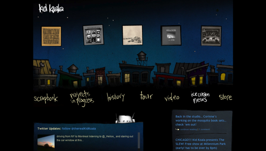
kid koala
Digital Invaders
New Hampshire Distributors Inc
Jose Luis Merino Parra
Bull+Arrows
Work at Play
Easy Bistro & Bar
appear
Pasarea de Foc
William Flagello
iFontMaker
Barrel + Barc – 24 Hour Challange
Tileables
Justin Cosgrove
50 Back
PixelCrayons
Where They At
Fully Illustrated
Stribe
zuppex
Pep Lopez
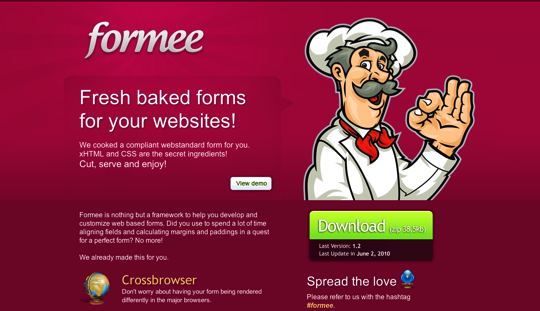
formee
time2project
Sources:
The Best Designs
unmatchedstyle
Abduzeedo – Sites of the Week


really inspiring web designs.
Pretty great collection, some I’ve seen in other “best” lists, others I haven’t.
This is an awesome list of dark websites.
My favorites are carbonads and fullyillustrated. I like their simplicity.
Thanks for the nice list.
Regards,
Daniel – CEO Mammut Medien
Nice collection!
Nice Collections
Sweet collection and thanks for including our website ( chilli.be )
What a great list of designs. At some point in the future I really would like to have my site redesigned.
I have to ask, how long does it take you to find all of these and put these posts together? I imagine that it takes a fair amount of time.
—
Nick, The Traffic Guy
Hi Nick,
Yeah, you are right, it takes a fair amount of time… but since I really like to browse around looking for inspiring web designs and new ideas, ‘time flies’ when I’m putting lists together. 😉
What great web designs. I always like looking at unique sites for inspiration. Thanks for the list!
Nice original round up here. iFontmaker stands out to me!
Good selection of sites, darker design tend to stand out more but I also think they are harder to get right in terms of design.
Interesting set
My top 3:
Le 28Thiers because it shows the products in a really beautiful way. I bookmarked this one for inspiration.
Time2Project because of the simplicity. Gets the word out.
Imagenow because of the large background used on the homepage. I like that a lot.
I made one where I didn’t use the jquery plugin to scale the big photo background. (Link underneath my name) I wanted the pages to be longer. Position fixed was an option but the iPad doesn’t get that. Target audience is show designers. Most of them use iMacs.
I never really thought much about using a darker colored layout for my client’s sites (especially since most of them use their sites for biz purposes)… but you have a NICE collection up there. (especially the ‘No More Dedidicated & Digital Labs’ one)
-Daniel
Great list!! I love loads of these designs – especially ‘Awesome’.
Will bookmark and be back for more inspiration.
Thanks!
Nice inspiring collection. These are nice dark selection. Thanks for sharing this wonderful post. 🙂
These look great. Love “where they at?” – never seen this site before.
Excellent work, Gisele. Thanks for compiling this list of quality sites. Greatly appreciated the read.
Excellent collection. Really love them. Thanks for the inspiration!
I love dark designs, mine is dark too!
Great selection. Thanks for sharing to inspire!
Wow, definitely the best set of darker design sites i’ve ever seen. Thanks!
Great collection.
Really nice to see dark websites done well.
Pretty nice themes (sites). Thanks Gisele!
Beautiful examples 🙂
I was attracted to this list of dark designs because I recently recreated my own company’s site with a “black, grey, and sort of neon” look to it. I see a TON of really light websites (usually the 2.0 variety) and wanted to validate for myself that dark is still cool! 🙂
Hey Gisele, caught this one a bit late I think… thought I would comment on the post anyway! You’ve included fullyillustrated which is one of my favorite websites that I look at recently because its a really beautiful website with some really nice content. As well as the fullyillustrated website I really love the Jqeury and Javascript website too. This is a great collection Gisele. Thanks for sharing.
Very nice, but many of this are old.
This is Fresh and very Cool take a look : https://www.dreamincoloronline.com/design-code-cool-single-page-portfolio-part1/
I like dark, all the design are awesome. Thank you so much for share with us.