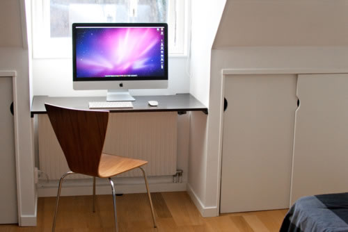
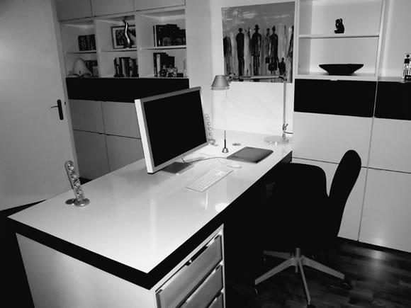
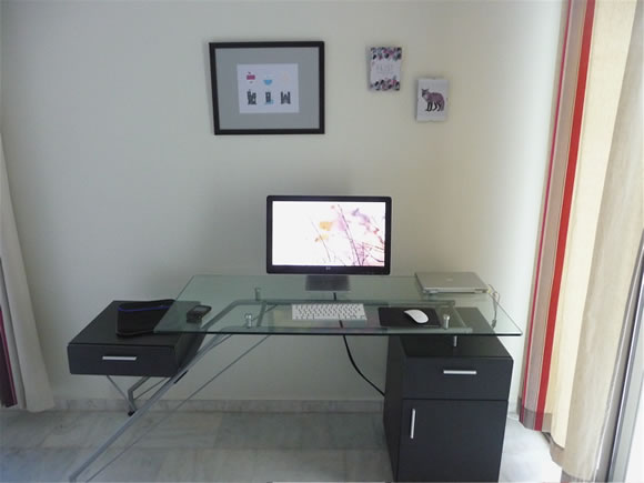
The basic idea of minimalism that less is more can also be applied to your workstation, and the result is really inspiring. Clean, minimal and beautiful stations with exactly those things you need to work, nothing more, nothing less. The spaces are simple: desks, a nice chair, your computer and something to give the space a nice personality, it’s all about keeping the space clean, really inspiring.
Inspiration  Gisele MullerDecember 14, 201137 Comments05.5k
A Showcase of Minimal Workstations to Inspire You
Share
Gisele Muller
Gisele Muller loves communication, technology, web, design, movies, gastronomy and creativity. Web writer, portuguese/english translator and co founder of @refilmagem & @mentaway Twitter: @gismullr


Here’s mine: https://www.facebook.com/photo.php?fbid=2794892758258&set=a.1288124689998.44472.1436629308&type=1
Nice – I love real wood 🙂
imac, imac, mac… Booooring. It is not a hard thing to buy white desk, put imac on it.
There is a lot of wel designed stuff on stores. Use brain and be (real) creative!
Very nice collection. Must tidy up my desk……
Nice places. The best for me is have a window in front of me or left with some trees and blue sky…Work with the nature is so good!
OK, this is nice… but why are these all Apple computers? Are you saying a PC workstation can’t be inspiring? I feel discriminated 😉
I was thinking…is the author getting kick backs for Apple advertising? After a couple of pictures, all I did was look for the next Apple and not the workstation.
Hi Carrie,
No, I didn’t receive kick backs from Apple… it just happens that most of the galeries (click at the images and you will be able to visit them and see for yourself) that showcase workstations have Apple products.
They are all Apple computers because Apple prioritises product design and the way things look, because that’s important to their target demographics.
It’s not discriminating, it’s just that windows based computer companies tend to have little idea what looks good. They don’t understand how minimalism works. There’s always exceptions to that rule, but even if you did boot up a nice looking PC, you’d still have that hideous operating system UI staring back at you as soon as you did.
This isn’t about which is better, it’s just saying that Apple is the king of aesthetics in the computer industry. You made your choice, discrimination only applies when you’re judged for things you can’t change.
@Alex, whether the UI is “hideous” or not is a matter of taste. Personally (and let me stress that it’s only my opinion; I’m not imposing it on anyone), I find it much more elegant and comfortable than what OSX sports.
As for discrimination, note the emoticon in my original comment. I was kidding, mate, don’t get so serious about it :D.
nice article! mac users have a faible for design 🙂
right! 🙂
Nice collection think I need a new desk.
I’ve noticed that almost all workplaces are in grey or white colors. Interesting choice 🙂 I like many of them, but the landscape of the ocean in front of you while you are working beats all the others!!
The best ones are ergonomic: a chair with arm support, ability to extend legs fully under desk, facing a window so the eyes can focus to infinity.
Ergonomic disasters, one after the other.
– wrong lighting
– not enough space for legs, no footrests
– no armrests
– no height-adjustable chairs or tables
– not enough distance between eye and monitor
love it, really really inspiring!
the ocean view is totally unreal! awesome!
They don’t inspire me unfortunately. They just make me feel cold and lonely. 🙁
Here’s mine https://twitter.com/#!/garethdaine/status/146971423813025792/photo/1
If only our office looked like one of the above! 🙂
Looks Superb.
Any way one question , why all you people use apple computer and devices is’t there any other company near you places.
(can you tell country)
i India i rarely find apple products since it too costly due to high duties.
Very nice Workstations! I would love to work on it 😉
Great inspiration – I’m move into my first own place tomorrow so can’t wait to create my very own zen like work station just the way I’d like it 🙂
I agree with other posts. No leg room. All flash and no comfort. No lumbar support on chairs. They look hard to sit on for any length of time. One has heater under the desk. One has speaker under the desk. Where you put your legs?
Why waste desk space with plants to.
I’m inspired. I really like the idea of a shelf above the workstation.
Though I have nothing against Gisele (the author), I don’t find much inspiration in these. Some of these “workstations” are hardly appropriate, I can’t imagine sitting for more than an hour at some of these.
And yes, it ain’t hard to “design” something minimal: get a white/transparent desk and stick an Apple product on top of it.
Apple…Apple…Apple…
Some of these set-ups look awfully uncomfortable to work at for more than 20 minutes…maybe it’s just decoration to show off the newest Apple equipment to friends and family signaling “hey, look at my desktop, I am a creative”…
🙂
One addition: “It’s the small mind that keeps things in order, it’s the genius who manages to have a clear conception of the chaos!”
Love the attic office with the bike and bonsai!
I’m guessing the water view desk prob isn’t a designer, stockbroker with a mac: )
We are speaking of “home offices”, right?, cause there are some beds in there.
Most of them are really sterile and unintimate. Not very inspiring to me. I’d like to see the touch of a human and not this laboratory-style desk.
Nice, but boring.
I have read this post several times now and always come to the same conclusion… my workstation isn’t a naturally creative environment, but never have the time to change it. Well today is 27th December, everyone is away for the holidays and here i am finally doing something about it, not easy though!!!
Just been reading a few of the posts above, many of which seem quite negative. I think it’s important to bare in mind that some of the above illustrations are to showcase that creatives no longer have to sit in a boring office layout and brain washed into working between the hours of 9 – 5. Everyone in our industry is unique and as a result work better immersed in a unique environment that best enables then to quickly tap into their creative groove. Inspiration comes from the books we open, the TV we watch and the galleries we visit.
cool post. guess you cant be minimal or inspiring with a pc though, huh?
Moving into a new office space this week and I could take a cue from some of these workstations. Less is more, Apple rules and sit near large window with a view of an orchard.
just insanely awsome, MAC needed in my case 🙁 (it’s just a dream to get one for me )
Minimalist but, very beautiful! I looove it!!!