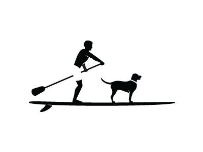
Negative space is the empty space between the main elements of a design. It is always inspiring to see how talented designers utilize this space to create shapes in a logo. Today we gathered some excellent examples of logos using negative space in a clever and stylish way. Take a look and remember to click on the images to learn more about each design.
Inspiration  Gisele MullerSeptember 6, 20137 Comments07.3k
Clever Examples of Logos with Negative Space
Share
Gisele Muller
Gisele Muller loves communication, technology, web, design, movies, gastronomy and creativity. Web writer, portuguese/english translator and co founder of @refilmagem & @mentaway Twitter: @gismullr


Cool list.
I’d like to add one of my own https://dribbble.com/shots/499302-Unhinged?list=users
Loved them. Thank you!
Still the same problems with those logos showcase… I doubt that half of them or real logos of companies… That makes the whole difference.
Wine logo is terrible: It looks like… I’m not gonna say it…
‘Salted Honey’ and ‘Wine’ are incredible. These guys are geniuses!
Creative logo designing, really very inspiring & thanks for sharing.
I do love negative space logos. Some of the ones I’ve seen out there are incredibly ingenious. These are no exception.
Nice Collection!!!!
Thanks for sharing…