Visual identity is the “persona” of a company and creating one is a very changeling process. A designer must research and find the right inspiration to deliver an identity that will really represent a companies personality and philosophy. Today we will show you some nice images of different visual identity projects we found on Behance. You will find some details of each projects as well as some nice images about them. Make sure to click at the images to visit each designer page to know more about the identities.
Vrrb
Description:
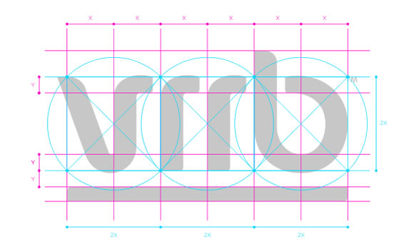
Vrrb Interactive is a California based web-developing studio. The founder asked us to design colorful identity with custom logotype. We came up with several concepts from which he chose the one based on logotype which is trying to emphasize the “rrrr” sound in the word by ending the first letter the same way as ‘r’s are. This also adds some extra rythm to the wordmark. Color system is based on existing set of color papers (Pop’Set) since printing white on pre-colored papers allows for much wider color variety of applications for low price than printing each and every spot color.
Designed by: Multiple designers, check project’s page
Remember to visit the project’s page for more details.
MYD II
Description:
Visual identity for a hungarian interior architecture and product design studio.
Designed by: Hidden Characters
Remember to visit the project’s page for more details.
Adam & Eve Law Firm
Description:
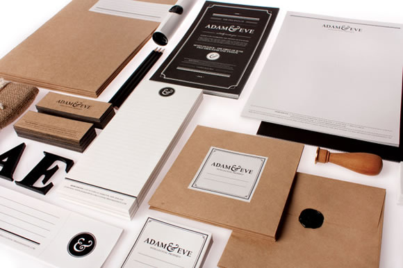
Adam & Eve represents a group of creative professionals who share ideas, experience, knowledge, the understanding and commitment to achieve legal results for their clients. Adam & Eve uses traditional biblical philosophies as a model in order to communicate their values as an Intellectual Property Law Firm.
This brief was to create the branding for an ‘Intellectual Property Law Firm’ that explores and challenges marketing and advertising strategies. I wanted to create a law firm that pushed the creative boundaries of design and marketing so decided to use a slightly controversial approach using religious influences to drive the design.
The name ‘Adam and Eve’ sets a very obvious tone for this company, in which I then created 10 “commandments” that the company prided themselves on. These commandments / values were what influenced the design solutions eg. one value was being a friend to nature, which inspired the eco materials and stocks. The design direction lead to mixing old traditional styles with modern techniques such as the scroll invitation in a modern day mailing tube.
Designed by: Raewyn Brandon
Remember to visit the project’s page for more details.
Star Builders Contracting
Description:
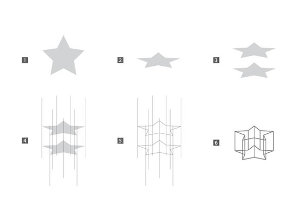
Visual Identity – Star Builders Contracting
Designed by: Mohd Almousa
Remember to visit the project’s page for more details.
Design Staff
Description:
Design Staff is a new blog dedicated to helping startups design great products. We write for both entrepreneurs and designers. For entrepreneurs, we’ll be discussing how to build a design practice at your company: how to do design yourself, how to recruit design talent, and how best to collaborate with designers. For designers, we’ll share the lessons we’ve learned along the way about practicing design at early-stage companies.
Designed by: Fabio Sasso
Remember to visit the project’s page for more details.
Maurer Identity
Description:
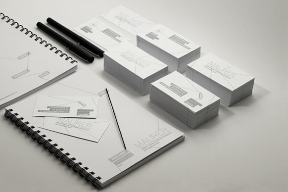
Identity Design for Ákos Maurer Klimes
Designed by: Hidden Characters
Remember to visit the project’s page for more details.


These are fantastic inspiration! The quality imagery also highlights the importance of having a clean, good looking design presentation.
Very nice collection. It’s been awhile since I’ve enjoyed seeing such clean corporate work. Thank you!
Great collection inspired a lot with the design chosen for the given business requirement. For a good design to a business organization involves the study of the organization and the services provided so that we may convey the same in the logo and banner designs.
The logo and colorful VRRB cards are very eye catching.
This is the pinnacle of design, I honestly love working with, developing and producing websites built in a unique web2.0 fashion.
The issue is a lot of the big corporate companies haven’t moved over to this style of design yet, they are very much stuck in the same routine of boxed design.
Superb! Minimalist and attractive!
OMG I love this post! Wonderful works here! Very nice and interesting examples… MYD II and Vrrb are my preferite like design and colours. Good idea. Inspire for my nex works. Thanks for sharing!
Vrrb is awesome!
im impressed with what adam and eve did! awesome looking!