
Our minimalism tag is filled with eye candy images to help you get inspired remembering that old and wise premise “less is more.” To add content to our tag and to keep showing you good examples of minimal designs that work we decided to show some posters designed by Pedro Vidotto. Pedro is a Graphic Designer and Art Director originally from Brazil who is currently based in London. His background is in Advertising and he has five years of experience working in the industry. Here you will be able to see that quality is better than quantity in design.


Just : Wow!
Yes, they are minimalist in nature, but many of these are not all that good. There are a few nice ones in here, but these look like they were done in the same way by the same designer. I certainly applaud you for finding these, but for some true inspiration, it might be better to pull form multiple sources.
I agree with the comments of raleigh logo design. A couple of the treatments are nice but most are uninspired and dull.
@raleigh – they are done by the same designer!
Great work though – they have a real impact, I love them
Incrível!
These were definitely pulled from the same source, but they are still quality posters. This is a very unique style that takes a very creative person to make posters this minimal look cool. Nice roundup even though they probably did come from the same place.
Does anyone know the font, which is used?
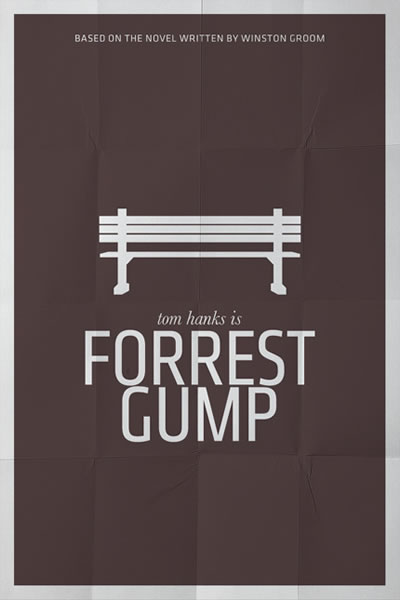
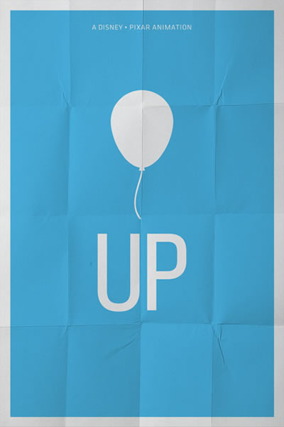
Nice selection! A great list by film. Some idea aro so perfect like Forrest Gump, The Godfather, Up…so essential!
Wow, lovely. I want them for my walls!
It is a nice collection.
Thanks for sharing.
The Titanic one stands out to me. I agree with Raleigh, though. The look gets old when it’s just a silhouette of an object with the same typeface over and over. That’s why I like the Titanic one – there’s a concept. The space in the middle feels like a porthole onto a scene of a ship while also being the iceberg above and below sea level. The large jagged shape juxtaposed against the tiny ship also connotes doom. I’m sure we’ll see more cool stuff from Pedro in the years to come.
Wow!!! I like the poster template used (also the posters)! Anyone knows where that template can be to downloaded
Regards!
Another archive, fresh one!
https://www.mightycreation.com/category/movie-2/
God I love these. so awesome!