
White is known to be the sum of all colors, the combination of all the colors of light. And in web design white is not only a color but a strategy, a way for designers to give a layout a minimal, classy or bright look. From white backgrounds to nice white spaces and minimal approaches, today we will show you inspiring examples of white usage in web design.
Hanzell

Last Bottle Wines

Neighborhood Studio

Lake Nona

Field Notes – Ian Coyle

Jonathan Krause

Foundry Collective

workdiary.de

Park La Fun

Edits

AIGA 50

Myjive

Never Bland

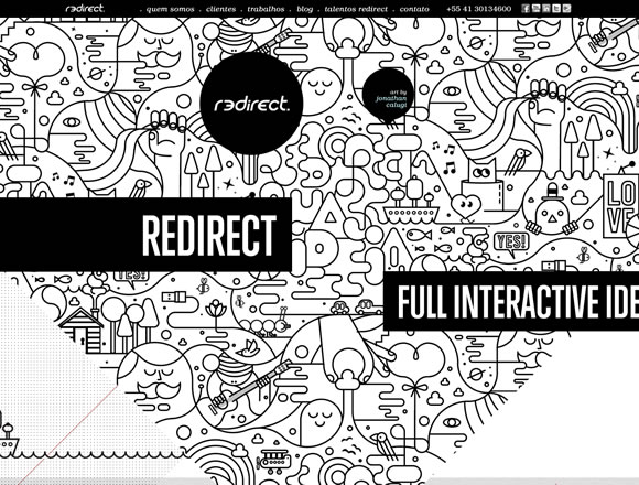
Redirect
In2 Audio Clothing

Dawid Wadach

Collection Societe Generale

Bruhat Marlene

La Moulade

iShu

art 4 web

Routalempi

WordPress Themes
Clarity

Filtered

Pure


Nice wall post.Each post are unique.
I always liked the usage of white, cause it always look like its painted around, and not painted specifically.
Good list. White is a good choice when I create a site or depliant where I make focus a part of the message. Is possible create a typical graphic “simple and clean”
awesome post 🙂
Hi Gisele,
I came to Web Design Ledger first and was pleasure to see that here is Very nice collection, I really feel like that was thing I was looking for.
I personally like Lake Nona and iShu, although rest are awesome as well. Can you give me idea if you have some websites who have some minimal trends. I couldn’t get any.
Cheers for your nice effort.
Izhar
here is another one white webdesign
https://www.webmatr1x.de
😉
I think you have done a great work by posting this article. In this contemporary world white is generally the best base color for website pages, because you need your content to have lots of contrast against its background. Thanks for sharing it.
Nice website designs. I like the clean feel you get with these. Very refreshing.
All webdesigns should be clean as these sites what you linked.
Thanks!
I agree. I came across this portfolio website that also has white usage in the design.
https://www.guntherkoo.com/
beautiful design with well prominent content, but one thing is that there’re too much negative spaces, how can we fix them and also need guides.
are you kidding me? The Lake Nona site is one of the busiest, NON-white space, Non-minimalist site out there… really? About 15% of your “inspired” sites are also in that category. There are SO many really good minimalist sites out there so why are you displaying others?!?? I don’t get it.
nice and comprehensive list
i always prefer light colours like white,cream,or silver
I love white.
It’s the noble and elegant.
In some cases I prefer to use colours because some pages will look like a spamming reclam page if you just use white and black. I really depends on what kind of page I am making.
I really like the collection. I personally prefer ample amount of white space in my work but somehow clients don’t prefer it, this post will be an answer to their doubts.
Very inspiring article, take a look to this website, totally white and minimalist http://www.imanetirich.com