
Eventually, we’ll all stop talking about responsive web design – not because it will go away, but because it will become what’s expected. Flashback ten years ago and we were all talking about CSS and tableless design, but today there’s no need to mention it. It’s simply the way modern websites are built, although sadly, I’m sure there’s a few out there still using tables.
Nevertheless, the concept of responsive web design is still relatively new. So it’s our job to help you learn about it and to help you find the stuff that makes building responsive sites easier. For this post we’ve gathered a collection of Responsive Web Design Templates and Frameworks.
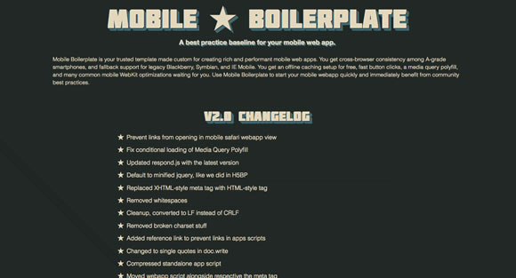
Mobile Boilerplate
Mobile Boilerplate is your trusted template made custom for creating rich and performant mobile web apps. You get cross-browser consistency among A-grade smartphones, and fallback support for legacy Blackberry, Symbian, and IE Mobile.
Skeleton
Skeleton is a small collection of CSS & JS files that can help you rapidly develop sites that look beautiful at any size, be it a 17″ laptop screen or an iPhone.

Hardboiled CSS3 Media Queries
These hardboiled CSS3 Media Queries are empty placeholders for targeting the devices and attributes I’m interesting in making responsive designs for right now.

tiny fluid grid
The happy & awesome way to build fluid grid based websites.

FluidGrids
A CSS framework for rapid interactive prototyping.

Less Framework
Less Framework is a CSS grid system for designing adaptive websites. It contains 4 layouts and 3 sets of typography presets, all based on a single grid.

CSS Grid
The 1140 grid fits perfectly into a 1280 monitor. On smaller monitors it becomes fluid and adapts to the width of the browser.

inuit.css
inuit.css is built to work on smaller screens (such as tablets) and tiny screens (such as phones) straight out of the box with minimal effort.

flurid
A cross-browser CSS grid framework that doesn’t hide pixels in margins!

Fluid Grid
A web grid system designed by Joseph Silvashy and New Gold Leaf that allows designers to use the screen real estate on large monitors and retain great design on smaller ones.

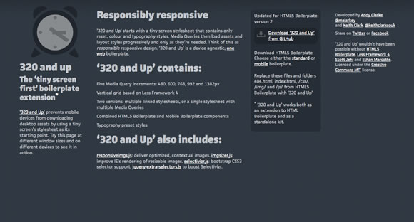
320 and Up
‘320 and Up’ prevents mobile devices from downloading desktop assets by using a tiny screen’s stylesheet as its starting point.


This is gold. I’ve been trying to bring clients and colleagues into thinking responsively for over a year now.
Thanks!
Great resources! I’ve used some of them myself and now have my own proprietary one.
Has anyone tried Foundation by Zurb? https://foundation.zurb.com/
I’m surprised the list is missing the current darling of the responsive movement: ZURB’s Foundation framework https://foundation.zurb.com/
yep. People accessing the web from computers is becoming less by the day. In a couple years tablets and phones should have the market share.
A nice collection. I also like simplegrid, it’s a very nice framset.
@Rupert Ong I’m developing a site with Foundation by Zurb right now. I’m having to do some tinkering here and there, but overall i’m very happy with it. It’s exactly what it says it is – a “foundation”. It’s like the HTML5 boilerplate plus base styles & js for elements you’ll commonly use.
Checkout the source from Git, all the stylesheets and js are separated so you can easily strip out the features you don’t want (I removed their reveal and orbit plugins). There’s a few other things, like removing the console logging in app.js (IE doesn’t like), etc… Pretty sure it’s still a work in progress, so it’s bound to get better and better! Oh, and the mobile styles are pretty nice too!
A good selection of resources for these last times! Thanks for sharing! Add to bookmark!
Awesome Resource for Responsive Technique! I have also created a post on responsive html5 page. I hope you like it!
https://www.alldesignstuffs.com/2011/creating-responsive-html5-page-using-media-queries/
don’t miss the Hive Responsive Grid system written for scss and sass
https://spleenteo.github.com/hive/
This will be very useful for us. Thanks!
Currently using Skelelton and works great for us! Definitely a standard part of a high quality website build
Skeleton, I have not worked in IE7
Nice useful articel.Thank you.
Sweet. I had done some research on Skeleton a few weeks back, but hadn’t heard of these others. Speaking of Skeleton, I just got finished building my first responsive site that uses Skeleton. It (skeleton) works fantastically and is very easy to use once you understand how to use it.
Additionally, the developer of skeleton was very helpful when I hit a small stumbling block.
Thanks again!
So great! I love Skeleton https://www.getskeleton.com, you can easily create a responsive layout. I have made a simple UI to make it even easier for designers and developers
https://www.responsivedesign.co.nz
Great list, just built my portfolio site using the 1140 grid, was very easy to use once you get your head around it!
+ for Foundation and Less Framework. Both work well for us.
Currently using Skeleton to create my own Drupal theme. So far so good. Too bad about the MIT license, would have like to have created a theme available to all once I was done.
Hey guys, I recently built a responsive CSS framework located at https://titanthemes.com/titan-framework-a-css-framework-for-responsive-web-designs. Unlike other responsive CSS frameworks this framework ajdusts on any screen size (not only mobile and tablets) and you are not limited by a fixed width. It has 12 and 16 columns versions. You can see SmashingMagazine’s website to understand how it works.
Great list.
Thanks for sharing the collection.
I recently discovered a great responsive boilerplate called “Yet Another Mobile Boilerplate” (YAMB which practices mobile-first approach but is equally elegant in wider view-ports.
This is good job, i also published something similar in my blog, Please check.
Regards
I have started using omega as my theming framework in Drupal as because of of its versatility and it has templates in html5 and CSS3. To deploy a website design in Omega has really helped me make our clients online vision a reality.
Hi Henry,
Very cool article – I love using responsive web design frameworks.
I’ve created this article: Responsive Web Design Frameworks, Grid Systems and Starter Kits.
https://boompah.com/2012/03/22/responsive-web-design-frameworks-and-dev-kits/
I essentially go through the differences between several responsive solutions, outline the benefits of each and I have a small guide to selecting which one is right for your project at hand.
Please check it out,
Cheers.
Cheer up!
Awesome resources! Please write up a article for responsive design framework comparison.
Can you please add https://www.responsivegridsystem.com to the article? It wasn’t around when you made your list…
anybody have experiences with Fluid Grid?
not easy to use..