
A common mistake in typography is the use of apostrophes instead of quotation marks. A lot of people just get the two confused, using double apostrophes instead of actual quotation marks. It’s hard to mistake it the other way around, but it will be worth your while to learn the differences.

Quotation Marks

Quotation marks, or quotes, are used in punctuation to emphasize a phrase or word or to indicate speech. There are four types of quotation marks: single open, single closed, double open, or double closed.
Opening quotations look like tiny little sixes, while the closing quotations look like nines. Most word-processing programs change them automatically, but always double check when you’re done.
Example of single quotation use:
“Henry said, ‘good morning,’ this morning,” said Ben.
Examples of double quotation use:
The doctor said, “Take your vitamins.”
“Oh, my gosh!” said the woman.
The apostrophe

One of the correct uses of an apostrophe is to show the possession of something. For example, “Sally’s ice cream” is the proper use of an apostrophe to indicate the ice cream belongs to Sally. You can also use apostrophes to form contractions. Not like the kind women get when giving birth, but the kind that makes “do not” into “don’t.”
Examples of contractions:
- I am to I’m.
- Do not to don’t.
- You are to you’re.
- It is to it’s.
Examples of proper apostrophe use:
- That is Stephen’s chair.
- John’s in the hospital.
You get the idea, but it’s good to memorize these if you’re weak in this area of grammar. Another thing you should know about apostrophes is that they are not the same as prime symbols or accent marks.
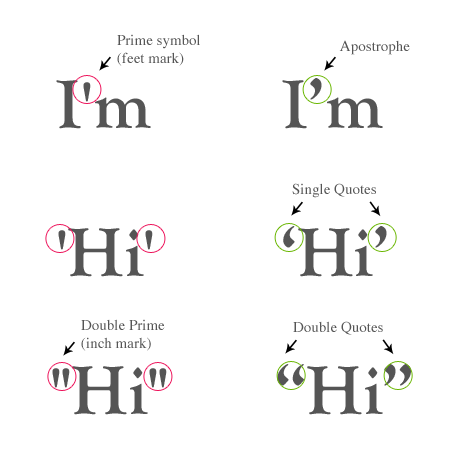
The Apostrophe and Prime Symbol

Another very common mistake in typography punctuation is using the prime symbol in place of apostrophes. The prime symbol ( ‘ ) looks similar to the apostrophe, but you should use it in mathematics and measurements. For example, 5′ means 5 feet, and 2’ ‘ means 2 inches. Depending on the font you use, it can be impossible to tell the difference. But, you might be using a font that makes it painfully obvious. Check and double check all your apostrophes, prime symbols, and quotation marks. No matter how amazing your typography turns out to be, a little mistake like this can ruin the work.
Ditto marks

You may be asking yourself right now, “What the heck is a ditto mark?” A ditto mark looks like this ( 〃 ). It indicates that the line you are on is a repeat of the one above. The word “ditto” literally means “same as before” or “repeat.” The truth is, double quotation marks are usually used in the place of actual ditto marks. But again, it will show if you are using certain types of font.
For example:
Goat for sale …. $10
Sheep for sale …. 〃
The sheep is the same price as the goat, $10.
In most cases, you can remember the difference between apostrophes and quotation marks by looking at their purpose in the text. If you are making a contraction or showing possession, use the apostrophe. If you are quoting someone, use quotation marks.
Sonia Mansfield is the content editor for PsPrint and editor of PsPrint Blog. PsPrint is an online printing solutions company, which you can follow on Twitter and Facebook.


Sonia,
I’m not so certain this post is relevant for most folk today, save for the printed word. Even the printed word – unless coming from a print shop – has lacked these symbols since the advent of the typewriter.
Sidebar: I cannot recall the last time I read a book, or even a poster or leaflet, that made use of this – these? – convention(s).
Very few computer fonts distinguish these marks, and about the only way to embed them in Web site text is to use a graphic as the punctuation, thus precluding proper resizing capability for accessibility purposes.
‘Twould seem that some print stylings must needs be changed in order to adapt to online – or even current – usage.
You certainly can use them online. Use “ ‘ ” ’ (Left Double Quote, Left Single Quote). Many CMSs automatically parse the prime marks to the correct punctuation.
Even though you’re not used to seeing them online or in print, doesn’t make using prime marks correct.
Oops, the quotes should read be written &(remove)ldquo; , &(remove)rsquo; etc.
Printed word uses proper quotes. Most word processing software automatically creates curly quotes when you type primes, so most printed material does use proper quotation marks.
ALL computer fonts distinguish curly quotes. It’s a basic character. You embed them into web sites using character entities, not graphics, and they scale just like any other text.
Print should never adapt to “current usage”. The tools we use should be updated to do the right thing.
Really nice article and very well written, thanks Sonia. Can we expect a follow-up post on hyphens ems and ens?
beautiful typographic tips.
Very useful article! Really informative.
Interesting article, the amount of times I’ve seen these type of typography mistakes is actually quite a lot, there seems to be a common misunderstanding with how to use apostrophes and quotation marks correctly. I’m sure many people will benefit from reading this just like I have. Thanks for taking the time to put together this interesting article.
I do agree with your post! Very informative article.
Thanks
Thanks for clearing it up! I normally ignore apostropes and quotation marks and I thought they’re just the same or something!
I’m kind of confused here. Is it the case that people commonly use primes and double primes? Presumably the apostrophe key on every keyboard I’ve ever used isn’t actually a prime key?
Windows users can hold down the Alt key and press 0147 on the numpad for “, 0148 for ”, 0145 for ‘, and 0146 for ’. I find this useful when I’m not using a word processor that fixes it automatically.
Good article, but in your first example… 6′ 2″ tall – you say that primes are incorrect and that curly quotes are correct. You should update the graphic.
As far as web use goes your page needs to have a proper doctype declared (for now) and if you are running Apache it need to be configured correctly or else you will find up with a lot of little question marks through out your pages.
Or you can use the standard ASCII set to make sure.
https://www.ascii.cl/htmlcodes.htm
also:
Dreamweaver settings discussion:
https://forums.adobe.com/message/3022314
Thanks for the valuable punctuation lesson, Sonia. Your example of single quotation use is bothering me, though; doesn’t it contain extraneous commas? You wrote:
“Henry said, ‘good morning,’ this morning,” said Ben.
I like this better: “Henry said ‘good morning’ this morning,” said Ben.
As the phrase “good morning” is so short, it seems to me that you can get away with omitting the comma after “said.” The AP Stylebook says, “Use a comma to introduce a complete one-sentence quotation within a paragraph,” as I just did. “Good morning” doesn’t have to be considered a complete sentence here.
I also considered the following, but it doesn’t seem right:
“Henry said, ‘good morning’ this morning,” said Ben.
I’ve now spent a solid chunk of my morning pondering this, and it’s probably not worth it, but hey–I’m a copy editor. One more thing: “2′ ‘” doesn’t mean 2 inches. “2”” does, of course. (And that combination of prime and quotation marks HAS to be confusing.)
Yes, but you only need to get burned once by display issues from encoding quirks to realize, hey, this is way overblown. Typography has its place, sure, but often it’s not worth the risk of botched display in some browser on some device.
Face it: this happens all the time.
Interesting 🙂
In French, these quotes symbols should be used : « Hello world ! »
thanks for the nice and neat article.
But personally I dont really care.
I think its about time they actually start combining the two together.
no one is gonna confuse the two and it just unnecessary effort…
This has some inconsistencies.
The unicode character for Right single quotation mark U+2019 — ’ — is apparently also considered an apostrophe.
https://www.fileformat.info/info/unicode/char/2019/index.htm
However, the unicode character U+0027 is called Apostrophe the Prime symbol you mention — the straight quote.
So as far as I can tell, in Unicode, there is no difference between a right single quotation mark and a proper typographical apostrophe.
Anyhow, this nomenclature is a bit confusing (not your fault; blame the unicode naming)….
“What the heck is a ditto mark?”
didn’t you use the wrong ones there? it should be the diagonal drop shaped kind instead of the straight down wards kind you used.
Or did I miss read your article?
Thanks for the article.
For apostrophes I directly type the quote on keyboard. But for prime symbols I always use “Insert Special Character” feature within the word processor.
When we type straight from the keyboard we are keyboarding the single and double ditto marks. They are straight up and down characters. They are sometimes referred to as dumb quotes. They are often used for feet and inches. True quote marks and apostrophes curl. Most word processors and page layout design softwares automatically take out the wrong ditto character and put a quote mark back in. Yet a third different character is called a prime character. Single and double prime characters slant up and to the northeast, so to speak. Many use prime characters when denoting feet and inches; but not all do so. It is used in scientific notation, and many typefaces will not include the single and double prime characters. So altogether, their are 3 shape-characters to discern among; not two.
Thankyou. This is something I’ve been ranting about for years. And it’s IMPORTANT. Font designers carefully create proper apostrophes and quote marks to compliment the font. And they’re shaped to denote the start and end of a quote. People who use foot and inch marks are either lazy or ignorant. And either is inexcusable. I’m seeing it more and more, particularly on TV and most unforgivably, in logos. Which means that someone calling themselves a designer went to the trouble of creating and crafting a logo but ruined all their hard work by using the wrong piece of punctuation. It’s wrong, and it’s ugly.
1. The pictures below “Quotation Marks” and “The Apostrophe and Prime Symbol” seem to contradict for me. The first one says apostrophe is the correct for a height measure, the second one urges one to use primes for this purpose. So I’m still confused.
2. The picture below “Ditto marks” may be incorrect. At least we use a prime for *minutes* (and not hours), and a double prime for *seconds* (and not minutes). Both for time and for arc: My best was 2h1’13”, or N52°31’12”, E13°24’34” is in Berlin.
3. As a remark, this very article also seem to use primes (U+0027) instead of apostrophes (U+02BC).
I’m with TheTudorHouse on this. This article, though well intentioned, misses the point. Also, I notice you don’t cover use of the apostrophe in the case of proper names ending in s, e.g. They are Jesus’s apostles… Perhaps you didn’t want to incite the English usage versus the American usage battle?
Your inclusion of other content for “Quotation Marks” fails to mention that the fonts are different between the Incorrect and Correct and hence look different between Incorrect and Correct!
Who accidentally uses the ditto mark? It’s usually the a software fault when copy and pasting text from one program to another. Dream weaver I am looking at you!
Since a keyboard doesn’t have both quotations and prime marks, no one can be expected to use them. I do a lot of programming and fancy quotations from Word always end up encoded on the page. It’s annoying, so I just find and replace them with the basic prime mark you have on a keyboard.
This. I’ll stick to my ” and ‘, as long as I want my code to work.
I’m exactly with you on this one Jeff and I also do as you do.
However the fact is we are technically incorrect in doing so. Word (and other word processors) typically make an “intelligent” replacement to circumvent the limitations of a keyboard. Again, I think Word is correct to do this as when writing letters you should use the correct (unicode character).
This article is NOT correct. It depends on the language. The apostrophe is a typeface used in languages written in the Latin alphabet, continually ranked among the punctuation marks although it would be more appropriate to call it a paragraphematic sign and sometimes a diacritical mark. Of this nature there are two variants: the typographical or curved apostrophe (’) and the typewriter or straight apostrophe (‘). In Italian, for example, is very common to use the straight apostrophe since it si the only one available on Italian keyboard.
Wrong symbol in
“The prime symbol ( ‘ ) looks similar to the apostrophe”. It should be ( ′ ).
“and 2’ ‘ means 2 inches”. It should be ( ″ ).
There is a basic confusion between a character (e.g., apostrophe) and its representation in a typeface. If we go to unicode and are using a typeface (font) that supports each of these different characters, then fine. But providing a few visual examples doesn’t do a thing.
The reality, on the web and with keyboards, is that ASCII apostrophe is what people type, read, and search for. That makes it the proper character (regardless, or in spite of display). “Smart Quotes” and all that other nonsense is meant to help the word processor ascend to the level of proper print typography. Well, it might get you halfway (to purgatory), and therefore stuck in limbo. For those using apostrophes and quotation marks (ASCII) for prime and double prime, no worries. It isn’t wrong, it is simply how we do it on the web.