There is no way to deny that fact static pages just don’t cut it anymore. With every company combining social media profiles with their standard websites, designers are discovering more and more that creating a successful site means embracing interactivity.
Internet users view countless websites each day, so as a brand you need to figure out how to stand out and make your mark in the mind of the viewer. One of the best ways to do this is to incorporate interactive elements on your site. The goal is to draw the customer in and engage them through interactive element—innovative scroll navigation, animated characters or unique click controls. Whatever you choose to do you have to make it worth talking about.
Examples of interactive sites
Need proof that interactivity on your site will improve your relationship with viewers? Look no further than this infographic by NeoMam Studios. With colorful animation and scroll navigation Thirteen Reasons really makes the viewer want to stay there and explore. Showing visitors how much time they have spent on their site when they get to the bottom only helps reiterate their point.
Google does a great job of walking viewers through all the steps it takes to do a search on their site. Inside Search uses simple graphics to break down what most people think of as a very complicated process and make it so that anyone can understand. This is a great example of how utilizing strong visuals can improve retention and learning.
This Happy New Year message from Soleil Noir will definitely inspire viewers. With positive messages that change when you scroll down the screen, visitors are rewarded with vivid animations that promote the studio in a way that falls in line with their brand’s edginess.
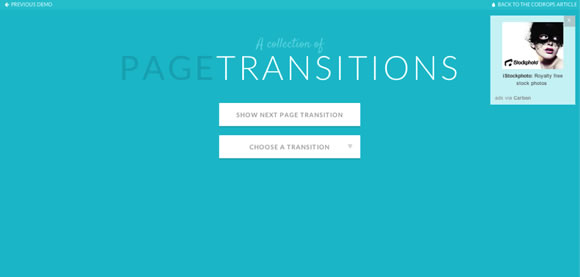
If you looking for a place to start, the Collection of Page Transitions provided by Codrop is a great place to look. They have created a guide that allows you to implement different navigation effects on your own site. They focus mainly on slide movement, but they also show you some other perspectives and transformations that will help your page stand out.
When SimpliSafe realized that they needed to educate clients on how to best protect their homes, they chose to use a microsite. With scrolling navigation that changes the setting, taking you inside and outside of an animated model, they let the viewer know exactly what they can provide and how it will keep them safe.
CSS3 Animation provides their visitors with a “cheat sheet” that allows them to then apply professional techniques and animations onto their own page. With lively animations that jump into action as you move around the screen, visitors will love browsing and downloading their different styles.
Tips for including animations and interactive elements
However you chose to get your site noticed, make sure you keep a few things in mind.
- Make sure that the interactive elements you employ stay in line with your brand image. You always need to convey a cohesive message about your brand to the viewer.
- Consider what devices your audience might be using to view your site. People performing searches on cell phones or iPads instead of desktops makes for a lot of diversity in screen sizes. There is no longer a standard one size fits all width anymore. Take this into account and make your site useable on your target audience’s chosen device.
- Provide real-time info whenever possible. If you are promoting an event or trying to unite people, inspire them or get them to recognize your cause, it’s important to show them that they are part of a larger group. Use a counter to tally votes or membership, show actual dollars raised for an event, whatever it takes to engage the user and make them feel like part of your community.


Great post! I try to tell my clients much of this on a daily basis, and they still seem to think that they “know what’s best”. Funny thing is that I know nothing about roofing, so wouldn’t tell a roofer how to do his job. I’d like to share this post with my clients and refer them back to it if you guys don’t mind. Thanks for the information!
nicely written. thanks for the useful information!
In web design world interactivity is King you have shown really nice examples of interactive web design. I really like interactive design of how search Work by Google. Thanks for sharing!!!
Nice post, I love the Soleil Noir and SimpliSafe examples. Another good example is https://www.evanshalshaw.com/bondcars/
Thanks for sharing!