
Modern icons in web design have become a staple for every digital interface. They can help organize content, they’re generally lightweight and even play mp3’s. No wait that’s iPods… well even iPods have a use for icons because they’re a quick visual method to convey information.
The field of web design has been using icons since before I can even remember. These pictorial symbols have developed into their own language through commonly accepted graphics(folders, printers, mice, arrows, etc). In this guide I want to share a few ideas for modern-day icon design on the web. I’ve also included a small collection of freebies and tutorials representing high-quality icon design resources.
Design Styles
The phrase “icon design” encapsulates a broad spectrum of ideas. On one end there are very simple and minimal icons, often known as a flat design style. The other end of the spectrum is complete realism through digital software like Photoshop or Illustrator. Each project has a different graphical need and icon styles typically fall somewhere along this spectrum.
The popular minimalist design style has created a large following of designers around the world. Line icons have become the primary style for iOS 7 and iOS 8 with other smartphone OS’ following suit. There isn’t a right or wrong choice when it comes to icon style – just various options to choose from.

I think the website Flat vs Realism does an excellent job of comparing the two spectrums. Icon design incorporates many principles of art like depth, proportions, lighting, and so forth. As you more towards a more realistic style you’ll need to learn how to create textures and shadows that look real. This requires a lot more work but it’s also highly rewarding.
Company Branding
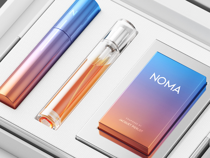
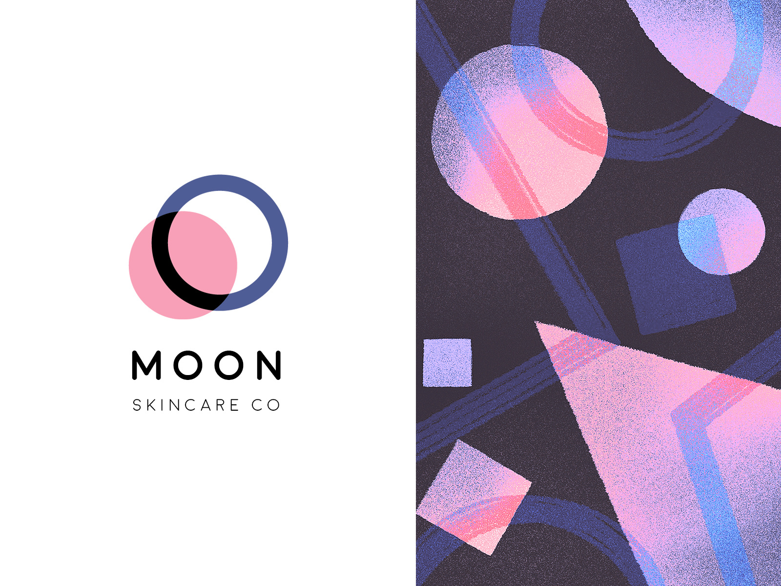
Brand design may seem obvious but it’s worth mentioning because some of the most outstanding websites often feature incredible branding. Icon design is a way of communicating ideas to each visitor. When branding a company the mascot or symbol or graphic should create a memorable attachment so each visitor can make a connection in their mind.
You can also make a series of different icons used for a single branding effect. Since icon design has such a wide degree styles, you might consider making a large set of icons all in the same style. As long as each icon is relatively unique the style will surely enhance the website and help it stand out from other similar layouts.
![]()
MailBakery is one such example which uses a large graphic on the homepage sponsoring their services. As you click each of the icons beneath the slider box, new content will animate into view. Each of the icons & graphics are designed exactly the same to hold a level of consistency.
The implication is that all of these graphics were custom-made specifically for this website. There’s certainly nothing wrong with using a free set of pre-made icons – but those free icons can be used on twenty other websites too. So the uniqueness and potential branding opportunity is removed.
As such, I’d always recommend that aspiring icon designers learn how to craft similar-looking icons for user interfaces. This will go a long way on projects for yourself and for clients.
Navigation Links
In the past icons were mostly used for navigational context. That is, icons helped to define links or buttons related to a website or GUI. The modern Facebook navigation follows this same principle which is handy when skimming a list of similar links.
![]()
Although you probably won’t use this technique all the time it’s worth understanding the benefits. Dropdown links typically behave well on their own because users are looking at each individual dropdown menu. But when you have a large horizontal or vertical display with a dozen links together then icons help to delineate each individual link.
Defining Content Visually
In website design the biggest reason to use an in-page icon is to help define existing content. Icons are visual cues which convey a very clear message when organized properly. They can lend balance to an otherwise text-heavy layout. One of the most important lessons to learn about icon design is how to convey a clear message based on a single graphic.
![]()
My absolute favorite example of this effect can be found on the GitHub Education page. The header section uses GitHub’s Octocat mascot to create a scientific/educational feeling with the chalkboard background. As you scroll down the page each major content block uses a series of icons to help illustrate the point at hand.
Notice that all of the icons have a hand-drawn effect and they all seem to match. Each icon connects into the greater whole and provides a sense that these icons were created as a set(and indeed they were). But more importantly, the icons help to define content visually. Text is enough to get the message across – icons just help to elucidate the message.
![]()
You can see a similar effect on the Glazed & Infused homepage. Small descriptive blocks of text explain their catering, coffee café, and gifts cards along with some nice graphics. These fantastic icons certainly aren’t necessary but they do capture my attention quickly and provide a deeper meaning to the content.
Vector Backgrounds
From repeating tiled backgrounds to vector objects, there’s a lot you can make with a few simple vector shapes. Website backgrounds have become much more lenient beyond just simple textures. Now it’s possible to create entire scenes in the background solely through vector artwork.
Vectors are often easier for scaling but difficult for creating realistic effects. Vectors don’t always support complex layer styles and you’ll need to toy around for a while to get the hang of building shapes on top of shapes. But once you learn the process it can be quite fun and very fulfilling.
![]()
The portfolio layout for Bota Iusti features an office setup created out of vector graphics. The page itself is naturally responsive and the background resizes along with the page. The benefit of creating vector art is that you can always upscale it to look great at any resolution. It’s possible to create vector objects in Photoshop but the layer effects and filters are not always resizable.
Design Tutorials
The best way to improve your own icon design skillset is by following online tutorials. There is no quick shortcut to achieve any level of proficiency at anything. All you can do is study from those who are better and try your best to continue walking the path with diligent practice.
Although icon design is a broad term I’ve put together a small handful of tutorials to get you started. Take a peek at these examples and see if they can fit into your routine. Granted we always need to handle the time-sensitive urgent matters – but improving ourselves is also just as urgent even though it feels like we have all the time in the world. I say it’s better to get started this week so that next week we’re already moving.
16×16 px Icons
![]()
Weather Line Icons
![]()
Flat Social Icon
![]()
Tab Bar Icons
![]()
Bat Icon
![]()
Gem Icons
![]()
Water Pistol
![]()
Mail Alert
![]()
Notebook

Almost Flat
![]()
Freebie Icons
Along with online tutorials you can learn a lot by studying freebies. Designers take the time to release their work online because it promotes their work and helps the design community. Learning how to use software like Photoshop is often the first step. Then once you grasp the basics you can dissect files to learn how they’re setup and possibly adapt your own methods.
Below I’ve cataloged 15 free icons and iconsets meant for web design. Each freebie includes at least a PSD or AI file, along with other similar filetypes like EPS or PNG. You’re welcome to download any(or all) of these freebies and just go bananas. I’m sure many of these icons will prove useful to designers of every caliber and serve as handy learning tools.
40 Flat Icons
![]()
Mini Icons
![]()
Colorful Iconset

Simple Flat

Sport & Fitness
![]()
Chat & Email
![]()
Atitel Icons
![]()
Tab Bar Icons
![]()
Simple Lines
![]()
Flatified

Web Design Iconset
![]()
iOS Settings Icon
![]()
Colorful Switch

Synthesizer
![]()
Book App Icon
![]()

You’ve picked very useful tutorials! And the inspiration part is cool. Thanks! I like websites with icons illustrating and supplementing the text. One of the examples of creative icons I like is this design https://www.motocms.com/html-templates/moto-cms-html-templates-type/52207.html Though, food icons are often cute.