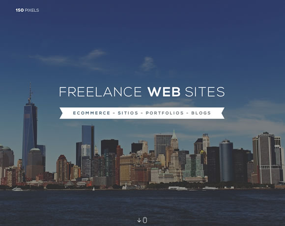
Single page websites have been a popular trend for a while now, and their popularity doesn’t seem to be losing any momentum. Going this route isn’t right for every project, but there are times when it’s fitting and just makes sense. For example, when there isn’t a lot of content, and you know the content won’t be growing very much in the future, it might makes sense to go with a single page design. It’s also a great way to engage the user with various effects as the page is scrolled.
For this post, we’ve gathered a collection of well designed single page sites that should give you plenty of inspiration for your next project.


Great post on these new designs.. One page and scrolling seem to be the trends leading into 2014: https://seoprospective.com/website-design-trends-2014/
Looks great one page websites, I think now the world is transforming to the great landing page instead of old crappy website designs..
New technology really matters!
Great work!
Impressive design work!
Impressive sites, I liked the list.
Some nice sites here. Just be careful with single page sites. They are definitely not a good choice for SEO.
I love single page sites and people who can do clever stuff, but some of these are just utterly terrible. Take 17Grad for example. I don’t think I’ve ever done so much scrolling in order to be told so little. And then about 80% down the way of the page, they have the gall to tell me “Keep it simple”! Not to mention that when you get to the bottom, there’s the “cutesy” “something went wrong” page, which just keeps loading and loading and loading nonsense. I loaded 60MB of content before I got tired of it and quit.
I can’t see their work. I can’t see their philosophy. I can’t even tell who they are or what their experience level is. I see a bunch of terrible animations filled with buzz phrases like “CUTTING EDGE.” Ugh. Ugh, ugh, ugh.
Leoni Robbardi. brilliant. Reminded me of Super Mario 🙂
I am really amazed after watching these websites, one page website is the best thing to show what you are and what you do in a single page, without consuming money and time in creating more than one pages.
One page website is awesome and beautiful in look, i am bit confuse about the SEO benefits of these websites.