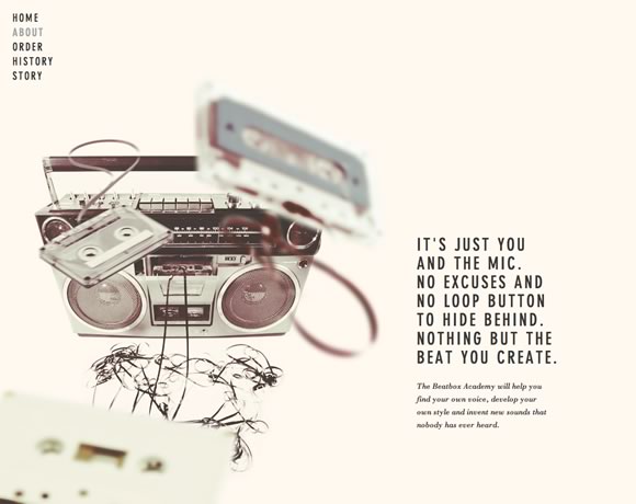
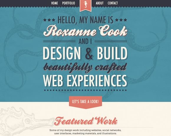
Sometimes it’s a texture, a type, a background image, a color scheme or even an icon. There are a lot of elements you can add to a web design to give it a retro or vintage feel. For this post, we’ve gathered a collection of sites that use this design style. So if you’re next project calls for a retro or vintage look, you should find plenty of inspiration here.
InspirationWeb Design  Gisele MullerAugust 5, 20135 Comments08.1k
16 Inspiring Examples of Retro and Vintage Elements in Web Design
Gisele Muller
Gisele Muller loves communication, technology, web, design, movies, gastronomy and creativity. Web writer, portuguese/english translator and co founder of @refilmagem & @mentaway Twitter: @gismullr


A beautiful and truly inspiring selection of websites, perfect for retro font fetishists everywhere!
This is great! Very refreshing! With everybody going the futuristic route, these web sites will stand out! Love it.
Really nice collection here Giselle, I think Sweez is my favourite, keep up the good work!
Cyclemon and Beatbox Academy are really cool,
thanks for sharing these resources!
What a great list here! Love it. Another thing about this list is I think it really highlights the cross over to Responsive Websites. Thanks for sharing 🙂