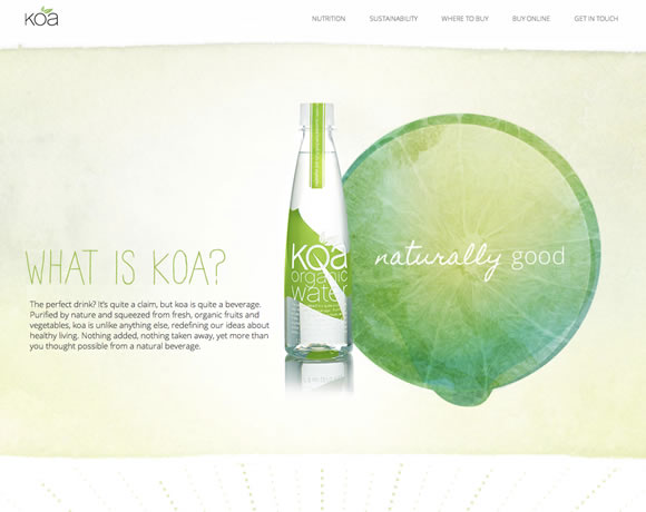
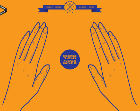
There was a time when the common practice was to try and place all content above the fold. But now, instead of fearing the scroll, web designers and developers are embracing the need to scroll, and using it as opportunity to engage the user with background reveals, element animations, and other clever effects based on the pages scroll position. So in an effort to inspire you, we’ve gathered a collection of websites that take scrolling to the next level.
Inspiration  Gisele MullerMay 20, 201315 Comments010.3k
18 Websites that Take Scrolling to the Next Level
Share
Gisele Muller
Gisele Muller loves communication, technology, web, design, movies, gastronomy and creativity. Web writer, portuguese/english translator and co founder of @refilmagem & @mentaway Twitter: @gismullr


Thanks for the feature, love the other site designs!
I’m really enjoying this series, keep it up!
Wow, nice list. I love HotDot best! Nice splashscreen and parallax horizontal scrolling effect.
Another great one is https://crosscon.com/
How about https://fuzebev.com/
Check out some here as well https://www.dezignmatterz.com/visually-stunning-parallax-scrolling-websites/
Moonbot Studios is another good one: https://moonbotstudios.com/#start
I like many of these – always have to stifle a laugh at the know-it-alls who walk in my office and throw around “above the fold.”
Nice roundup, some are awesome 🙂
My favorite is Artem & Julia.
Great collection, thanks. Here’s another one with pretty funky scrolling: https://www.mobilewebdesignwolverhampton.co.uk/
Holy mother, those are great works… Scroll still take an important rule on desktop and touch screen devices…
Scroll for your help is a wonderful scrolling site example.
Thanks for the inspirations!
Check out some cool scrolling examples here as well. https://www.dezignmatterz.com/visually-stunning-parallax-scrolling-websites/
Love the ‘Artem & Julia are getting married’ web design, beautifully illustrated and intuitively scripted. I note the website footer declares ‘Design by the bride, programming by the groom’…a match made in heaven it seems.
Great list you have put together! My favorite is the Hot Dot. I thought that was an awesome web design and it loaded and worked fast. Thanks for posting these!