As we can find on Wikipedia, “Form refers to the shape, visual appearance, or configuration of an object.” And here I believe that this is also the perfect explanation… forms in web design are a way to gather information, but they must also take on a “form” or an appealing visual appearance in order to be effective. So we decided to gather some fresh examples of websites that have well designed forms. From registration to contact and login forms, you will see some very inspiring examples.
EEHarbor
EEHabor offers ExpressionEngine goods, so forms are probably their expertise.
The website itself is really beautiful and clean. The register form is clean, beautiful and straight forward, it is certainly a form that will not scar you away.
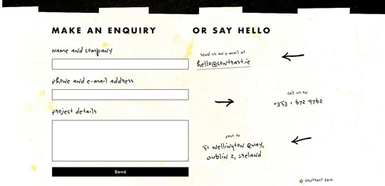
Contrast
Contrast is a web apps developer. Their website is pretty unique and nice, good usage of typography, colors and shapes. The contact form is also pretty unique and fun.
SVN2FTP
SVN2FTP is a hosted source control system. The website has a nice fun approach and a beautiful texture. The contact form is also nice and different from usual.
Ally Creative
Ally Creative is a small creative company. Their website is clean and have a nice textured background, the contact form is also pretty nice.
Think Vitamin Membership
Think Vitamin is a nice place to watch videos to learn web design and development. Besides having a nice website, all their forms are beautiful and pleasant.
Scribble & Tweak
A beautiful and neat single page layout that holds a nice and easy contact form.
Barnt & Arnst
I know I already showcased this website in previous lists, but I really like its colors and simple layout. And they deserve and extra point for their super clean contact form. 😉
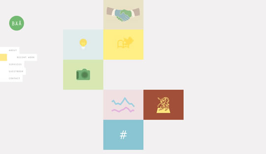
The Bullitt Agency
Nice website layout based on shades of black, gray and some beiges. Beautiful background images and classic contact form.
Atlason
Clean and beautiful layout with “built in” forms for FTP and email.
Major Tom
Nice image based layout with a “hidden” sign in form for clients.
Blind Pig Design
Their website is really cool. And as for the contact form, pretty classic and clean. Also loved the subject detail from the contact form – Oink!
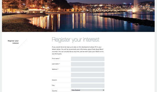
Clyde Quay Wharf
A residential project from New Zealand with a layout based on beautiful background images and elegant type choices. The “register your interest” form is pretty clean and beautiful.
37 East
If you are thinking about doing the real African Safari, you should check out this website. The layout is based on really beautiful background images and interesting typography.
Michael Freimuth
Michael Freimuth is a art director and illustrator. His website is pretty simple and cool. The login form to browse archives is also really nice.
Social Design House
Their website has delicate colors combination and a good choice of typography. The contact form is also pretty beautiful.
Tinkering Monkey
Besides having some pretty stylish products to sell, Tinkering Monkey has a super clean layout. The contact form is also pretty neat.
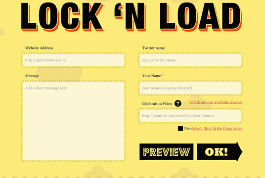
Go Live!
Need a button to shout about your work? Try this! Go Live has a pretty colorful layout and their “let’s do it form” is also really nice.
Sophie Hardach
A cool single page layout for a book website. Contact form really unique.
Soapbox
Simple layout with a beautiful color scheme.
RxBalance
Beautiful watercolored layout with texture background. Delicate colors and typography. The contact form is also really elegant and simple.


I personally found design of ‘SVN2FTP’ website quite interesting and eye-catching too. Others examples are okay-okay for me.
BTW, Nice article Gisele.
A bunch of contact forms are no help to anyone. What about examples of complex web forms from web applications.
It’s too easy to make a nice looking form when it only has text inputs!
Its great to see how forms have evolved over the years, when I started in web design all the forms looked the same and there was no styling or attempt to make them look different. These are a great selection of how that has changed. Nice selection
I agree, I think the ‘SVN2FTP’ form is really interesting and clever design, I like the clean style of ‘Think Vitamin Membership’. Id love to know how to incorporate a ‘send’ button like on ‘Social Design House’ Im guessing its a big image button directly underneath the message box, correct me if i’m wrong though.
Sophie Hardach’s contact us page is very unique. Good list. Thanks!
I’m really impressed by the form on Sophie Hardach’s website. Very creative. Thanks for posting.
thanks andrew.
it was fun building sophiehardach.com without a doubt.
it’s actually up for Best Site of The Year at the netawards… not sure how that happened, and i’ve got to say i’m pretty excited:)
The Sophi Hardach and the SVN-2-FTP forms are really inspiring. They are make filling out a web form interesting and enjoyable. Feels more personal and memorable.
Does anyone else get completely lost on Contrast?
I appreciate that they probably build good web aps, but web design isn’t one of their strong suits, I’m guessing.
Great post and some nice inspiring work, thanks for sharing.
nice post they give me an inspiration for do a new work of web design
Very nice collection. I will use some for inspirations to build some awesome forms!
Thanks for sharing.
These forms are really great examples to inspire website designers.
Wow, inspirational stuff. A great tool for being remembered is https://www.sendola.com/. It lets visitors send your contact details straight to their phone via sms. easy to use, and completely free.
I vote for SVN2FTP 🙂 looks so exceptional!
Thanks for sharing!
Always happy to see some good expamples of creative ways of using forms. Hopefully more people will subscribe to more functional/creative use of forms that engage the user, rather than boring them out to death. That’s what I am trying to create for my clients as well https://www.formsdesign.com.au