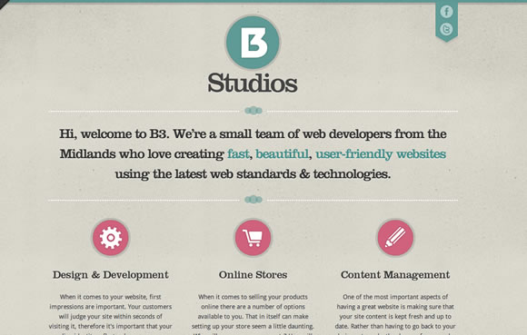
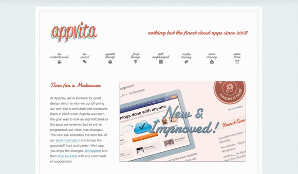
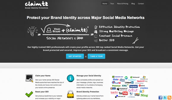
Here on WDL we love icons! From Icon Tutorials to a list with the Best Free Icon Sets of 2010 and a 15 Must-Have Minimalist Icon Sets, we already showcased a lot of great icons around here to boost your inspiration. Today we decided to gather some examples of icon usage in web design to show you how icons can make a difference in a layout, giving a page a nice touch, in both interface and experience. Check out the examples we got and start to think about giving icons a new try on your next design.
Inspiration  Gisele MullerJuly 18, 201122 Comments07.9k
20 Excellent Examples of Icon Usage in Web Design
Gisele Muller
Gisele Muller loves communication, technology, web, design, movies, gastronomy and creativity. Web writer, portuguese/english translator and co founder of @refilmagem & @mentaway Twitter: @gismullr


Nice collection of web design icons.. i really like “Cake Sweet Cake” web design icons.. keep sharing more with us..
yeah right
weay to go
nice collection. some great sites.
These website all show the icons wonderfully. They seem to give out the most appeal when they appear on clean basic sites with very little photographic imagery. I really like ‘I Am Tiago,’ ‘Studio Nudge’, ‘Enixel’ and ‘Syropia’. All of them use icons really well and to the sites advantage.
At the risk of blowing our own trumpet, our website uses some nice illustration-style icons. Check out https://www.pragmaticdesign.co.uk/services/ and the dropdown menus.
Thanks for the link, you were right a nice design.
great examples of icons in web design.
Thanks for that nice collection.
One more example with fotorealistic icon in the main navigation:
https://www.archaeofirm.de/
Thanks for the great web design ideas! I loved the attention to clarity!
Some great websites here…love “I am Tiago” & “Peter Nappi”!
My wife came across this site and loves the childlike, hand drawn icons. https://www.toshi.com.au
Lovely stuff – I’m seeing some trends develop for 2011 that are rather beautiful!
Peter Nappi’s website is a piece of art unto itself. It is one of the most stunning websites I’ve ever viewed!
Nice round up, thanks!
I adore icons as they are informative and appealing =) Presence of well drawn icons would be one of the signs of usability for me =)
Thnaks for the list, i love the “Peter Nappi” design.
Peter
Webchemie
i got some new ideas.. thank u very much fot this 🙂
This is exactly how I like my icons, clean and simple. Very useful list.
I would like to add my 2 cents. I have recently been busy browsing and adding free icons to http://www.creattor.com. They are royalty free – everything I added was free for commercial use. You could try getting some icon packs and make your own template, like the sites above.
We create our own custom icons too. What do you think? https://www.unleadedsoftware.com/capabilities
The icons used on these websites are great. Websites also look clean and make icons standout more.I like Studio Nudge, Syropia and Enixel the most.