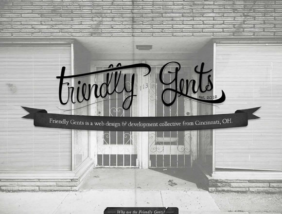
Here at WDL we love textures, specially because they can add personality, depth and style to websites, print, apps and everything else you can think of. From gathering free textures to showcasing examples of textures in action, we like to keep our readers up to date with the theme and also want to show how other designers use texture in their projects. Today we have a new list of websites using textures in inspiring ways. From super discrete textured fonts to complete textured backgrounds, here are some good examples of how you can integrate textures in your next project.
Inspiration  Gisele MullerMarch 26, 201210 Comments04.7k
20 Inspiring Examples of Textures in Web Design
Share
Gisele Muller
Gisele Muller loves communication, technology, web, design, movies, gastronomy and creativity. Web writer, portuguese/english translator and co founder of @refilmagem & @mentaway Twitter: @gismullr


These are brilliant, I especially like the buffalo lounge texture, looks sweet. Makes a change from the standard noise textures. Nice blog!
You never can really go wrong with textures just as long as they are used correctly. Great post
the depth of the texture is what gives more style to the Web
Amidst the sickly and indulgent designs here, we do have a couple of sites that actually use texture in an interesting and meaningful way, rather than as shallow decoration. The ‘Still’ site is very sweet, and shows an elegant reserve. The problem with the web is that there are little or no restrictions, resulting in very little tension and delight, as exemplified by many of the sites above.
Love this collection. Textures are always a big inspiration and I like using them for my blog posts.
miss this one : http://www.pauseshiatsu.fr
Images should be 100% crops and not reduced in size because you cannot see the texture which is the whole point.
Links should open in a new window, especially if the only way to see anything is visiting them.
Very informative and interesting post. Thanks for sharing it.
very nice source of inspiration. thanks for posting this 🙂
Some excellent websites. Great inspiration! Thanks.