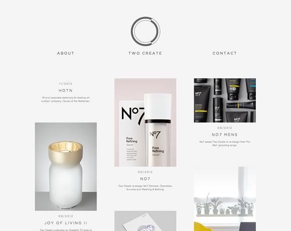
Certain colors give a website a really elegant and clean look. Some color combinations are pretty popular in web design, and definitely the black, white & grey (sometimes with a hint of red) is one of those popular combinations. These colors, combined properly, result in beautiful and elegant designs. Today we will show you inspiring examples of websites using these colors. From subtle details to complete backgrounds and images, here you will see several different approaches to the same color palette.
Inspiration  Gisele MullerFebruary 4, 20139 Comments010.1k
21 Examples of Black, White & Grey in Web Design
Share
Gisele Muller
Gisele Muller loves communication, technology, web, design, movies, gastronomy and creativity. Web writer, portuguese/english translator and co founder of @refilmagem & @mentaway Twitter: @gismullr


These designs are definitely pretty cool. Grey, white and black aren’t the most striking, but when done right, they can have a great impact on your audience.
I personally opt for more colorful and modern looks, though, because a wider audience will be attracted!
Really inspiring collection of grey color usage within web design. Personally “Aria” is the favorite one. Thanks for sharing !
Nice collection of elegant designs. The problem with some of these sites is that they start to all look the same, especially with the rising popularity of WordPress themes. Designers have to continue innovating with unique photography and typography to create more points of difference.
Yes!! Black, white, grey and red are wonderful colours to combine in design! High impact and crear effects
Great collection, some of which i have come across before and used as reference. Yung Wang i totally agree with your comment but from this collection you can see which ones really stand out because of how well the designers have used the photography and typography.
I think the photo on Lincoln is brilliant and really catches the eye with all the detail through the hair and small creases.
Yeah I love how some designers use white and grey in their designs. It makes some websites look subtle yet effective at the same time. Using blue can also enhance the grey/white look which I’m going to try soon!
Always been a big fan of Sagmeister’s work.
Awesome site as well!
Good photography here is key.
I reckon that ‘grey’ websites are adaptable to most types of audiences.By using minor tweaking with fonts and colours it becomes easy to adjust the styles and the effectiveness of the whole look. Personally for my website I have introduced colourful headings for approachable feel.