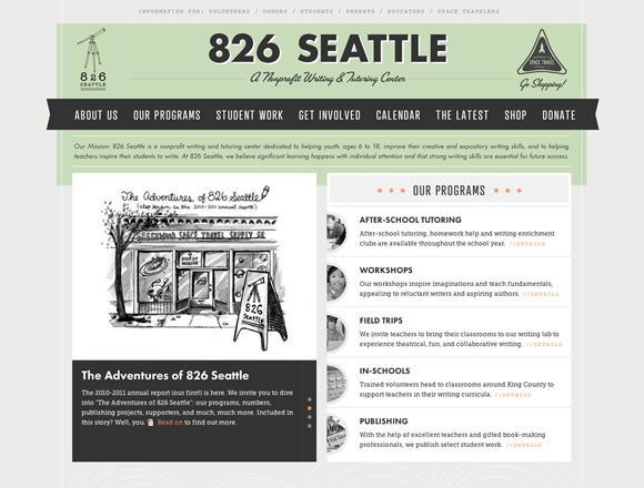
Trends in web design come and go, with some hanging around longer than others. One trend that seems to be withstanding the tests of time is the use of ribbon style graphics or design elements. Web designers have been using ribbons for a few years now to add emphasis to certain aspects of a design, and the trend doesn’t seem to be slowing down. So for this post, we’ve gathered some excellent examples to inspire you in case you’re considering using ribbons in your next design.
Share
Gisele Muller
Gisele Muller loves communication, technology, web, design, movies, gastronomy and creativity. Web writer, portuguese/english translator and co founder of @refilmagem & @mentaway Twitter: @gismullr


Very nice examples
Addition: https://themeinn.com
Very nice collection.
A good choice of examples by ribbons. I like “Jopp” and “simply as milk”. Design and background too.
Nice and inspiring collection!
All posts are really good, great work.
For some reason, I really dislike the overuse of ribbons nowadays.
I like the Radoor example. Thanks for sharing.
Thank you for the very nice colletions of unique and beautiful websites.
Just want to say impressive!
We incorporated ribbons into the design of a new site we just launched for a client: https://OneWord365.com
Love these other solid examples!
Nice collection of designs, I do like a good design with stickers or ribbons. Simple as Milk has to be one of my favourites mainly because of the typography!
nice collection!
thanks for sharing!