About pages are important because they are the place where the user goes to discover more about who/what is behind the site they are visiting. From design studios to apps and online shops, users like to browse a page to find the good old who, where, what, how information about you. And of course there’s many different approaches that can be taken when designing an about page. From the very formal to the fun and creative, it’s important to go the direction that’s fits the personality of you or your company. Today we gathered a some inspiring examples of about pages to show you how different websites are allowing visitor to learn more about them.
FancyRhino
I always like the creative-humorous approach using pictures. It’s nice to see faces behind ideas.
12th of Never
A nice and minimal approach in a landing page with a “more coming soon” note.
H-Art
A nice combo of beautiful images and well designed info-graphics to give us more details about their work.
Oliver Russell
Nice and elegant approach to the “what we do” page. Beautiful typography and colors.
Doberman
A cool mix of illustrated elements, typography and images to present their work, values and team.
Playtend
And of course a creative studio focused on encouraging imagination would go for an imaginative about page, well done.
Pulp Fingers
Another colorful creative approach to present who is behind work.
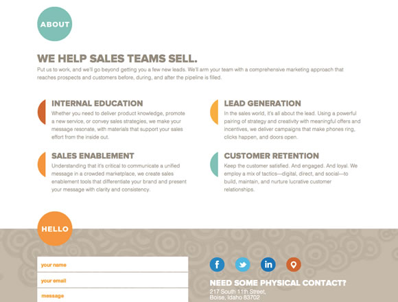
Level
A clean who we are page with beautiful colors and typography explaining their ideas and services.
Pursuit
For a stylish suit shop nothing better then a well suited team page.
Ghosthorses
Ghosthorses decided to use a nice typography combo to tell us more about their work and the outcome is really nice.
FO
FO divided their about in two beautifully done parts: who we are – explaining their values, creative force – showing their founders.
Fear the Grizzly
Clean and minimalist layout with a few images and texts explaining their work.
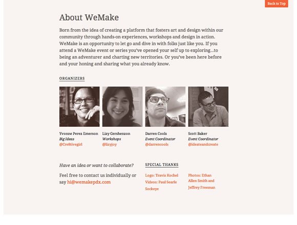
WeMake
A beautiful single page design with a nice about section with text and faces. 😉
shoplocket
Great colors, textures, typography and icons to explain their work and ideas.
FiftyThree
Beautiful typography based about page.
Nelson Cash
Nice images, icons and typography combination to show us more about their work, history and team.
COOP
For a coworking space, nothing better than using a beautiful background image showing the space. They are also using nice colors and transparency to tell more about their story.
Trailer Park Truck
A creative and less formal approach to the old and good who we are page.
Haus
Haus is using a delicate palette with nice images and text in a timeline to present their team and milestones along the way.
Blind Pig Design
Blind Pig Design counts with a photo of Aaron Awad (the founder) in action and a nice text to tell us more about the studio. They also count with a beautiful textured side bar menu. 😉
Duggard
And for a super cool website selling vintage stuff nothing better than a vintage about page!


Good inspirations. Playtend and Pulp Fingers are so different but I like so much together! I like so much also the use by typography for Ghosthorses. Thanks!
great collection! we just updated our about page here: https://interactiveblend.com/about.html
Definitely something I need to enhance on my website. Thanks!
Dezebo-graphic design | design inspiration | design tutorials) great post bro
Thanks for sharing! Totally agree with you that ‘About’ pages should fit the personality of the company, and they are the tools to show who we are and what we do. How do you like our ‘About’ page? https://wittycookie.com/about.html
Great collection of awesome designs. Pulp Fingers my favorite:)
Oh wow… so many ways to create a about us page… Conveying that personality creates a bigger impact with your users/client… Lovely share
Great collection, love the design of FancyRhino.
Awesome collection!
Would love some feedback on my about page 🙂
https://www.ryan-coleman.ca/about/
Excellent samples of “About Us” pages. This is right on target. Thank you for compiling and sharing them.
Lisa Gangadeen, President
The 33480 Group LLC
https://facebook.com/the33480group
https://twitter.com/the33480group
Great roundup guys! About pages (or inner pages for that matter) all seem to be given less time and importance in design. This collection you provided gives great inspiration to designers!
Amazing designs!
Here’s our “About Page” https://tarful.com/about
We’ll love some comments and feedback about it! Thanks
I love your “About Us” page. Very clean and artsy. Definitely would make me want to do business with you. Great job!
Some really awesome about pages here. I’m partial to the design WeMake and FancyRhino uses, they’re pretty cool.
Excellent! Exactly what i needed to get me moving on the new https://www.weirdlittlemonsters.com/ about section
Gracias
hope to share with you ours https://www.design21st.com/about
A takeaway from this gallery is the importance in keeping “About Us” pages minimal in text, engaging in visuals. Humanizing the brand with casual, fun pictures of the staff is a great way to replicate a closeness with the company, and get that much closer to recreating a brick-and-mortar experience. Awesome examples!
Cheers,
Sarah Bauer
Navigator Multimedia
Nice collection, thank you!
Pulp Fingers nailed that color scheme.
Super collection. Keep up the great work.
Nice collection! Some are fairly straight-laced and others are cute and playful but they’re all nicely designed.
H-Art solved this good – but I think your image is not up to date, because they show a movie in their current version. Thanks for sharing!
Wow! I like all of it! But those that made use of graphics and cartoons really struck me big time! These are just so creative. Thanks for giving me ideas.
Great collection! I liked ‘FancyRhino’ the most 🙂
I think ‘About Us’ page speaks volumes about your company. You should never overlook it.
The “FancyRhino’s” are pretty cool :)..humorous approach is one of the best idea I personally think an eye catching style!! It can engage the viewers!! Write now I am working on my about page…thanks for the ideas mahn :):)