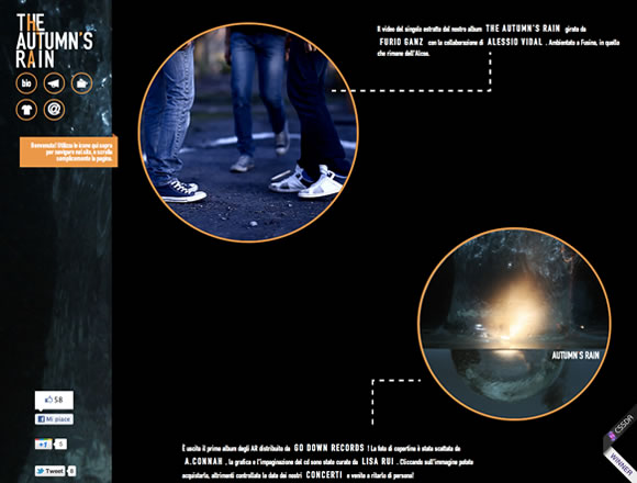
We all know that color is a key aspect of web design, and here at WDL we like to show you how designers are using colors in their projects. We’ve already showcased lists showing colorful websites and sites using white, so today, to keep you inspired around colors and how to use them, we decided to gather a few examples of websites using dark colors.
Inspiration  Gisele MullerJanuary 30, 201218 Comments05k
21 Inspiring Examples of Dark Colors in Web Design
Share
Gisele Muller
Gisele Muller loves communication, technology, web, design, movies, gastronomy and creativity. Web writer, portuguese/english translator and co founder of @refilmagem & @mentaway Twitter: @gismullr


Some nice designs. Not sure Soup is a dark site though 😉
Some good examples here!
Josh Sullivan is a great looking website!
Interesting concept for a post and some great website examples – many thanks!
Some great examples for sure. I was definitely quite taken with the clean and approachable design of Nicola Potts’ website. Beautifully done!
If you are interested in another great dark website our agency just went live with an updated look and feel. I’d love to get your feed back on the site.
Great examples, all of them but I fell in love with that Ascension Latorre website, wow.
Great post 🙂 the examples are phenomenal
Dark is not my preferite colours in the net but I see some particolar interesting design here! Thanks for sharing.
I still prefer white space over black space, but this collection is stunning. Thank you for sharing.
As usual nice collection of sites. As a suggestion for a future article, how about–I don’t know how you’d say it–but, sites that are _mostly_ dark but with splashes of color–like Lushtea, dataveyes, cjs etc?
Nice collection. Definitely shows a great variey in layout and styles using dark colors. Thanks for putting this together!
amazing color concept with great example.
Most of the designs are on black bacground, where dark colour web design background could be other than black; I mean some dark shades of other colours.
OK, lots of examples of no contrast – one of the crucial basics in any design, involving text and readability.
Inspired by these sites, my last project has been designed along these lines. And I must say it does look quite cool, or so the client keeps saying! Am I aloud to put links on here? I would love some feedback.
Very aesthetically and tastefully designed. Azure Stoneworks swept me off my feet.
1 year later, Luhseta is still as stunning as ever!