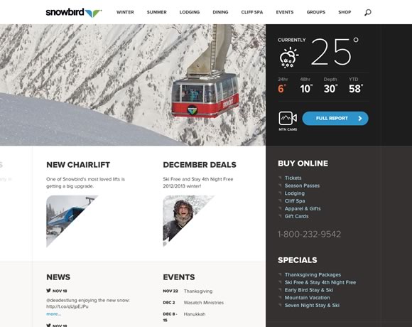
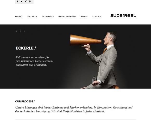
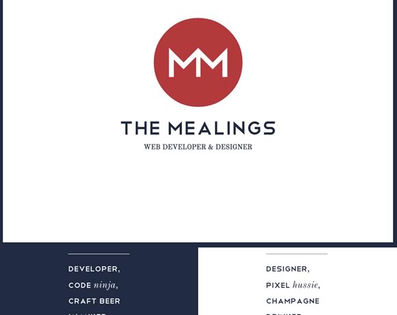
White space is the blank space, the empty space, between elements. It’s the space we leave between elements to give a layout an elegant look, a clean look. Lately we can see that more and more designers are realizing the importance of creating clean designs, designs that are user friendly and that take advantage of white space. From using white space in headers, footers, between menus, between images and information, texts and sidebars, here you will see great examples of whites space usage in web design. Remember that white space doesn’t need to be white, it may be any color, as long as it is empty.
Inspiration  Gisele MullerNovember 19, 201210 Comments18.8k
21 Inspiring Examples of White Space in Web Design
Share
Gisele Muller
Gisele Muller loves communication, technology, web, design, movies, gastronomy and creativity. Web writer, portuguese/english translator and co founder of @refilmagem & @mentaway Twitter: @gismullr


By adding plenty of white space you can leave room for big images, video files, and larger text styles. Readers need extra space to digest larger blocks of sentences. This is a beautiful collection of websites thanks for sharing.
Good set. Bring us a “inspiraing examples of DARK WEBSITES’ 🙂
Great examples! We leverage whitespace heavily in our site (linked on my name) at LoudNoises. Would you mind taking a look and giving us your feedback? We’re constantly iterating and looking for valuable feedback!
Cheers
Once again, a great collection of fine usage of white in web designs. Philip House looks really really good!
Great examples of web design giving white space centre stage for a change. Online attention spans are notoriously short, surely presenting information clearly, concisely and without unnecessary page clutter is the best way of engaging with your online audiences? Web designers pay attention!
Really Awesome collection.. My collection will be present soooooonnn…Please wait…
Refreshing! I wish more people appreciated ‘breathing room’ in design instead of asking that every pixel of space contain a marketing message.
White space is a must – it surrounds the area of great importance 🙂
Great selection. I personally love Session M.
All of these designs are new. Website with white spaces looks beautiful but every page of a website should have different color.