I’m reading the book The Laws of Simplicity and it is really nice to browse around looking for minimal and clean designs after understanding more about the laws John Maeda talks about. My favorite law is probably “reduce” – the simplest way to achieve simplicity is through thoughtful reduction. If we get the concept of “how simple can something be?” and apply to web design, the result will certainly be some nice and minimal layouts, like the ones we will show today. We gathered several different approaches of minimal websites to show you that reducing elements in a page delivers a beautiful layout. And remember that a minimal layout doesn’t need to be white or single colored, you may add colors, images and other details and still have a minimal website. Check it out.
Simply Adam Mann
Tapmates
Young Jerks
Cycle Love
IXI Store
Pear Tree Press
Ousback
Belief
Dodge & Burn
It’s a Shape Christmas
Boundary Breaks
Ditto
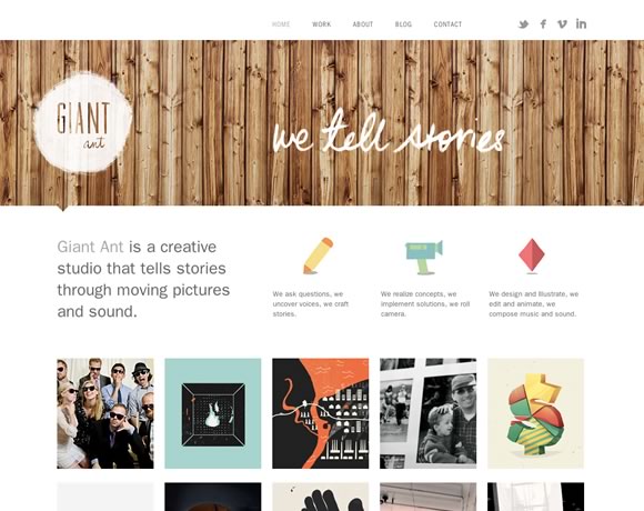
Giant Ant
Kait Bos
Friends of the Web
Roy Barber
Built by Buffalo
JAM with Chrome
Nudge
Circle 21 Candles
Bake
Related books:


Hi Gisele,
Thank you for including CycleLove amongst your selection 🙂
I agree, reduction is very important in web design. The world is a complicated place and I would hate to make it more so…
James
always loved the way designer present their portfolios like how Dan Cassaro does it on Young Jerks. Well done!
Please check out Our New Modern and Corporate Web Design template:
https://themeforest.net/theme_previews/3533647
Recommend our template, If you like.
Please send feedback to my id (masood@falconcreativestudio.com)
Minimalism is holding on strong as far as web design goes and it’s pretty much my favorite of the existing trends. So I don’t know if it’s because I’m currently looking for a new pair of glasses, but out of your collection, I really liked the design of the Ditto website 🙂
Oh wow. My website has so far to go…
The screen-shot looks a little funny, but thanks for including the Belief website.
I feel like I am always recreating my portfolio to try and keep it as clean and minimalist as possible. Every few months I take a look back and feel I can make it even more simple yet elegant for users to browse
Very nice this collection…Inspire so much. Thanks!
Very good collection.
you can insert web agency https://www.fe-el.com
one of best italian web agency
Nice collection, I like Pear Tree Press most as it seems to be trying to break the mold of what a website should be like more than the others. All very nice though!
Personally I am big fan of minimalist design, the whole less is more approach really can make a website look fantastic. Bombarding the visitor with graphics and information doesn’t get your message across.
These designs show really well how all you need on the page is what you want the visitor to know, nothing more should be needed.
I’m in love with Cycle Love :)))
Thnaks for another great compilation!
I love simplicity, white space does wonders. I tend to stick with a few colors and two types of fonts. Nice selection, thank you for sharing.
So much inspiration here. Thanks for sharing.