There has always been much debate on whether white is really a color. Someone who works with inks and pigments might argue that white is the absence of all color. While someone taking a more scientific approach would tell you that white has to be a color since it is the blending of all colors of light.
Whatever your stance is on white being a color, you can’t argue that it can have a big impact on a design – whether it is used to fill “white” space, or to create bold typography on a dark background. So for this post, we’ve gathered some very good web designs that make good use of white.


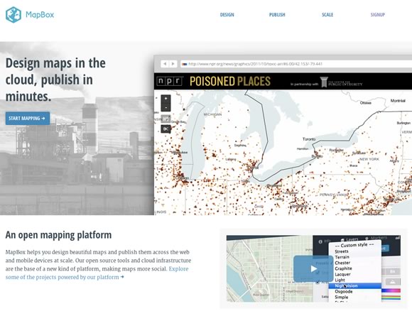
In my opinion here are the top 4 for me from the list of 23 examples:
1. Kiawah Island (I love the color scheme)
2. MapBox (Looks very Web2.0 like and clean)
3. ButterworthSullivan (Professional, clean and color co-ordinated)
4. Matthew Williams (It is very fast loading)
What’s your top ones?
Nice list! We just re-launched our new design with a black/white theme, check my URI for the link. This is definitely inspirational for ways we can even further optimize and improve the design.
Awesome list! This is our kind of taste! If you like white minimalistic sites please visit our new redesigned portfolio site: http://www.trafficlight.se
Cheers!
Roundhouse design is one of the most beautiful and simple ever seen. Thanks for sharing.
Some stunning examples!
I use white often to make text pop on a colored background… My own logo is an example. Plus, good use of white space can give a very clean, fresh feel to a design.
Looks good! White 1921 stands out among all! Nicely done with different shades of white.
Check out http://www.timelessdesign.com.my, where we used white as the core of the design as well!
Though white is a simple and common color which we can be the best opt for any webdesign but as a power consumption point of view we need to consider some dark colors like black which saves lot of power in the form of voltage required for displaying it on the screen and at the time of data transfer.
Great list as usual! I will add them up to my collection. Please see my collection of website with white color scheme here, https://webdesigninspirationtoday.com/design/color/white
Cheers!
Awesome list! I like all of them. The Papermill and Fear The Grizzly definitely stands out.
awesome
Great examples which shows white color has big impact in designing. I specially like Johann Lucchini and moving things designs which has white in background and looked very professional.