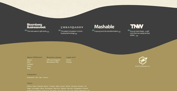
As a user I really like to find a well designed footer in a website. I think it is nice to know that the designer was thinking about everything when putting the layout together, I feel happy to find a beautiful design “from header to footer.” And by that I don’t mean that the layout must be fancy, I just mean that is nice to find a nice image, illustration or simply well organized info and maybe some nice and elegant icons. So based in all that, today we decided to gather a list showing a few examples of footers in web design. And I have to say that this time around – we already showed footers here twice: nov/2010 and dec/2009 – it was harder to find interesting examples to show. Guess footers are being forgotten lately, what do you think?
Share
Gisele Muller
Gisele Muller loves communication, technology, web, design, movies, gastronomy and creativity. Web writer, portuguese/english translator and co founder of @refilmagem & @mentaway Twitter: @gismullr


Thanks! Thats inspiring!
Really like “studio chirpy”, works really well with the rest of their website.
Website footers are a much neglected part of most websites, Cork Circle is a bit jerky but very clever design!
I’ve been dreaming of changing my site’s footer.. Since I just downloaded a free WP theme, its giving me a hard time to change the footer php, hope I could make it one of these days.. Love all collection above.
The footers, The last but not least …
Wow, I liked those! 😀
I especially like the La Bubbly footer. Could have been tinier, but anyway, looks much different and transmits a message.
Some cool samples, will be using these for my inspiration.
Cool inspirations, the Nudge Footer is the best for me.
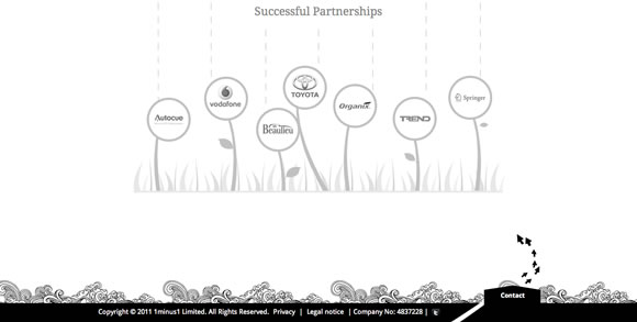
Love 1 minus 1. I agree that the footer is much neglected. Very cool and inspiring.
Bristol Archive Records and Nudge are awesome. It’s really good to see some uniqueness within the footer of websites. They’re definitely a place to spice up a layout with even more creativity.
Very nice list Gisele, thanks!
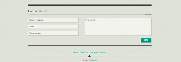
I thought it was a great ideas to include a contact form on the footer. Great way to make it easy for people to contact you.
One to add is from https://www.sohtanaka.com.
creative footers..thanks!
Great round up thanks for sharing 🙂
I always feel that way too, I never say I finished one of my websites until a proper footer is introduced, so thanks for the share, I saved a few.
Thanks these are great! Will def be using for inspiration on http://www.webdesignhighwycombe.com thanks again for sharing will be checking back daily!
I really like your posts. Good picks, very inspiring.
The Poogan’s Porch one is stunning, great collection.
Although they’re all good, hats off to the footer on ‘Nudge’ and the footer on ‘Poogan’s Porch’.
Also, it’s subtle but the footer on https://markforscher.com/photos/2011/08/these-windows/ when you click “More” in the bottom left is very nice
very inspiring, today some content can be inserted in footer too, not only the main navigation
Thanks for the inspiration. A few had good use of contact forms in the footer.
Thanks.Really very cool stuffs and inspiring.All the design shows the importance of footer.
very nice collection thanks
Gorgeous! Details make the difference!
Great examples.. like them all 🙂
Some really nice examples. I often think footers in a website are completely neglected and just an after-thought.
However, it is not only a place to inject some personality into but to help with navigation and contact info etc, not to mention how it can help with ranking!
wonderful !
This is just giving hundreds of ideas to use this ofter neglected space. I am amazed how it makes different. This is brilliant idea to make potential customer stay in website and click highlighted pages.
I will sure give more attention to footer in future.
great inspiration for my next project
I’m a firm believer in a good footer, people have low expectations at the bottom of a web page so if you can wow them with creativity then they are sure to remember you.
Love the one by La Bubbly but my favourite is Corkcicle’s 3D effort!
Cheers
Great Examples. Thanks for that inspiration
Thanks for the mention! we’re really proud of our design work on the site!