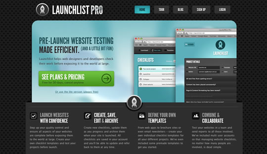
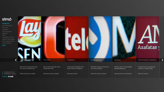
Almost a year ago we featured a showcase with 50 Inspiring Dark Web Designs and today we decided to gather a new list of dark websites to inspire you. It’s always nice to remember that a dark layout also has it’s beauty, specially when everybody is talking about clean white web designs. So check out some examples of inspiring dark websites and start thinking about giving dark colors a try.
Share
Gisele Muller
Gisele Muller loves communication, technology, web, design, movies, gastronomy and creativity. Web writer, portuguese/english translator and co founder of @refilmagem & @mentaway Twitter: @gismullr


Very nice list, great inspiration!
really inspiring
help me get some inspiration to my next project..
thankyou..
Agree! We’re a proponent and a practitioner. Blacks and dark gray can be an elegant way to stand apart from the crowd. And when you do use a bright color it’s like a ‘subtle pop’.
– John
Fill Studios site as darn awesome!
These are nice and some are stunning, but I still find it hard going to use, as distinct from view, these dark background sites. The contrasts for text run from too hot to almost indistinct.
The Tom Pain slide out is pretty sweet.
Also… shameless self promotion… I have a dark site too!
thats a great showcase of dark website designs.
Love these examples of dark web page designs, especially the textures and shadows which are used to make the designs much more interesting.
I think dark web designs are great if your going for a dramastic yet sleek approach, and agreeing with John using a touch of colour definitely gives that “subtle pop”.
A really great list. I really like the Pointless Corp design =)
A wonderful collection of light challenged designs. I really like the Pointless Corp website. Maybe its just their logo, something about a bear on a bicycle. Thanks for putting them up. ~ Chris
This goes to show that dark websites look great when designed properly. I really like the background of the East Village Eatery, and its something that is easy to create. I will definitely use these as an inspiration towards dark websites.
Some great examples but im not sure if I would class all of them as dark web designs. Haunted cat house isn’t strictly speaking dark 🙂
The Night Owl Interactive got my attention! Black goes nicely with other different colors in one page, as it makes the colored image, fonts, etc stand out.
dark site design really rocks! i love the grungy effect done on tompain’s site.
Sure do like me some dark website designs. Lots of great examples in this post; Night Owl, Launchlist and Free Association were my favorites. Nicely done everyone!
tasteful list. gr8 thx