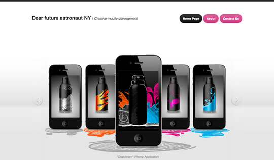
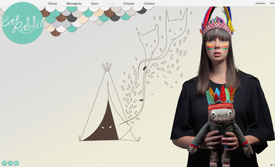
Four months ago, we showcased 30 Examples of Big Backgrounds in Web Design, and we can say that the trend surrounding big images as backgrounds is still hot. As we noticed that a number of new websites were using big backgrounds, we decided to do a fresh round of examples to inspire you. Here you will see websites using big images as the focal point and you’ll also see sites using big images to enhance the content in creative ways. Keep in mind that using only a huge image as a background is a bit risky, since you might be driving attention away from content. So try to have something “in between those lines”.
blitz
Moods of Norway
Art of Kinetik
Michael Korstick
Handle With Love
Brandon Knaster Jewelry
Te Haku Lake House
blitz


Love the straight-to-the-point elegance that these sites offer.
My website would really suit those examples! I have full-screen photo backgrounds 🙂 Anyway, very nice set, thanks for sharing.
Beautiful! The problem with many of these though is their lousy search engine findability.
Love the use of large imagery, text heavy websites might be good for seo but no one wants to trawl through loads of text…
Wow some of them are too good and exceptionally great. thanks for sharing such useful ones that will enhance creativity of any designer
excellent collection, great job!
nice .. very inspiring
Would love to see a tutorial about best practices for designing and especially coding these large background sites. Know of any?
These are all great, though you missed a really nice site in your findings : take a look at https://acanarytorsi.org (this site was featured on Slideshow Pro’s site)
cool works, good for inspiration
very inspiring, thanks!
Thanks for listing TREME’s website ! Made by http://www.ultranoir.com from Paris/france ^^
Great post! Right at a time when I’m going to be designing a site that uses large background images on the homepage.
As Kenny mentioned, I too would be interested to read about best practices for developing sites that use these large images.
Awesome post, definitely gets my inspired gears turning. I especially love the examples that incorporate elements of the large image as navigation items.
Here is one tutorial that appears to address a lot of our questions:
https://css-tricks.com/perfect-full-page-background-image/
This article delineates four approaches to sizing, centering, etc., using CSS3.
What would I do without you?? Also @Nicky thanks for that, I’m in the process of working on a site like this