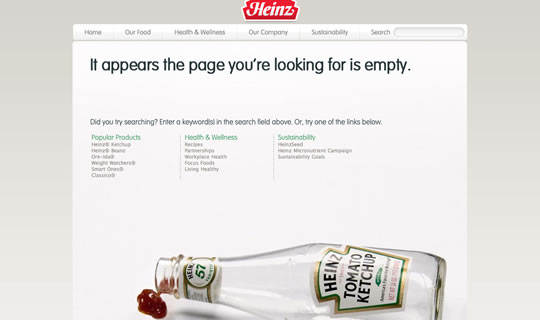
This week I was doing some research and I often found that horrible error blank page in several websites. I instantly recalled a showcase we had a while back with 40 Creative 404 Error Pages to Inspire You and decided to do a new roundup on 404 error pages. I simply love when someone spends time designing an error page, even knowing that this page won’t be seen that much – or at least it shouldn’t be seen. This is a major proof of consideration for users. It’s knowing and remembering that sometimes we all make mistakes and end up in the wrong page. So for those few times when something goes wrong, it’s much better to see something nice.
Share
Gisele Muller
Gisele Muller loves communication, technology, web, design, movies, gastronomy and creativity. Web writer, portuguese/english translator and co founder of @refilmagem & @mentaway Twitter: @gismullr


Some really good ones in there. Couldn’t find decent 404 inspiration, but here it is.
Where’s the github one? It’s the only 404 I know of that has parallax.
https://github.com/404
Very nice collection. I especially dig Irrational Games’ 404 page.
Apadeloup is my favourite here. Nice and inspiring collection!
An awesome collection… I recently had a go at doing my own: https://www.tomcash.co.uk/404 😀
luv the frye/wiles 404-site … whoops 🙂
Nice collection. Here’s ours: https://www.pragmaticdesign.co.uk/404/
I thought ours was quite cool for a photography website? https://www.flixelpix.com/404/ddd
If I had to vote I’d probably go with Blizzard’s.
@David It’s not bad but perhaps not as creative as those mentioned in this post 🙂 Props for pegs! (I also love your navigation menu – it’s lovely in its simplicity.)
I really miss the github 404 page here. It’s the best out there: https://github.com/404
You just forgot one of the best of all times: Github 404 https://github.com/404
The creativity is fun, but I’m disappointed to see how many of these examples completely dead-end the user, and make no effort to try to redirect the user in a useful way. No suggested search results or even a search box, and some don’t even seem to have proper site nav. I love the idea of being a little cool and creative with your errors, but it’s important not to sacrifice the user’s experience for the sake of a pretty page. When someone hits a 404, the MOST important thing you should try to do is help them find their way to what they were looking for – or at the very least provide them with some options for moving forward. Sad that we still see this kind of UI fail in 2011. That’s a 1997 mistake.
such creatively designed 404 pages should add great value to the site. nice and inspiring collection..
These 404 pages are really awesome. cool collection, inspiring and creative. thank for sharing Gisele.
Thanks for featuring my 404 page and my lost piggy 🙂
Hey… great pages!!!
Sweet I’ll rip off the simpsons and be “creative”
Some nice ones here 🙂
Lauri Kreutzwald
Love it … Thanks for share 😀
i recently put up a custom 404 page as well: https://mikemai.net/404
😀
404 error that also teach visitors…
You must include this one, found an error 404 on nativehacker.com
See my page. And i guess its creative enough to top the above list. 🙂
Isnt it guys?
https://www.webdesigncc.com/404
uno more error 🙂 https://www.marsciano7.it/404