The first impression is always important and usually, you have just a few seconds to impress.
Nice and quality clothes, matched accessories, coming to meetings on time, all these matters. They give people a first glance about who you are and create some emotions related to you.
Likewise, the first impression also matters in the online world. In few seconds, the website visitors make judgments about your website and about your company’s’ credibility, starting from what they see and from the feelings they have while viewing your website. According to statistics, one in five visitors will leave your website without giving you any second chance, if you make a wrong first impression.
Sure, it’s true that web design has progressed tremendously over the years, since the beginning until now. New features are always discovered and implemented every year, the most popular of them being added to the list of options for designers and developers to use. Infinite scrolling, landing pages, banners, pop-ups, cookies, social media integration, sharing, comments – and the list can go on – are just some of the features that were considered hot trends the last years.
Knowing the latest web design trends and adapting them in order to convey the best your message, makes it possible to create a website that will impress your audience and will grab the visitors’ attention.
Two months ago, we wrote an article related to the nine hottest web design trends for this year. Sure, they are not the only ones for 2017. Therefore, we would like to share with you some more information related to this topic, in order to help you with the implementation of the best features for your website.
But before diving deeper, let’s clear something: even if web design requires creativity, it’s not art in the purest meaning of the word. Because beyond of expressing feeling and provoking emotions, web design helps people find answers to their needs, take action or complete a task, and give the users a special experience.
More than ever before, everything in web design, from imagery to content, to navigation and layout, serves a specific purpose. Of course, many websites have been designed for a while and have collected a lot of clutter during the time. If your intention is to refresh or redesign a website, your first step should be a content audit and based on it, you should clear it out and focus on what’s important in your relationship with the target audience. But if you decide to design a site from scratch, your starting points should be the site map, the wireframes, and the top tasks. In this continuing struggle between clarity and the absolute completeness, the first one should be the winner.
Beyond all the modern web design trends, should be the relationship with the target audience and the intention of conveying a clear message. Therefore, we have chosen five web design trends that we hope will help you create a modern and efficient website.
1. Tiny text
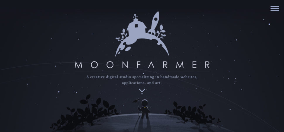
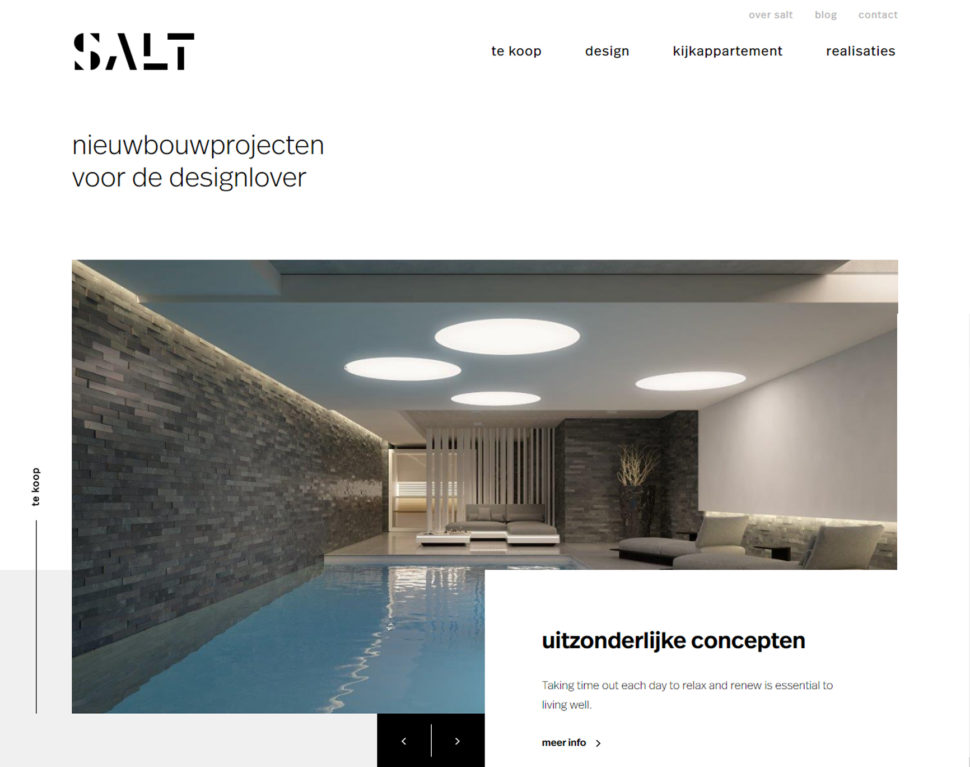
Even if the big, bold typography still plays the game, the smaller, almost “tiny” texts have begun to replace the oversized headers and subheaders that have been a stamp of the website design for a while. For small headlines, to the body texts that seems to be reduced to the limit of the readability, there’s been a definite trend for downsizing the typography.
Although there could be some concerns related to the readability when it comes to the small text, the small fonts are not such a bad thing. In fact, sometimes, they are preferable to the oversized fonts. On one hand, smaller typefaces let the layout room for breathing; on the other side, small fonts help increase the interest for the message they express. Speaking about small type, the catch is to keep lettering to a minimum in order to be effective and interesting.
Balance is also a concern related to this trend. For creating a nice sense of harmony, all of the typefaces have to scale down somehow. This scale down could be not just in terms of the size of fonts, but also in terms of colors. It is very acceptable a combination between big and small typos, in which light typefaces used for headers could mix with small fonts from secondary copy.

2. Geometric layering
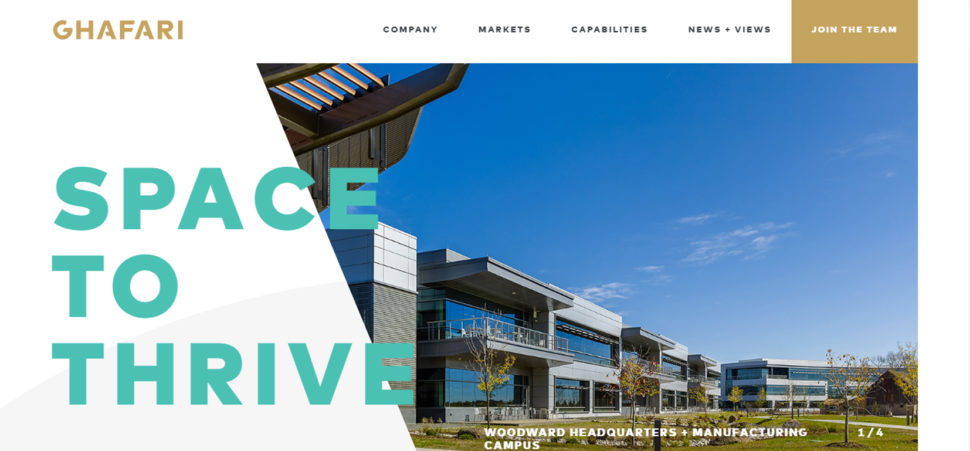
In a permanent searching for new elements that could add new visual interest to the design, the geometric layering has steadily increased in popularity. Being brought as a mainstream and modern design technique by the Google Material Design, geometric layering is a technique for adding a new life to images that are somewhat plain – for example buildings, interior designs, people working and so on.
The addition of fun shapes, contrasting colors and cutouts give always the user a starting point to get into the website design and effectively help him to focus on the most relevant content, such as branding or headline.
The best part of using the geometry layering is that they are easy to work with and to integrate with the rest of the design, and fit pretty much with any type of content. The angles and curves in geometric elements help the users point from one element to the other, and when they are used effectively, could be a great directional tool. By using the circles for content, you want to be viewed first and positioning angles so that they “point” to the content you want users to see, you will help the audience to better understand the message you want to convey.

3. Enhanced 3D
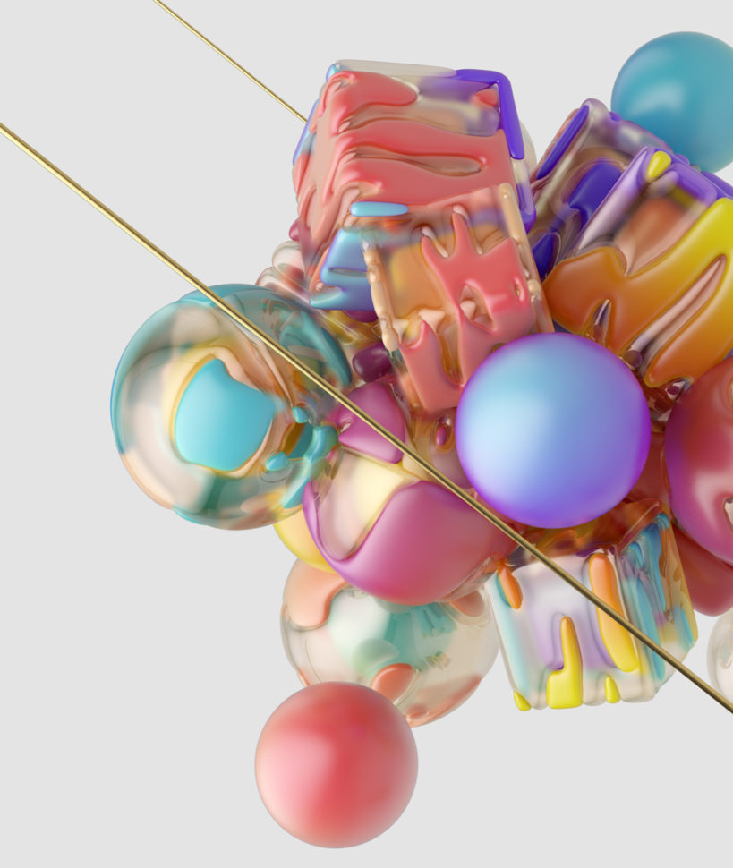
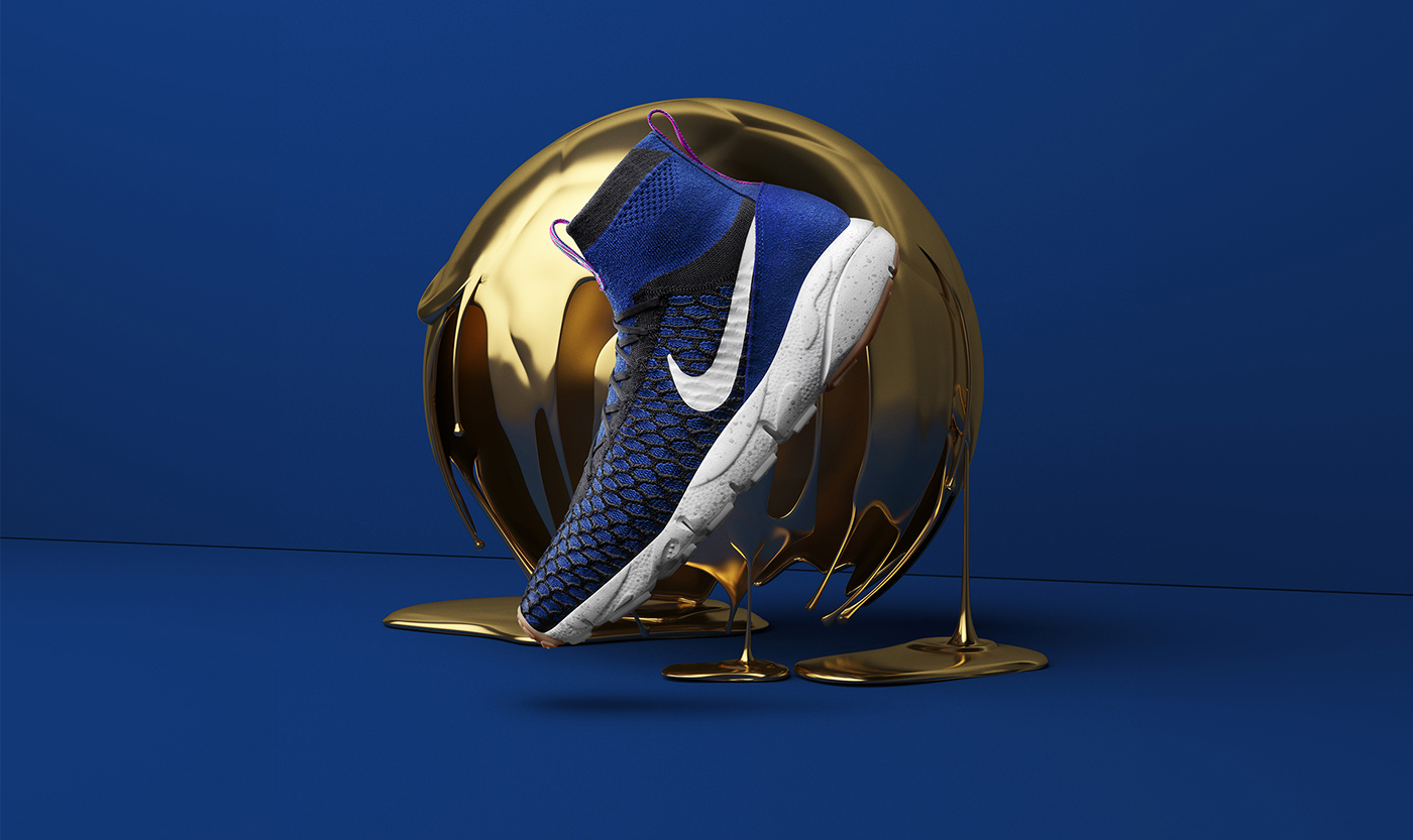
3D arrived in web design in 2011 and in the following years, we have seen a lot of excitement for the possibilities of 3D usage among web designers. The development of 3D in the online world has continued and there are some pretty impressive implementations out there, from “wow factor” visuals that act mainly as proof of concept, to thoughtful uses of 3D squarely aimed at crafting a great web experience.
Using 3D elements in web design could make a website more impressive and memorable, their purposes being the creation of a feeling of depth. For this reason, websites including 3D elements look more interesting and vibrant than the most sites that include a flat, 2D design. In terms of the possibility of usage, 3D effects can work pretty well for a variety of different design options. From the game style interfaces to shopping and product identification, an interface that almost gives the users the feel of real interaction proves to be quite attractive. This could be the main reason for which it’s trendier to incorporate 3D effects and styles into the website design. Furthermore, with the VR/AR rapidly development, this trend is evolving pretty fast and will become more popular than today.



4.Innovative Scrolling and Parallax
Scrolling, once reserved for getting from the top of a page to the bottom, is now being used in more creative capacities to deliver the content. If the designers in the past were concerned about keeping the most important content in the upper part of the page, we’re seeing this old-fashioned notion disappear, as users are viewing the content of screens of all different sizes and resolutions.
Parallax is essentially a scrolling mechanic, which gives a 3D effect as the foreground moves at a faster pace than the background behind it. The parallax effect has been around for years in classic video games, but in the last years, it became a trend also in the web design world. This nice and modern effect could be seen regularly as part of the innovative scrolling feature of the web pages. In order to create a sensation of depth and providing an interesting and attractive browsing experience, it is defined by the usage of multiple backgrounds that seem to have different speeds of movement.
The term derives from the Greek “parallaxis”, which means “alteration”. In other words, Nearby objects have a larger parallax than more distant objects when observed from different positions, so parallax scrolling can be used to determine distances.
This visual idea is great to add a unique element to any website. From a multilayered parallax to a video parallax, anything could be possible.


5. Microinteractions
Microinteractions are single, specific moments when a user is interacting with your website. They are such a fundamental part of many website designs these days, that any website without them will probably look boring. Most designers think about microinteractions as magic components that add delight, create surprise and offer something attractive, entertaining and engaging to the website visitors.
Anyway, creating amazing micro interactions isn’t always easy. Like every other feature, if they have a proper use, are great. If not, they could be a disaster. Therefore, you should create something practical, that makes the user’s life easier, needing to be human, intuitive and responsive. Long short story, if you haven’t used micro interactions until now, you should try! You’ll be surprised!


Bottom line
Sometimes, the biggest trends hinder the evolutions of other trends. It could be interesting to see the small-step progress almost as it happens. That’s what you tend to get when you are looking at trending elements that can be applied to almost any project, such as the five trends showcased here.



Leave a Reply