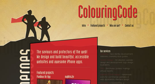
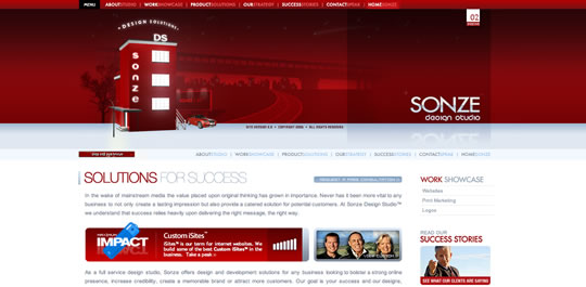
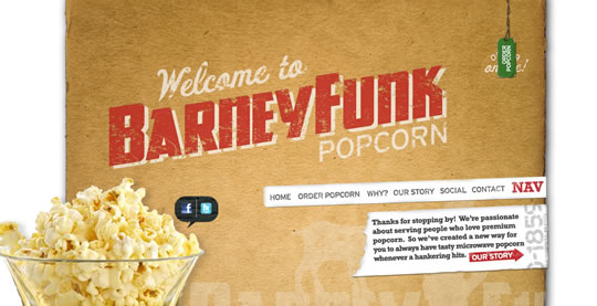
A few weeks ago, we showcased web designs that made use of the color yellow. Along those same lines, this week we are focusing on another warm and bold color, one that definitely has lots of impact. This inspirational showcase is all about the color red. Red can have several meanings, and a few of them even contradict one another, such as love and anger. Despite how the color red is being used in a design, there is one thing for certain – it can definitely get people’s attention. So much in fact, that studies have shown red to cause a person’s respiration rate and blood pressure to increase. Notice how these 50 web designs use the power of red to strengthen their message.
Share
Gisele Muller
Gisele Muller loves communication, technology, web, design, movies, gastronomy and creativity. Web writer, portuguese/english translator and co founder of @refilmagem & @mentaway Twitter: @gismullr


Nice collections, give us some inspirations, thanks for share.
Nice collection, I’m not so convinced Twitter convention website is “so red” 🙂 anyway it’s a nice example like all the others.
Thanks for the inspiration.
Thanks for posting this collection. Red can be a pretty powerful eye-catching color. I like the Truf Creative and Taami Berry sites especially.
I’m working on a redesign/realign of my personal site (which uses a lot of red) so this inspiration will come in handy.
A great collection. But I think some of them are just too red to look at them for a long time.
Nice collection!
If this post had come out a month ago had helped me a lot, I was developing a site with predominantly red color (www.logisul.com).
Are these websites described as inspirational based purely on their visuals or is anything else taken into account?
Great post!
Have to agree with Federica, I don’t think the Twitter one is red. It would be if it had a red background or something. But still, great post all around. 🙂
Thanks for the reddish inspiration, periwinkle blue next?
very inspiring collection! good work..
🙂
Awesome list guys. I’m lovin’ Gorilla Coffee
WAIT! you not write this website to your article? https://bit.ly/bekWYi
Thanks for this article, inspired me.
Thank you for featuring PosterNinjas in your beautiful list! 😀
Red and white are default go-to for starting a project, then I quickly remember I have to design according to what they need, not what I want!
Nice collection !
Look this : https://www.exprime-rouen.fr/impression-textile.html
Red and white can be stunning when designed in a way that is striking, not hard on users’ eyes.
Awesome.. Great Collection.
I totally love it. I was looking for this from a long Time..
Nice article, great source of inspiration!
Really great selection.
I like this one too : https://www.kumao.fr/lide.html
Thanks so much for featuring my site.
A great collection.Red can be a pretty powerful eye-catching color.
The templates were very beautiful especially LEVI – Advertising, Here, File File, Revolver, Uemit Oezcan..
Great article, and loved the example http://www.bless thisstuff.com , its one of those worth checking daily, they have awesome stuff on there. The design is very clean and minimal, great grid use.
I am a great fan of the color red that is why I am in awe of the designs. Although not all of them look pleasing to the eyes especially those that are overabundant with the red color. It’s irritating to the eyes.
I love this one >>> axelsears.com
@Falcao
“article”…where is it? you mean compilation.
quite easy…bookmark a few magazine sites and regurgitate.
Great collection. thanks
excellent post, I loved ..
regards
Nice job. Good selections. I also like your websites in purple and black
Wow! Excellent content and image combination! i liked this post very much and got informative.