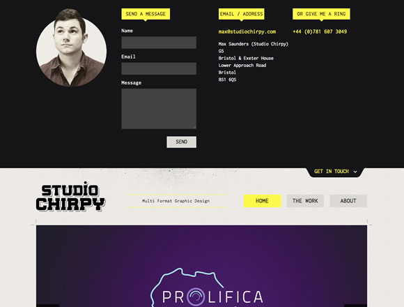
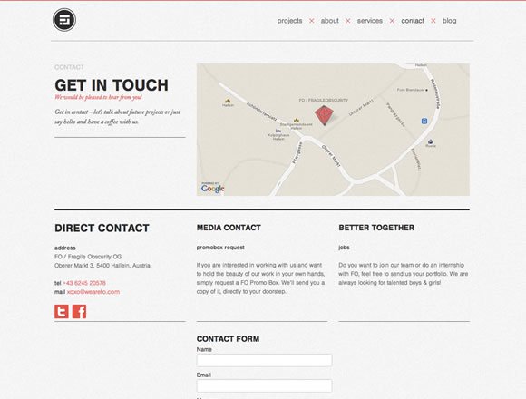
When designing a website we need to think about every aspect, from header to footer, from landing page to about us page, and even the contact page. It’s important to make sure the design is great all the way through. So today we decided to gather a few examples of how websites are displaying their contact page. Some dedicate a complete page to make the user get in contact. Others use a section inside the about page, while some have the contact information on the sidebar or footer. Whatever way you decide to display your contact space, make sure to take good care of this specific section because it can get the user’s attention or scare them away (and this could cause you to loose your next client/user).
Share
Gisele Muller
Gisele Muller loves communication, technology, web, design, movies, gastronomy and creativity. Web writer, portuguese/english translator and co founder of @refilmagem & @mentaway Twitter: @gismullr


Some really nice examples here, thanks for sharing!
Getting the contact page right can be so important to finalise that conversion. I saw a massive difference on my web design site after I updated my contact form.
Hi Guys, look at my contact page too: https://estudioclick.com.br/contato/
Thanks!!
These are great examples; I love the diversity of types of contact pages you show. Thanks for sharing!
Thanks for sharing these Gisele. For some reason I really love the Furniture site’s contact page with the chair, not so much because it is a furniture company but the message it sends. About to go through your post on About pages. Cheers.
Loved the post, makes me feel bad about how normal ours is. I’d be interested to see the CTR/Conversion rates from some of them.
We’ve found that it’s more effective to keep contact pages clean and simple- don’t distract the visitor from what you want them to do.
Great selection of contact pages. I especially like the one with the photos/email addresses. Great to put a face to the name.
Innovative collection of contact pages. I think the contact page need to be with a form, text address and map if necessary for direction for business organization websites.
Casey Britt’s is so clever and engaging. Great example of user flow. Best of all, it’s clear what the user is meant to do.
Cheers,
Sarah Bauer
Navigator Multimedia
These are some great examples. Thank you for sharing.
Great examples. I like that they’re creative and interesting but still simple. I’m designing a website for a new idea that I have and these should help to get the design brain juices flowing. Thanks for sharing.
It’s sad to note that only very few people really care about this most crucial part of any website.. Nice collection guys
Contactforms in you webdesign are almost the most important part of your website. A website without gives a visitor an excuse to leave without giving there details.
Think of how much easier your visitros will leave there info with less input fields. Asking to much info leaves room for error…
This is great stuff. A tool for enhancing your contact page is https://www.sendola.com/. It lets visitors send your contact details straight to their phone via sms. easy to use, and completely free.
Another great one Gisele,
Do you have any figures of how different Contact us pages are performing as far as it concern to conversions & conversions optimization?
@Leonardo
You page wont load to me.
@MattWest
Great tip. Thanks for sharing it!
Yam Regev
Such a wonderful posting of content pages . it’s really helpful to everyone .