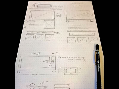
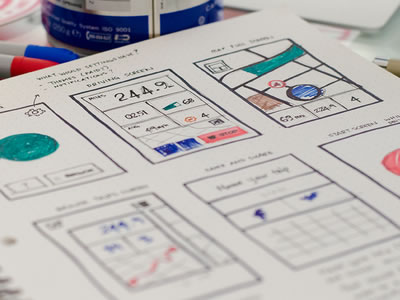
Sketches are a really important step of the creative process and every designer should take the time to sketch their ideas before taking the first step on a project. The sketch is the best way to see how your idea looks on paper, is a good way for you to try out options, see some proportions and improve your thoughts before getting deep into building something.
A while back we published a list showcasing UI Wireframe Sketches and our readers really liked to see how other designers are putting their ideas to work. Since the post was really popular and we got several requests for a new round of wireframe sketches, here they are, a whole new list of wireframe sketches we found on Dribbble. We will show you sketches of personal sites, landing pages, apps and responsive designs, so check it out. Remember to click at the images to know more about each piece and its designer.


Cool examples, but I find it so hard to sit and sketch when I can do this work in half the time(and in more detail) using my desktop. However some pitches I do try include hand rendered ideas if I think it can win a deal.
Yes, I agree, cool stuff and so, but to much time lost, I can do this on
my desktop with premade elements, so I can save a lot of time and paper 🙂
Actually, you lose a lot of time not doing the sketches.
Designing is a process and not some “thing” you just open a laptop and walla. There is a process to first visually understand the strategy, the user experiences, going from one page to another.
On page, you can design the full process visually but what you done is started with “wire frame” not “sketch.” These are two different strategies. What we see here are sketches not wire frames yet.
They will lead to mockup wire frames.
When you sketch, it’s you getting the concept down on paper and the full process of what the user is going to go through. A lot of rough, dirty, grafting but fast sketching done from thought to paper.
Sketching always happens before wire frames.
I show these sketches first to clients and they approve. Or they may ask for adjustment and I adjust in the sketch first. Then move to wire-frame using software.
1. Idea. 2. Sketch. 3. Wireframe. 4. Professional Mockup. 5. Coding.
The idea behind wireframing/sketching is to visualize your high level thoughts and concepts quickly. If you are spending time on the small details, then the process is lost on you. The designers in these examples obviously spent more time on these sketches so that they could show them off (I should know since I’m one of them).
Of course each person has their own practices and preferences that works best for them, but I find wireframing helps me communicate my ideas without the client seeing too much into the aesthetics.
so beautiful, nice collection!
Thank you for this, I really dislike wire-framing but this has given me some real inspiration to do it more often.
Inspiring collection. Sketches are a great way to begin.
very nice sketches,
frankly, i havent encountered a client that understand that the sketch isnt the final design, and i found myself wasting more time explaining than i would have making a clear design, even if its half finished…
I’ve never had that problem because the customer is educated from beginning of the process and that’s a qualifying process also, if they want to work with me.
You can tell what type of client you have approaching you for your service by asking questions. Maybe, you might need to ask questions first, see what level the client is at and provide relevant information while you do the sketches.
So when you have done the sketches and it’s time to talk to the client again, they know exactly what is what. They familiar what you’re showing them, and why, and when they need to give feed back and when not to.
I found through experience, the problem isn’t the sketches and wire frames, or even the staff or team. It was in past, more of a system in working with customers. Having more experience and putting a process in place in how I work with client.
Hope that gives some help tip. But if you find your way works best, then hey, that’s what matters end of the day.