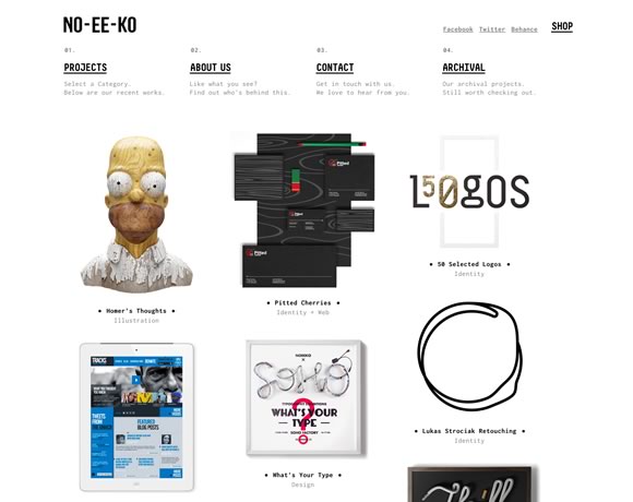
Snow, milk, clouds, foam… I could mention a number of white things that are pleasant. White, for its brightness or for its power of calming and conveying something nice, is a powerful color in web design. From menus to background, details in images and textures to frames and type, you can certainly count on white to add an elegant touch to a website. And that’s why today we gathered good examples of websites that beautifully incorporate white in their designs.
Inspiration  Gisele MullerFebruary 11, 20136 Comments02.9k
21 Examples of How to incorporate White in your Designs
Share
Gisele Muller
Gisele Muller loves communication, technology, web, design, movies, gastronomy and creativity. Web writer, portuguese/english translator and co founder of @refilmagem & @mentaway Twitter: @gismullr


white makes everything else stand out. nice looking collection.
Hi Gisele
Thanks. I liked Eden and the Hat Shop. Nice Designs
yeaahh.. White is still the best color! You can easily match with other colors. Easy to maintain and importantly look nice for users!
Loving Eden’s minimalist design!
The Eden-made website is really fantastic. I like it as i dislike Iphone ! Good wood integration, good design, good font usage … Really beautiful.
White is classic and timeless. Like the examples. The hat store site was great! Also if you use more white space in printed design, the project will cost less! Not as much color, not as much $$$$$.