Sick of Helvetica? Here are our top 11 alternatives

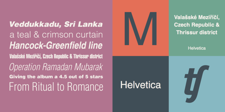
Image from MyFonts
Helvetica.
Such a wonderful, useful, and overused font. Don’t get me wrong, it really is amazing. It was actually rated one of the most frequently used fonts of the 20th century and it even has it’s own documentary. But, as a graphic designer, you definitely don’t just want to fall into the flow of things and be like everyone else. You need to have a font that you know people will like, but not to be too mainstream. And that is why today, my friends, I am posting 11 alternative fonts for the modern day designer.
Where did it originate?
So as I was saying, Helvetica was designed and created by Max Miedinger, together with Eduard Hoffmann, in the beautiful year of 1957. I remember it like it was yesterday. It was initially released as Neue Haas Grotesk, designed for the Haas’sche Schriftgiesserei (Haas Type Foundry) in Switzerland. This font, Helvetica, was designed to compete with another font called Akzidenz-Grotesk. As the two competed, Helvetica came out victorious from the gruesome competition and later on became widespread and universally used font of the world!
About It’s Simple and Easy-to-Read Design
While doing some research for this article, I found that there are many derivatives of the font Helvetica. All beautiful in their own way, but my personal favorite is the original. So let’s talk a little bit about the sleek design and unique characteristics of Helvetica.
Instagram should start a new hashtag called #FontCandyFriday, because if that was a thing, this font and design would definitely be featured every Friday. Due to its tall x-height, the font is incredibly legible and relaxing to the eye to read. It has tight spacing between the letters, which makes words appear not too long.
Due to the fact that it is so good and so commonly used, a great and common quote of the modern-day graphic designer would be, “I need a font like Helvetica, but definitely not Helvetica”.
Since everyone and their brother has been posting 10 alternative fonts, I thought to myself, “I’m gonna post 11 because, why not”.
So here you have it: 11 amazing Helvetica alternatives.
1.Roboto
Roboto has a dual nature. It has a mechanical skeleton and the forms are largely geometric. At the same time, the font features friendly and open curves. While some grotesks distort their letterforms to force a rigid rhythm, Roboto doesn’t compromise. Thereby allowing letters to be settled into their natural width. This makes for a more natural reading rhythm more commonly found in humanist and serif types.
2.Aktiv Grotesk

Aktive Grotesk is a grotesque sans-serif typeface released through Dalton Maag in 2010. It has been described as a “Helvetica killer.” The designers of Aktiv Grotesk wanted to create something in between Helvetica and Univers by removing the quirks from Helvetica and adding a bit of warmth to Univers. Aktiv Grotesk is one of my personal favorite grotesques.
3.Swiss721
Swiss 721 is a font from Bitstream library. Edouard Hoffmann saw this typeface as an improvement on the late nineteenth century Berthold Gothic, Akzidenz Grotesk. Hoffmann, director of the Haas Typefoundry, specified the design; Max Miedinger drew it under his guidance. It was initially released as the Haas Neue Grotesk; the name Helvetica was applied four years later by Walter Cunz when D. Stempel AG, a major stockholder in Haas. reworked the design for Linotype GmbH in Frankfurt, a major stockholder in Stempel.
4.Walkway

Walkway font by this great type designer can be used to make a difference in web design, graphic design or illustration project portfolios. This sans serif typeface comes formatted for graphic design software and publishing software like Adobe Photoshop, Adobe Illustrator, Adobe InDesign, CorelDRAW, QuarkXPress and Microsoft Office and it’s glyphs are compatible with Windows, Mac or Linux operating systems.
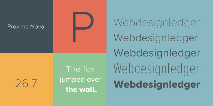
5.Proxima Nova
The Proxima Nova family is a complete reworking of Proxima Sans (1994). The original six fonts (three weights with italics) have been expanded to 48 full-featured OpenType fonts. There are three widths: Proxima Nova, Proxima Nova Condensed, and Proxima Nova Extra Condensed. Each width consists of 16 fonts—seven weights with matching italics.
6.Ars Maquette
Ars Maquette is a grotesque sans-serif typeface designed by Angus R. Shamal and released through ARS Type in 2001. A display version of Ars Maquette is available which is rare for a grotesque font. I think Ars Maquette makes a great alternative to more widely-used sans-serifs such as Proxima Nova or Gotham.
7.Montserrat
Montserrat evokes the modernist style of the early 20th century, but it feels less formal than, say, Futura. Montserrat comes in 3 variants right now, the original regular version, an alternate caps version and “Subrayada“, which has built in underlining (and which I am not so keen on). The alternate caps are probably more suitable for display being a little wacky, Julia says that they are intended “to capture the variety and soul of Buenos Aires“.
8.Maison Neue
Maison Neue is a grotesque sans-serif typeface designed by Timo Gaessner and released through Milieu Grotesque in 2012. It’s a complete reworking of the original Maison, with updates made to take advantage of new display and reproduction technologies. Maison Neue is available in five weights—light, book, medium, demi and bold—each with matching italics. There is also a nice monospaced version available.
9.Univers
Univers is a classic Swiss neo-grotesque typeface designed by Adrian Frutiger. It was released in 1957, the same year as two other famous neo-grotesques—Folio and Helvetica. The design of Univers is somewhat similar to that of Helvetica, as both were based on the 1896 typeface Akzidenz Grotesk. Univers contains an absolutely huge variety of weights and widths, making it a much more flexible type family than Helvetica.
10.Galaxie Polaris
Galaxie Polaris is a sans-serif typeface designed by Chester Jenkins and published through Constellation in 2004. The Galaxie family, which includes the serif Galaxie Copernicus and script Galaxie Cassiopeia, was designed to be a large, harmonious superfamily. The name Polaris comes from the pole star, as Galaxie Polaris was intended to be a reference point for the design of the rest of the superfamily.
11.Founders Grotesk
Founders Grotesk is a grotesque sans-serif typeface designed by Kris Sowersby of the New Zealand-based Klim Type Foundry. The design was influenced by classic grotesques from the early twentieth century. The c of Founders Grotesk has a very narrow aperture which is one of its distinguishing characteristics.
So these are our 11 font alternatives for Helvetica. We really hope that you had fun reading this article, and that it was also useful to you in some way, shape, or form. Until next time,
Cheers and happy designing!


I wouldn’t say I’m sick of Helvetica but having some good alternatives is useful. The positive about Helvetica and the new fonts above like Roboto is that that are clear, sleek and easy to read. I think that what makes them popular. I’ve not seen a few of these before, particularly I like Galaxy Polaris. I’ve added a bookmark here as I think I may use that font on an upcoming project.