To close our “best of 2013” series we gathered the web designs our readers most talked about, and we did this huge list to show you what we and our readers considered the best web designs of 2013. These are websites we featured during the year to show you examples of good use of images, type, texture, navigation and much more. Take your time to browse our selection and explore all the websites. Happy 2014!
Yoke
Fior di Latte Gelato
Evolve
Fhoke
The Good Man
WebKnit
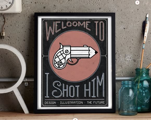
I Shot Him
Designed to Move
Friends of the Web
Glad Creative
Data Driven London
The Windmill Club
iconmonstr
Brooklyn Soap Company
nudge
Ryan Feerer
Charmer Studio
Si Digital
IXI Store
MailChimp Annual Report
Wild Blue
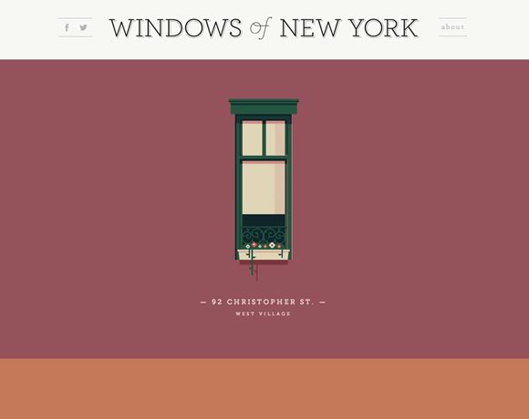
Windows of New York
Truf
Minimal Monkey
Shelton Fleming – Ideas into Experiences
Makeshift
We Are Mammoth
Northbound Design
Milk and Pixels
Karma
Kin
Eva Black Design
living edge
Richard Photo Lab
Crafting Type
LayerVault
Frank Digital
Playground Inc.
Smog Bicyclettes
Bark PR
Ready to Inspire
Olly Sorsby
Fair State
Scott McCarthy Design
Postable
Cole Townsend
Sam Markiewicz
Squarespace
Big Data
MailChimp
Big Cartel Shop


Our vote goes to Fior di latte gelato’s website. Simply stunning!
Some absolutely stunning designs in that list and awesome inspiration. I particularly like the Box Clever and Adaptable sites.
Nice collection…Thanks!
I hope this parallax fad evolves into something more. Unfortunately there is a sense of ‘all-look-same’, to me. I look forward to more diverse interactive trends in the new year.
I like all the design especially Bark PR…Simple and Clear…
Lots of great looking websites, with fantastic design…
But they are all marketing, design, photographic and small business websites… that where designed to woo and wow!!
Can we show real life big corporate websites that have to survive in a comparative/competitive market, those sites are where the money is for designers and developers, I would rather see good practice/design in large complex websites than these small designer websites…
So much almost similar WordPress templates! The background picture is the only piece of individuality of most websites. Y_Y
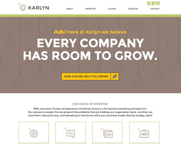
Good read ! I like all the design. Karlyn is my favorite
Its hard to select out of myriad of 2013 designs, but you did an excellent job, I liked mixed, though all are awesome.
Great collection Gisele! I have two favorites from your collection: Fior di Latte Gelato (mainly cause of the simplicity) and the MailChimp Annual Report (because of the power of their brand being so well illustrated). All of the sites here are an inspiration for our future designs. Thanks for posting the inspiring collection!
Disappointing list.
Such a limited scope of design. No focus on sites which address deeper content.
Too many samey sites with giant stock images and large bold text.
Design to move is the website design that I like a lot.
But the all designs are also good and really very hard to find such designs anywhere online.
I also would like to share with you one website i.e. http://www.61DesignStreet.com that is based on the scrolling to read the website.
Thanks
So much of this looks exactly the same, flat design, big photos. All these are product or portfolio type sites. Where’s the beef? Where are all the content heavy sites?
We’re part of a design ourobouros with us eating our own tail, every website moving to the same design. WDL in this article is helping that happen.
Showcase some content, ya’ll.
Nice collection! So much flat design und big header images.
I’m curious about the trends in 2014.
We were really impressed to see different designs like this. WOW ..They are really nice and amazing. As web designers, it was really nice to see different designs like this. Thanks for sharing …..!!!