In a changing climate, you may wonder how you can get positive attention in a new market. Media is largely digital, and it can be difficult to think of advertising any other way. However, to help your business’ message come across as memorable, you may need to find a new approach.
Although it may seem outdated to use flyers these days, a bright, concise advertisement will never go out of style. Understanding the balance between conciseness of content and vibrant design is key for an effective flyer. Above all, content matters most.
Your flyer, like your business, should be unique and reflective of how you stand out from the crowd. Make sure that consumers can see the effort put into your flyers. Over three-quarters of people will at least glance at a content-heavy flyer on the street. A little less than half of people respond to flyers.
Always research the best places to put your flyers to reach the best or most vast audience. Design, color, and word use are all important in how a flyer is balanced – how it stands out to your target audience.
We are going to share 20 alluring examples of effective content-heavy flyers that draw people onto your brand. These are well-designed, colorful examples that market with a great amount of content that is concise and informative.
-
Camp Flyer

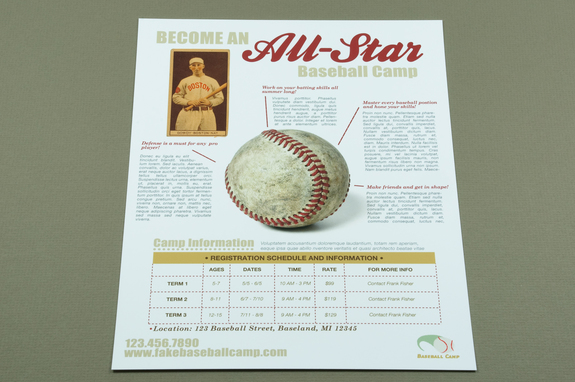
Designed to reflect the camp theme, this camp flyer stands out among others. Right away, we can see what the camp offers. Using the baseball as its center point, it remains easy to understand and leans heavily on the gift of content. With information about activities and pricing, a parent is provided with a comprehensive guide to the camp.
-
Plumbing Service Flyer

Like many of these terrific examples of effective, information-heavy flyers, this flyer for a plumbing service uses imagery reminiscent of what it is selling. With bright, clean type consumers immediately see the quick titles and can go straight to the information that they may be looking for. The flyer quickly shows the company’s website, how long they have been around, services available, as well as contact information.
“Professional and bold without too much color, this flyer is exceptionally memorable,” – says Joanne Smiths, an illustrator from Sydney, Bigassignments.
-
Material Style Business Flyer

The Material-style Business Flyer design is a recent design that is already used by web designers, agencies, and other creative professionals. It displays information about your business, products, and services, and more with a card-based layout. Consumers can easily find the information that they need, such as contact information, from the well-organized cards in this flyer.
With ample space for images and a moderate use of bright color, it allows for both a creative and professional touch. This design is ideal for catching your audience’s collective eye.
-
Corporation and Marketing Flyer Design Set

The Corporation and Marketing layout provides a positive balance between white space and content. This flyer is designed to be balanced so that your business can inform its audience without distraction from too many colors or pictures. This flyer has a clean layout that remains content-heavy so that consumers get all the information that they need regarding your business. It is well-organized instead of overwhelming.
With just a few vibrant images, the Corporation and Marketing design is concise and candid. It works best with your business’ simpler promotions.
-
Service/Repair Flyer

With images indicative of what is being sold, this vivid example of an effective flyer is perfect for the service and repair shop that it is advertising for. Though it uses white space at the top of the flyer, it has a simplistic, classic feel. With clean type and memorable titles, this vintage flyer uses minimal color for maximum effect. Despite this, it is content-heavy and tells consumers everything that they need to know.
-
Product Data Sheet Flyer w/Pricing Table

If you need your audience to see a price or other product data above other information, the Product Data Flyer is best. Because facts and figures are one of the hardest pieces of information for consumers to look at – frankly, they’re boring! – it is important to display them in a way that changes this perception. Numbers are crucial in illustrating your business’ past success.
“With this design, your business’ impressive numbers become something worth looking at. Reflected near the top in a clear way, the flyer displays them in a format that is easy to understand. The design also leaves room for product and service descriptions, contact information, and more.” – shares Grace Lawton, a web designer from New York, and the writer at Bestessays.
-
Design Corporate Business Flyers

The Corporation Business flyer is an impressive combination of lively color, imagery, and informative data. The grid system is a flexible way to showcase creativity as well as providing as much content as needed. This flyer is designed to provide space for facts and figures as well as creativity.
Providing a balance between vital figures and company information, the Corporate Business Flyer ensures that it is presented in a purely professional manner with minimal color.
-
Conference or Event Flyer

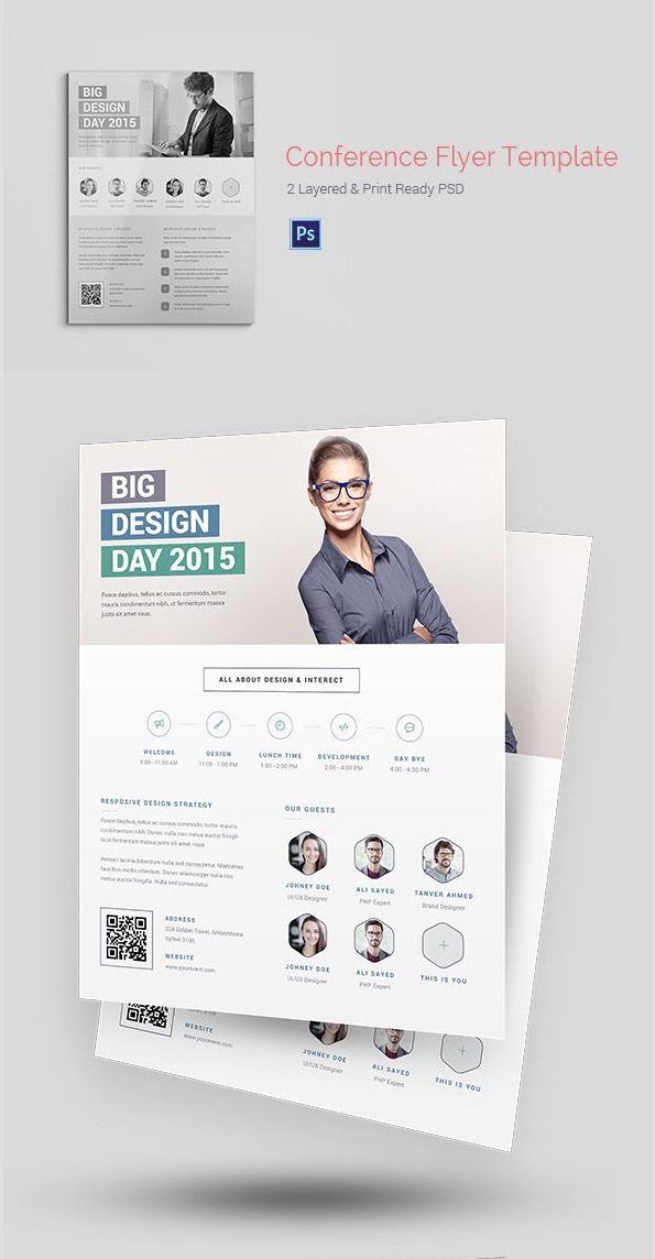
The Conference or Event Flyer is designed to grab the consumer’s attention, and immediately draw them to the event. This design showcases a large space at the top to grab the naked eye with bright colorful print and energetic imagery. If you are looking to showcase or promote an upcoming event, the design of this flyer is ideal.
With space for contact information, highlights about the event, a potential showcase for guests, and more, this design ensures that your advertisement remains as eye-catching and vibrant as your event.
-
Design Creative Corporate Flyer

The 2-Design Creative Corporate Flyer is an ideal way to provide information and business expertise as well as creativity. It features a large, vibrant space at the top to show off the uniqueness of your business. The bright colors of the design serve to bring attention to the top image and the content below.
It is simple and effective, yet it can greatly increase your business’ ability to stand out. Because information is presented in an easy to understand and a bulleted style, people can easily see what your business is about with minimal effort.
-
MomentStudio Corporate Business Flyer

The MomentStudio Corporation Business Flyer is a simple and productive flyer. Simply colored, it is clean and has a pure layout for those who are not looking for too much flair. Still, the color contrast is a creative touch that provides a great contrast between the cards in the layout.
Carol Lace, an art director at Oxessays comments: “With the Corporate Business flyer design, your company can easily present all necessary information without distractingly bright colors and images. This flyer promotes a truly professional and concise look for your business.”
-
Simply Flyer Template

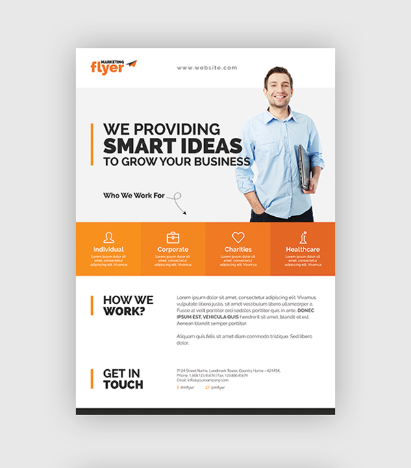
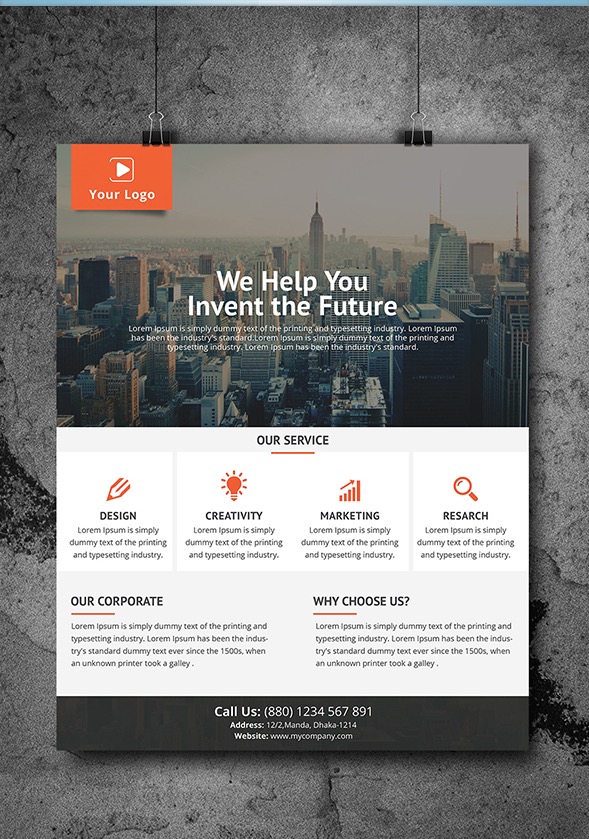
The Simply Flyer design is much more than its name suggests. With a large space at the top that has room for a photo or other vibrant, eye-catching image, businesses can play with attention-grabbing text. Very straightforward, the design displays information in a clean manner. It is a simple statement and nothing more. Information is outlined with titles and quick pictures to indicate content. Although simple is what this advertisement is all about making sure that consumers know exactly what your business can do for them.
-
Company Flyer Design Template

Lead by a vibrant image and title, this Company Flyer is more than a creative, standalone image. It creates a content-heavy advertisement to showcase services and products, highlight company attributes, and truly showcase who you are.
The Company Flyer design creates an easy and eye-catching place for contact information, despite being placed at the bottom. It is easy to understand and well-put together. This design template will reflect both a creative mind and an informative, professional image.
-
Mobile App Promotion Flyer

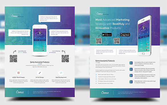
The Mobile App Promotion Flyer may seem dated, but it is going to catch people’s attention – and keep it. Because it asks potential consumers to utilize their mobile phones, they are taking your flyer with them!
This flyer is perfect for those businesses looking to promote a mobile app, and any other type of digital or web agency. With bold colors and digital representation, you can properly advertise with simply stated information. To bring you and your business into the digital age, the Mobile App Promotion Flyer is ideal.
-
Festival Flyer

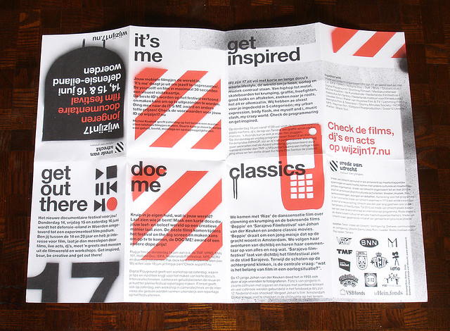
The Festival flyer is a fun, linear design that is varying at the same time. Although content-heavy and separated into a timeline of paragraphs, this flyer is easy to read and understand. Most importantly, it uses memorable, quick titles that are easy to navigate. A bright flyer is a great advertisement for your festival or event.
-
Restaurant Flyer

This flyer is an ideal advertisement for a café or restaurant. It shows a colorful, lively image of the restaurant’s food, which is an advertisement itself. Julie Wonders, an Art director from Best Australian Writers comments: “Showing a delicious meal in flattering detail makes a potential consumer wonder if the food is as good as it sounds.”
Included is a coupon for the restaurant, which acts as an incentive for a consumer to not only pick up and keep the flyer but to go to the restaurant. The bright colors in the flyer are eye-catching and showcase the same beautiful imagery to the restaurant itself.
-
Café Flyer or Menu

The last restaurant flyer was vibrant, colorful, and served as an advertisement for the business. This restaurant is a menu: it showcases the best food served at the café. With a simple title and soft colors, the name of the restaurant, while bright, does not take the full attention of the consumer away from the rest of the menu. After all, the food is the main feature of any restaurant.
“Simply written, this menu has a classic feel perfect for any trendy, new restaurant.” – says Kathy Koonse, an artist and creative director from Resumention.
-
Vintage Travel Flyer

The vintage travel flyer is a creative, fun way to illustrate what is being advertised. Designed to look like an open suitcase, this flyer immediately tells consumers what is going on. The creativity is intriguing and implores them to read on.
Billed for a travel agency, the flyer is content-heavy and informative. Colored a crisp blue, the type is easy to read and the creative aspect ensures a lasting impression.
-
IT Department Hiring Flyer

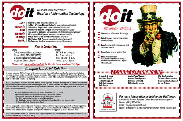
The job advertisement for the IT department of this company is a great example of a two-page flyer. Although it may seem lengthy at first, it answers many questions that will inevitably be asked by any applicant. “Job duties experienced needed, contact information and company information are all provided. It also uses familiar imagery that makes this flyer immediately memorable for the applicant”, – says Laura Johnson from Uktopwriters.
-
Room for Rent Flyer

Sometimes, too simple can be an entirely positive thing. With a coordinated two-color design, this flyer uses images to illustrate each point. Seemingly elementary, the room for rent advertisement is easy to read and even easier to understand. Indicating two beds for two bedrooms, as well as a television and a laptop for perks, a person who is actively looking for a room can read through quickly and waste no time.
-
Nutrition/Fruit Flyer

Some flyers are just cute. Using images that you know will make people smile is always a good idea. In this flyer from a nutritionist that informs viewers about fruit and its benefits. “Using simple and fun language, this flyer is effective and informational. It is highly memorable due to its remarkably light animation,” – says Jennifer Reed, an art director at Paperfellows.
Why Are They Effective?
Each one of these flyers is clean, professional, and content-heavy. For less efficient advertisements, relying too much on content risks wordiness. At this point, viewers or potential consumers feel as if they are drowning. Any creative aspects become moot and the flyer is no longer useful.
Flyers do not have to be traditional, and there is no reason to dismiss this media as outdated. With professional, clean design and concise writing, flyers such as the examples shown can be just as effective as any other type of advertisement. Premiere use of space, color, memorable and vivid images, and an orderly layout makes a flyer truly powerful.
Before someone tells you that flyers are outdated, show them one of these creative and clean examples of effective flyers. These flyers are working for the businesses using them – it does not take a marketing professional to see why!












It is an informative post keep sharing the valuable thoughts like this..