
Modal windows are the latest style of inline popups for the web. These content blocks appear on top of a website instead of literally opening a new browser window.
Most of the time this lovely replacement for the popup window can be very handy. But when used inappropriately or unnecessarily it can severely damage the user experience. In this post I want to share a few ideas, trends, and good/bad examples of modal window design. The key is to empathize with how a visitor may react to an unknown or unwarranted modal window.
Traditional Modal Design
Modal windows are generally opened by some type of user interaction. When a user clicks on a link or button it may trigger a modal window with details, further info, or a loading graphic. However some modal windows are triggered immediately on pageload, completely unprovoked by any user action.
I’m a big fan of the former and tend to cringe at the latter.
Desired modal windows are a way to include extra page content without forcing it into the layout. Just like Ajax content can be loaded with a page reload, modal windows can hold a private message form without reloading the page. I think Facebook’s PM window is a fantastic example.

This is generally the most well-renowned choice for modal design. Offer something that users will need and keep it to a minimum. Traditional modal windows are meant to simplify forms and data collection by removing these features from view until they’re requested by the user.

Imgur’s upload field is another great example which is controlled by a modal window. Quick, easy to control, works perfectly and fits naturally into the design.
I won’t go as far to say that all unprovoked modals are a poor design choice. However you really need to think about why you’re forcing a modal window in the first place.
Is the modal’s content really going to be helpful to most visitors? Does it blend into the layout? And perhaps most importantly, is it easy to get rid of?
Just Let Me Close It!
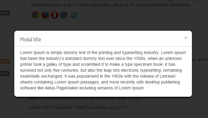
Speaking strictly from a UX perspective, modal windows should be closeable by clicking outside the window. These boxes generally take up a small portion of the screen while blacking out the rest of the site. But people who just want to view the site are so accustomed to clicking the background that when it doesn’t work it can evoke arrant frustration.

Take for example the homepage of Moqups. Their modal window is only meant to guide new visitors with a brief tutorial. This is all well and good, but even if you don’t want to view the tutorial this modal requires interaction. You can’t simply close it by clicking outside the box – you have to click the green “try it now” button.
Another point to take away from this example is the microcopy. Why does the button say “try it now” instead of “close” or “no thanks”? The modal is asking if you want a tutorial, so the phrase “try it now” seems like it could imply trying the tutorial. This makes it seem like both buttons would start the tutorial.
Confusion is a big problem with user experience design so avoid it at all costs.

A lesser-important but still interesting example can be found on Mapbox. Clicking the login button does not bring you to a new page but instead opens a modal window. This is neat but also difficult to close. The X icon is somewhat small and the window itself is small, too.
I don’t want to bash Mapbox because they have a fantastic service and website layout. But you’ll notice that their sign up link goes to a new page – so why can’t the login form have its own page? Weigh the benefits and drawbacks carefully before using modals on your site.
Forced Modals: Apropos or Annoying?
Everyone should be familiar with the forced modal window popup. This unwelcome window appears right on top of the content when visiting a blog post or landing page. Forced modal windows are typically used to offer deals or gather new signups for a newsletter.
But do these modals actually provide value to a site? The answer to this question changes based on your disposition. An Internet marketer could argue that signup rates will improve through forced modal windows. However a UX designer might say that visitors really just want to see your content, so anything that gets in the way is just plain annoying.
You can find a large collection of forced signups on this OXP article. I find that the majority of them are simply annoying and while they may slightly improve conversion rates, they oftentimes make a website look unprofessional. Special deals and newsletter signups are one thing – but the worst offenders are the modal windows that force action and will not close otherwise.
Let’s take for example Quora which is a user-voted Q&A site. When first landing on a page you’re allowed to view the question without interruption. However if you browse anywhere else on the site you’re greeted with an annoying login request modal box.

If this were simply a way to increase Quora’s userbase then I could understand. However in this case you literally cannot browse the site without registration. Where does this leave users who don’t want to sign up? Isn’t Quora’s information supposed to be free? Why do you get 1 pageview as a freebie but 2 or more require registration?
This is without a doubt one of the worst user experiences I’ve ever witnessed. It’s almost like forced compliance under duress by bargaining with information you need. Sometimes this may work – but you know what probably happens most of the time? Visitors just leave.
There are plenty of forums with answers to these questions without a padlock over the content for anonymous visitors.
However we should also take a look at forced modal windows that actually work well. I think the Creative Market modal is at least relevant and easy to manage. You can quickly close the window by clicking anywhere outside the box and it won’t bother you again.

These types of modals can be a nuisance, but at least they show some respect. The content is relatable and might actually interest new visitors. Those who are not interested can have the window closed within a second and move on from there.
Open Source Plugins
Designers who want to add modal windows into their own projects would be wise to use an open source solution. There are dozens of choices available which can save you time and stress lurched over a keyboard.
If you want to build a crisp & reliable modal window then take a gander at some of these plugins to see which one(s) may fit your project the best.
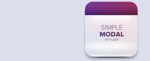
Simple Modal

The Simple Modal plugin was originally released in 2011 but has since been updated many times. It has a wide assortment of features including confirm/deny buttons and even Ajax support. Look over the plugin’s live demo to see how it works in action.
Lightbox2

Lightbox2 is the predecessor of the original Lightbox plugin. Although this may not be a traditional modal plugin it is built exactly like typical modal windows. Darkened background, internal content, and customizable options. It’s a very safe and reliable plugin in use on thousands of websites.
Custombox
Traditional JavaScript developers may take a liking to Custombox. It’s a modal window plugin which isn’t reliant on any library. Although it can work with jQuery, it only needs JavaScript and possible CSS3 support. The demo page has loads of different animation examples you can check out.
Featherlight.js

Featherlight.js is more of a one-size-fits-all library. It’s meant to be a lightbox plugin that can also work as a traditional modal window. You can load any style of content from plain HTML to images and even Ajax responses.
Remodal

If you’re looking for a relatively simple design aesthetic then Remodal is a great choice. It’s a jQuery plugin which also incorporates CSS3 transition effects. The code is still in active development on GitHub with excellent documentation.
Wrap-Up
Modals seem like a confusing subject but are really undervalued or over-criticized. Plenty of great websites rely on modal windows to improve functionality, share important notices, or request user information. But the most significant factor is how they affect user experience. I hope this post can illuminate some deeper ideas about what it takes to create a modal window that improves your site rather than impedes your users.


Leave a Reply