The artistic use of fullscreen website backgrounds has become a large part of the web design lexicon. Many different layouts from landing pages to agencies and social networks have used this feature with great success. It’s a fantastic way to draw attention while simultaneously branding a company or project.
In this post I’d like to cover a few primary uses for background images and videos. Best practices are in constant growth but have stabilized to focus on usability, user experience, and content priority. As long as a website is functional and the background content adds to the overall message then you’re on the right track.
Images vs. Videos
A fullscreen background is typically comprised of either imagery or video. With images you can include photos, illustrations, or even a moving collage slideshow or carousel. Video is more straightforward but also more difficult to implement with wavering browser support.
For either case an important principle to remember is that backgrounds should remain an accessory and not a necessity. If the fullscreen image or video were removed, content should still read properly and organize itself accordingly. It’s wise to have fallbacks in place which use a solid color background like a safety net. But at the moment browser support is far-reaching and growing larger with each passing year.
The homepage for InVision uses a large background image naturally darkened to provide more contrast for text. This is a standalone image created using the Backstretch plugin. Static backgrounds are far easier to manage because you have one stationary image to underlay the header content like navigation links and the company logo.
In contradistinction background video can be more fluid and unexpected when it comes to managing colors. The homepage for Story & Heart uses a fullscreen video that shifts between many different scenes. Text is bright and generally visible in every scene – this is the goal to shoot for when using BG video. It’s too much effort to dynamically change text color as the video updates, so instead work to create a semi-uniform color palette in the video.
Homepage Designs
The most common and most useful place to include fullscreen content is on the homepage. Other pages of the website are dedicated to specific content like privacy policies or shopping catalogs.
I want to emphasize the great effect on Coulee Creative because their website does a number of things just right. First the site is fully responsive for mobile screens. Dropping below a certain threshold replaces the video background with a tiled image background. This is useful on mobile where fullscreen video isn’t as appreciated.
Also their header is not meant to dynamically resize to the full browser height. It does take up the full width of the page using a fixed height based on the video size. Not every homepage needs to expand fully based on height and width – find the method that works best for each project.
One of my favorite creative agency websites has to be Underbelly. Their homepage uses a fullscreen image which is also responsive but stays at a fixed height. From the very first pageload you can tell what they do and that communication is very important. I find that the background image helps to convey their purpose and the shade of blue matches nicely with the company branding. This example gets a solid A/A+ rating in my gradebook.
Vibrant Contrast
Contrast is the property of visibility between a foreground and background. For example white text on a black page has very high contrast – this is exactly what we want to achieve when designing with fullscreen backgrounds.
Here is a very weird example that’s both unique and probably over-the-top in most cases. core4 uses Flash to embed a background video from their office hallway. Not only this, but it uses a live streaming feature to play video in real time.
So if anything can appear on the background video how does this work so well? The page content uses a background color behind the main text so it’s always readable. Likewise the top navigation links are placed in a corner where it’s always dark and clearly legible.
This is a good strategy if you create a background video that loops between different segments. Place crucial text in locations that will always be dark, or if that’s not possible just give the text a solid color background. Remember that fullscreen content is meant to be an aesthetic and compliment the content. It does nobody any good if the page is unreadable and unusable, even if the background photos are stunning they can’t make up for poor contrast.
Fullscreen Slideshows
Talking about fullscreen images there’s really two types of background design. One is static with a fixed image while the other is dynamic with different rotating images. These rotating slideshows are really popular because they can showcase related design work or photography.
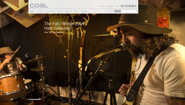
Coal Headwear uses a fullscreen image rotator to display models with their different hats and accessories. This is a common marketing technique to sell products based on common uses in real-world situations. Interestingly as you scroll down the homepage you’ll notice that the slideshow is also fixed as the whole page background.
Other pages on the website use fullscreen backgrounds with static photos taken from the slideshow. It’s a nice effect that you won’t find everywhere but when it works the result is fantastic. Keep in mind that other websites aside from eCommerce shops can use photo slideshows with a similar effect.
L’attrape rêve is an art store which uses a fullscreen video background on the homepage. But the background is actually a rotating carousel with multiple videos that you can shift between. All of the content is presented in black & white so there’s plenty of contrast for page text.
Personally I would recommend against video slideshows only because they’re very intensive to create and render in the browser. This layout has a specific target audience so it works well and actually runs very smooth on both my desktop and laptop. But although video slideshows are a possibility they’re best put aside in lieu of image slideshows.
Resizable Layouts
If you’ve been following design trends over the past few years then responsive design shouldn’t be a new concept. It’s become a cornerstone to modern web design allowing a single layout to hold it’s weight on any screen resolution.
With fullscreen backgrounds it can be tougher to create a fully-responsive layout – but that’s no excuse to abnegate the idea entirely. Plenty of great websites use fullscreen backgrounds and keep the responsive trait. Seed Spot 2014 is one such example with a very clean photo slideshow.
Their website header uses a fixed-height on the slideshow to maintain consistency above-the-fold. Often times I find this to be a superior approach compared to fullscreen height because text content becomes the primary focus while still delimiting a header with relatable background content. Responsive design works great with fullscreen as well – you just need to be more crafty when implementing variable-height backgrounds.
Overall these techniques should be applicable to any type of website. Fullscreen content has become much more widespread and is heavily supported among most web browsers. These practices should be enough to get you started on the path to well-crafted website layouts. If you have any other spectacular examples of fullscreen backgrounds you can share with us in the post discussion area.


Woah, thanks for the share. I love full screen background sites but so many people forget to use the best practices. Awesome examples too! I think one thing to be aware it readable type- using a background, you will want to make sure your type is still readable or else whats the point of the site?
It should also be noted that moving pictures can trigger people with epilepsy, so they should NOT be used as a background.
Hi Jake, thanks for this info. I was wondering what you recommend for the size of images and/or video in the background when using a fixed height?